Maps: Visual Representation of Data by Location
‹View Table of Contents
Adding a Data Layer ~ Creating Choropleth & Dot Density Maps with Boundaries
Epi Map can create a choropleth or dot density map by combining a dataset with three boundary formats: shapefile, map server, or KML (Keyhole Markup Language) (descriptions of each format follow). This is the map/boundary format compatibility:
- Shapefile—an Esri vector data format for location, shape and geographic attributes.
- Map server—an Open Source repository for map images and vector data.
- KML—an XML notation for geographic annotation and visualization.
The boundaries are independent of the dataset but are joined with database keys.
Note: The dataset and boundary file must contain the proper database keys and the user must designate the proper key from each drop-down list to create a choropleth or dot density map.
Key descriptions are as follows:
- Feature Key—designates the variable in the boundary set that will match a corresponding variable in the dataset.
- Data Key—designates the variable in the dataset that will match a corresponding variable in the boundary set.
- Value Field—designates the value being displayed.
Shapefiles
A shapefile stores non-topological geometric and spatial information in vector format. These files are simple to use but lack complex data elements. Various sources attach additional information or tables to shapefiles for more advanced analysis.
KML
KML is an open source specification for describing geographic data. Like shapefiles, KML files contain instructions used by mapping tools to draw boundaries, points, and other feature sets. A benefit to using KML files is that they can be edited using simple text editors.
Map Servers
Map server is a platform used to publish spatial and geographic data to the Internet. One advantage of the map server format is the capability of creating a central repository for mapping data with relational database management systems.
Choropleth Map
A choropleth map uses graded differences in shading or color to display variations of a variable across a geographic area. The color gradient typically spans from one color to another or from a lighter to darker shade of the single color.
The following example demonstrates how to combine a map server feature set for the state of Maryland with the Lyme data set included with Epi Info to create a choropleth map. The boundary format in this case is KML.
Note: This example uses case-based data, where each row in the data set represents an individual case, rather than aggregate data.
- Select Add Data Layer from the toolbar.
- Select Choropleth from the list.
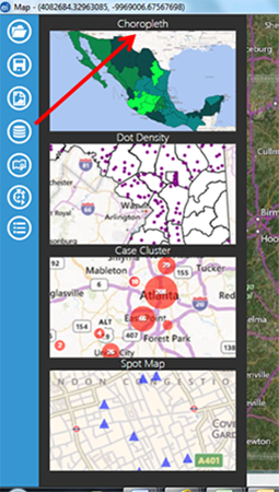
Figure 10.45: Screenshot of choropleth map selection
- The Data Source dialog box appears. Click Browse to open the database options.
- Click Browse next to the Data Source field. Select the Lyme folder and then the Lyme.prj file.
- Select the Case Report form in the Data Source Explorer. Click OK.
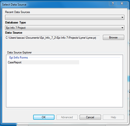
Figure 10.46: Choropleth Data Source dialog box
- Select the KML/KMZ radio button in the Data Source dialog box and click Browse.
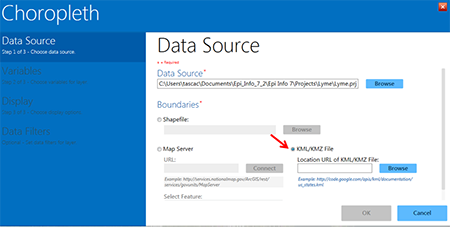
Figure 10.47: KML/KMZ radio button in Choropleth Data Source dialog box
- Click back to the main Epi Info Project folder. Open the KML_Example folder and select the Maryland_Counties.kml file. Click Open.
- In the Data Key drop-down, select County.
- In the Value Field drop-down, select {Record Count}. In the Feature Key drop-down, select County_Name.
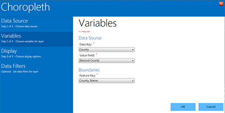
Figure 10.48: Data Source drop-down menus in the Choropleth layer
- In the Display property panel, set the desired display options such as legend title and text (labels). For this example, leave these options blank. You can also select the colors and data ranges to use, including the number of classes into which you would like to divide the data. For this example, leave the default selections. Click OK.
- The choropleth map appears, showing the number of records in the dataset within each Maryland County. Counties with the highest tier of records are dark blue, while counties with the least amount of records are very light blue. Note that the “starting” data category is white, but no data fall into that particular category here.
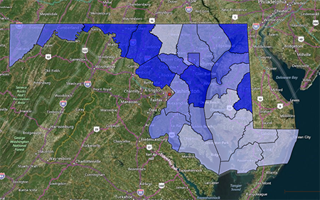
Figure 10.49: Example choropleth map from Lyme disease dataset
- Click on Blank in the upper right of the main Epi Map window to view the choropleth with a white background only.
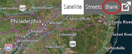
Figure 10.50: Blank selection in main Epi Map main window
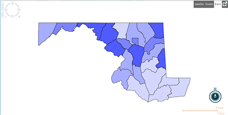
Figure 10.51: Choropleth in blank map view
- To change any of the display options or to add optional data filters, place the mouse over the Map Layers tab located at the bottom of the screen. When the tab scrolls up, click the layer configuration icon to re-open the Choropleth layer.
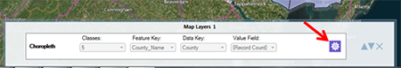
Figure 10.52: Map Layers tab and layer configuration icon
Dot Density Map using Shapefile Boundaries
To display densities across geographic boundaries, select Dot Density from the data layers list. Epi Map will populate the dot density map according to the dot value selected in step eight. Increasing the dot value increases the value each dot represents. The dot density map populates each dot randomly within a set of boundaries to display the density. The example below demonstrates how to create a dot density map with data from a Vital Statistics report published by the Mexico Ministry of Health using a shapefile.
- Select Add Data Layer from the toolbar.
- Select Dot Density from the list.
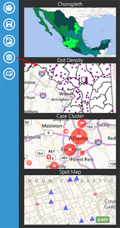
Figure 10.53: Screen shot of Dot Density
- The Data Source dialog box opens.
- Click Browse next to the Data Source field in the main layer dialog box, and then again in the Data Source dialog box. Select the Sample project folder and the Sample.prj file.
- Select the MexMap95 form in Data Source Explorer. Click OK.
- Click Browse next to the Shapefile line. (If the Browse button is grayed out instead of blue, click the Shapefile radio button.)
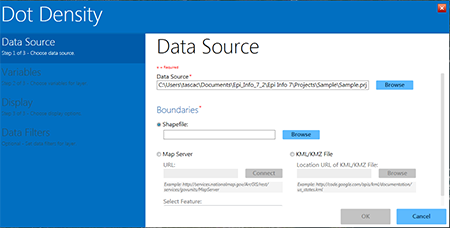
Figure 10.54: Browse Shapefile selection option
- Select MXState.shp in the Sample.prj file.
- Select STATE from the Data Key drop-down list. The data key connects the dataset field, STATE, to the shapefile feature key name.
- Select PerTeenBirths95 from the Value Field drop-down list. This populates the dot density map based on the percentage of teen births in that state.
- Select name from the Feature Key drop-down list. The feature key connects name in the shapefile to the dataset.
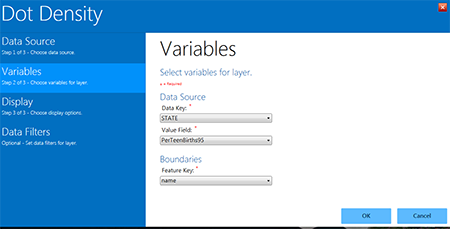
Figure 10.55: Shapefile variable options and boundaries
- Click OK.
- The Display options dialog appears. Options can be selected here for the color of dots in the map and the value each dot should represent (Dot Value). In this example, the dots are associated with the percentage of teen pregnancy in each state. By specifying “1”, each dot will represent a single teen birth percentage point.
- Click OK.
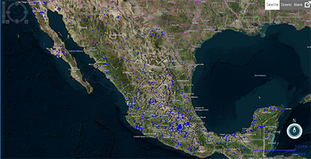
Figure 10.56: Dot Density using shapefile
- The Dot Density map data layer displays on the main Epi Map window. Since one (1) was selected as the dot value, each blue dot represents a single percentage point for the dataset. Areas with a higher concentration of red dots represent a higher percentage of teen births.
- Select Blank view at the top right corner of the main Epi Map window to display the Dot Density map with a white background. You can also select Streets to view the map at the street level.
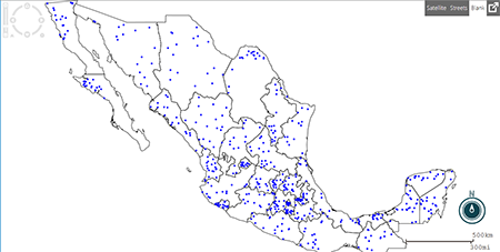
Figure 10.57: Dot Density in Blank View
- To change any of the display options or to add optional data filters, place the mouse over the Map Layers tab located at the bottom of the screen. When the tab scrolls up, click the layer configuration icon to re-open the Choropleth layer.
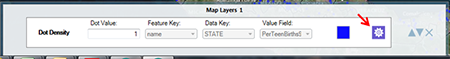
Figure 10.58: Dot Density Map Layers view and layer configuration icon
The three examples shown in the Adding a Data Layer section do not represent every possible combination of map type, database type, and boundary file. Epi Map is capable of mapping all combinations using similar processes.
Maps
- Maps Introduction
- Basic Tools
- Basic Functions
- Save
- Add a Data Layer
- Case Cluster
- ›Create Choropleth/Dot Density Maps with Boundaries
- Base Layer
- Chapter 10: Maps – Full Chapter