Maps: Visual Representation of Data by Location
‹View Table of Contents
Adding a Data Layer ~ Case Cluster
Case Cluster
Case Cluster layer displays case locations on a map based on geographic coordinates. Each dataset used to create a case cluster must contain numeric fields that Epi Map can designate as latitude and longitude. The software has the geocoding capability; that is, it can convert a street address into latitude and longitude coordinates. If geocoding is not applied, a street address alone will not be sufficient to create a case cluster. For additional information on geocoding, refer to the Form Designer section of this user guide.
In the main map window, large case clusters appear as bigger circles with the total case count contained inside of them. Individual cases appear as single dots without a case count designation. The example below demonstrates how to create a case cluster map in street view with sample Epi Info 7 ™ data from the E. coli project folder.
- Select Add Data Layer from the toolbar.
- Select Case Cluster from the drop-down list.
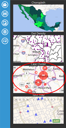
Figure 10.22: Case Cluster selection in list of Data Layers options
- The Case Cluster layer dialog box appears.
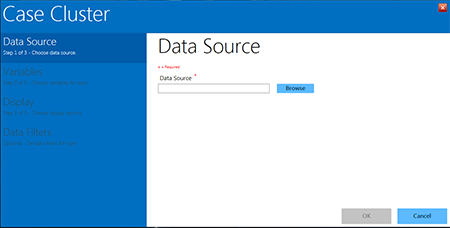
Figure 10.23: Case Cluster layer
- Selecting a Data Source is the first step in the Case Cluster process. Click the blue Browse button located next to the blank Data Source line in the Data Source menu in the Case Cluster dialog box (Figure 10.23).
- A Select Data Source dialog window will open.
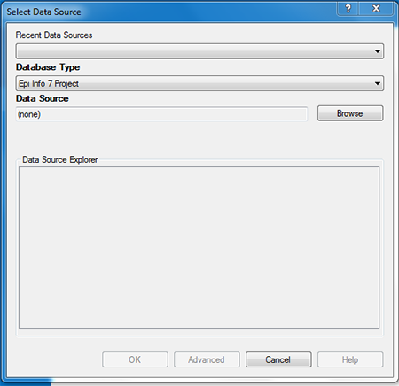
Figure 10.24: Select Data Source dialog box
- Select the appropriate database option from the Database Type drop-down list. There are multiple database types available in the drop-down list, and it is imperative that you select the one that matches the file format you are adding to Epi Map. For this demonstration, the default Epi Info 7 Project option is used. (Note: If you are using a data source you have worked with in Epi Map recently, you can use the Recent Data Sources drop-down to select that specific database.)
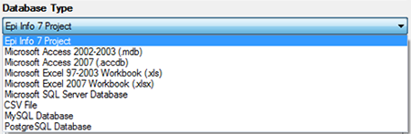
Figure 10.25: Database Type drop-down menu
- Once you have selected the appropriate database type, click on Browse next to the Data Source field. This will open a list of files associated with the database type you have selected.
- Double-click the file and/or project name to select it. For this demonstration, select the Ecoli project by double-clicking the Ecoli folder and then double-clicking the Ecoli.prj database.
- Once you have selected a database, its name will appear in the Data Source field and the associated project data will be listed in the Database Explorer window.
- In the Database Explorer window, select the project data you would like to map. For this example, select the Food History form. Click OK.
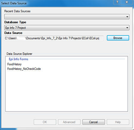
Figure 10.26: Data Source Explorer dialog box
- Select Latitude from the Latitude drop-down list.
- Select Longitude from the Longitude drop-down list.
- Click OK.
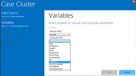
Figure 10.27: Latitude and Longitude drop-down lists in the Case Cluster layer
- Epi Map will automatically take you to the Display options, where you can choose a color and legend title for your clusters. Enter your desired legend name in the Legend Description box. The Color Representation block is blue by default. Clicking the small blue square will pop up the Color options chart, from which you can select standard or custom colors.
- For this example, enter Legend Example for the Legend Description and select red as the cluster color.
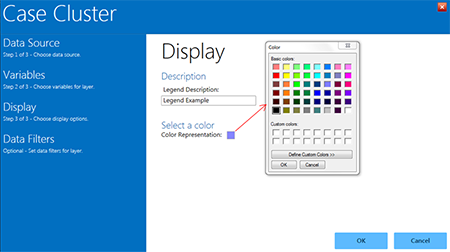
Figure 10.28: Display options in Case Cluster
- Click OK.
- The Case Cluster layer closes and returns to the map. Red circle “clusters” appear in the appropriate locations, with the number of cases in the center of each circle.
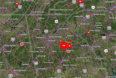
Figure 10.29: Case Cluster results
- As the view zooms in, case clusters separate into smaller clusters and individual cases appear as single red dots.
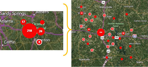
Figure 10.30: Case Cluster zoom
- Moving the mouse over a small case cluster (less than 12 records) will “flare” the cluster. The number seven at the center of the cluster in this example represents seven different cases. When the mouse is over the case cluster, seven smaller dots appear, each representing one of the records inside that cluster. This is useful if the same household contains multiple cases.
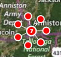
Figure 10.31: Expanded case cluster
- Hovering over the Map Layers bar at the bottom of the map will scroll the bar open and display current map layers (e.g., Legend Description, fields).
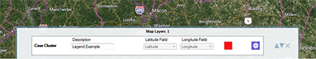
Figure 10.32: Map Layers bar at bottom of map window
Data Filtering in Epi Map
Data filters in Epi Map are used to select a subset of data by specifying and applying certain conditions. This allows the user to show the effect of a variable on the geographic distribution of cases. To access the data filter tool, move your cursor over the Map Layers bar at the bottom of the main map window as described in the previous section. In this example, there is currently one case cluster layer, which is in red and does not contain any filters.
The following example demonstrates how to apply a filter to the Age variable in the data layer from the previous example.
- In the Map Layers bar, click the Edit data layer tool, which is circled in red in Figure 10.33.
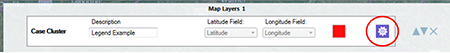
Figure 10.33: Edit data layer icon in Map Layers tab at bottom of map window
- The Case Cluster layer opens. Select Data Filters from the list of options in the left-hand menu.
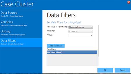
Figure 10.34: Data Filters menu in the Case Cluster layer
- From the drop-down list labeled The value of Field Name, select Age.
- From the Operator drop-down list, select is less than.
- Enter 21 into the Value textbox.
- Click Add Condition. One row defining this filter is automatically added to the Data filter table.
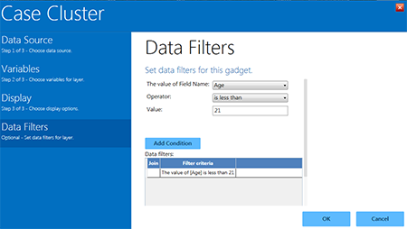
Figure 10.35: Data filters menu with one filter added (age less than 21 years)
- Click OK. The map refreshes to display only cases in which the patient’s age is less than 21 years.
- A filter can be removed by scrolling down below the Data filters window, highlighting the desired filter, and clicking Remove selected. Clicking Clear all conditions removes all filters.
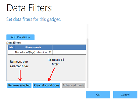
Figure 10.36: Options to remove one selected or all Data filters
Visualizing Multiple Data Layers (Additional Data Layers)
Filters are a powerful tool for sorting data. In certain instances, however, it is best to display the full dataset in groupings displayed in different layers. This requires separating the data, by filtering on more one or more conditions for each layer. After completing the steps to this point in the user guide, the example map displays the patient population that is less than 21 years of age. To create a map with one or more layers, another data layer is needed to show an additional age group in the patient population. In the following example, this is achieved by adding another case cluster data layer with a filter based on the patient’s age. Blue clusters will represent the records that meet the specified condition.
- Select Add Data Layer from the toolbar.
- Select Case Cluster from the drop-down list.
- Follow the Data Source selection steps from the previous Case Cluster section to select the Ecoli.prj folder and the Food History form in the Data Source Explorer.
- Select Latitude from the Latitude drop-down list.
- Select Longitude from the Longitude drop-down list.
- Enter Legend Example2 in the Legend Description box. Leave the color as the default blue.
- Click the Data Filters option in the left-hand menu.
- The Data Filters menu appears. In the drop-down for The value of Field Name is, select Age.
- From the Operator drop-down list, select is greater than or equal to.
- Enter 21 into the Value textbox.
- Click Add Condition.
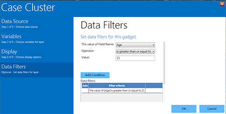
Figure 10.37: Second data filter added to case cluster
- Click OK.
- The map window displays both age group data filters by color.
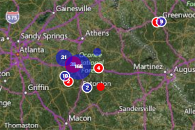
Figure 10.38: Example of case clusters filtered by two age groups
The blue clusters represent cases in which the patient is 21 years of age or older, while the red clusters represent cases in which the patient is less than 21. Epi Map tool allows for multiple age groupings and can also filter the dataset based on other variables (e.g., whether the patient is male or female, foods eaten, etc.).
Note that the Map Layers bar at the bottom of the screen displays a (2) instead of a (1). This indicates that there are two different layers with corresponding filters. The properties of each layer can be viewed by clicking the purple gear icon on the right-hand side (this opens the full Case Cluster menu). The order of layers can be changed using the gray arrows, and layers can be removed fully by clicking the “x” at the far right of the bar.
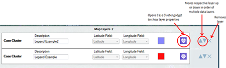
Figure 10.39: Map Layers bar illustrating two case cluster data layers and some of the tools to work with each by two age groups
Time Lapse
When a case cluster layer is added to Epi Map, the tool displays all cases contained in the dataset (or, if a filter is applied, all cases that meet the selected filter criteria). The Time Lapse tool creates a dynamic environment that illustrates how the dataset transforms over time. To enable this feature, use a dataset with a time variable.
- Add a Case Cluster data layer (see Adding a Data Layer). Use the Food History form in the E. coli project for the following example. Select Latitude as the latitude variable and Longitude as the longitude variable in step 2 of the data layer process.
- Once the data layer is added, the Create Time Lapse icon will appear in the left-hand toolbar. Click the icon.
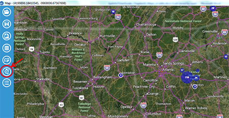
Figure 10.40: Create Time Lapse icon on toolbar
- Select the OnsetDate from the Time Variable from the drop-down list. Click OK.
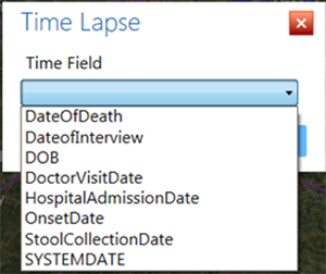
Figure 10.41: Configure Time Lapse dialog box
- The system will add a timeline to the map illustrating the start and end dates found in the dataset. In this example, data in the dataset start (first onset date) on 4/19/2011 and end 4/20/2011 (last onset date).
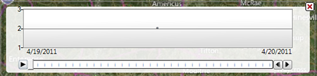
Figure 10.42: Timeline resulting from range of time in the dataset
- To watch the time lapse progression of the symptom onset date over time, click the Run button (single right-pointing arrow at the far left of the timeline).
- The main map window clears and begins adding the cumulative number of cases respective to the timeline. The figure below displays the number of cases in the dataset from 4/19/2011 to 5/13/2011 (end date is displayed at the lower right of the timeline).
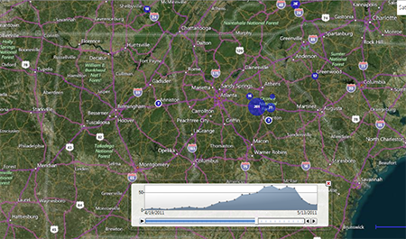
Figure 10.43: Time Lapse display
- The distribution of cases displays at the bottom of the screen.
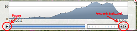
Figure 10.44: Time series distribution with pause and forward/backward buttons highlighted