 An official website of the United States government
Feature Area
Best Practices
Overview
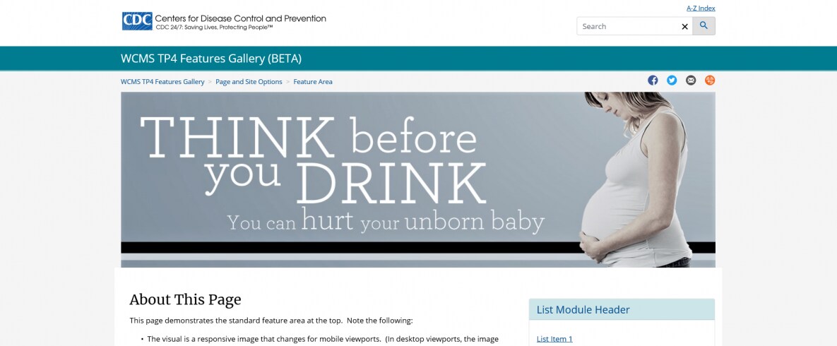
The feature area is a special page slot above the white page body area, typically reserved for “hero” responsive images, sliders, jumbotrons, etc. The feature area can be used on wide pages only (pages with no left navigation menu). The picture below shows a jumbotron in the feature area.
Usage
There are two types of feature area: standard and fluid. A standard feature area is essentially the width of the page body (as shown above); a fluid feature area spans the browser window.
Both types can be used on content and home pages (without left navigation menu), but generally, standard feature elements should be reserved for highlighting content on home pages. Fluid feature elements are best for adding visual interest only (not highlighting content). See examples: standard feature area and fluid feature area.
To “sub-brand” a section of related pages (for example, pages for a specific target audience), consider using the visual element, which is implemented via SSI. (The feature area is implemented in page Display Options for individual pages.)
- Building in the WCMS [PDF, 1.2 MB]See tips and guidelines on working with the feature area in the WCMS.
- Image with Caption / JumbotronUse the jumbotron in a standard feature area to highlight an important message.
- Responsive ImageWhen embedding text in a feature area image, use the responsive image.
- TP4 UX Best Practices [PPT - 14 MB]For guidance on colors, layouts, and overall presentation, see TP4 UX best practices.
Guidelines
- Use sparingly for high-priority feature content on home pages.
- Use a high-quality, interesting image, but keep it simple: a busy image can distract visitors from your message.
- To highlight a key message, consider using a jumbotron (image with caption) in the standard feature area. The text overlay can shift visitors’ focus to the message without hiding the image.
- Engage visitors with a message that encourages them to venture deeper into the site. Typically, brief text works best.
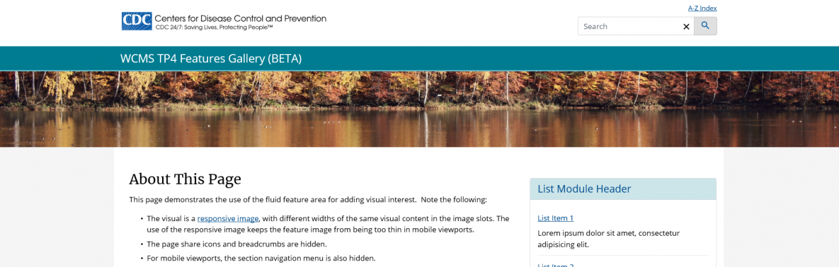
- For optimal display on home pages, try hiding the breadcrumbs and page share icons (see example with hiding of share icons and breadcrumbs vs example with those elements displayed). For mobile viewports, also consider whether to hide the section navigation menu. If the feature area doesn’t work for your display needs, consider simply placing your featured content at the top of the page content area (see the winter and summer home-page examples).
- When working with an image with embedded text, determine whether you need to create a simpler version for mobile viewports. The responsive image supports this approach. (See example feature area with responsive image.) The responsive image is also best for the fluid feature area due to the great difference in image width needed for the largest and smallest viewports.
- Preview in all viewports. When using a jumbotron, pay particular attention to viewport 4, the smallest desktop viewport.
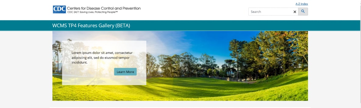
Fluid Feature Area with Responsive Image for Visual Interest (see example page):
Standard Feature Area with Jumbotron and Hiding of Share Icons / Breadcrumbs (see example page):
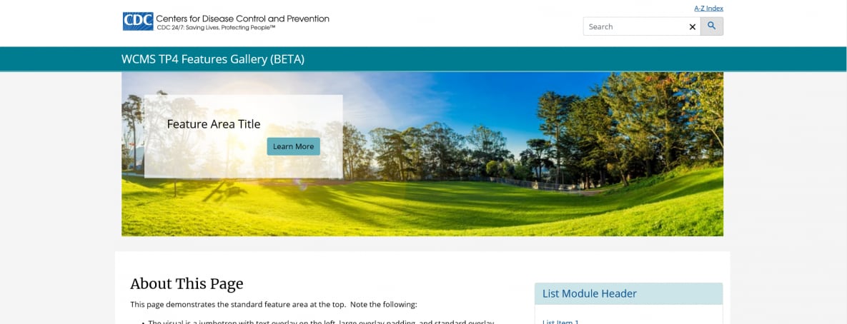
Standard Feature Area with Responsive Image and Display of Share Icons / Breadcrumbs (see example page):