Data Bite
Best Practices
Visit the new Gallery!
Overview
Data bites help page users quickly find answers in a single highlighted value. They provide a way to aggregate data into a single value to focus attention and provide textual context about that value. When used inside a dashboard, data bites provide calculated summary information that react to dashboard level filtering as an interactive page element.
As a reusable Data Visualization module, these data bites can be reused across a site and updated in a single editor.
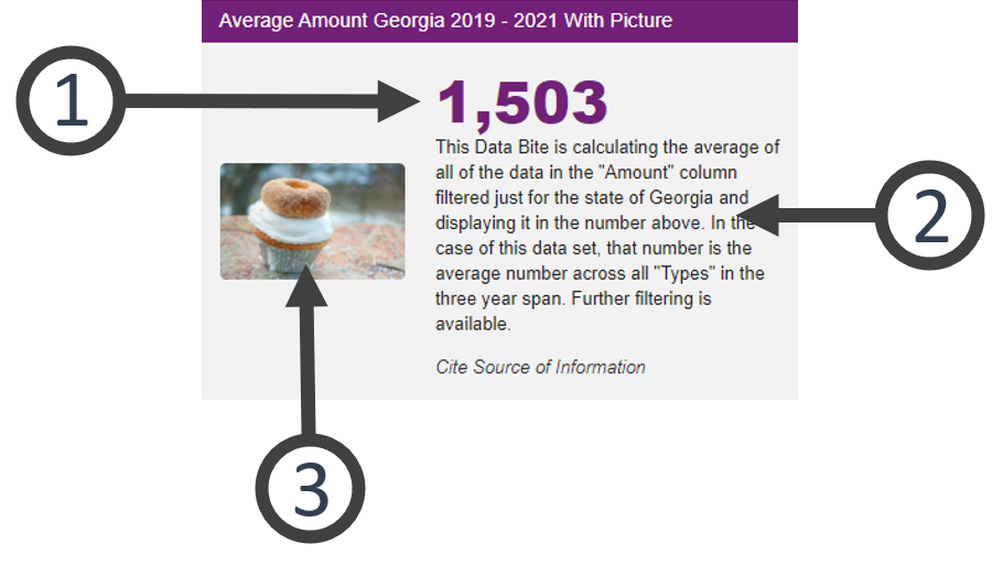
The picture below is an example featuring the elements of a data bite. Go to examples at the bottom of this page to see some of the additional layout and data configuration options.
- Go to ExamplesSee examples on this page that illustrate key options.
- Building in the WCMSSee key tips and guidelines for building a data bite in the WCMS.
- TP4 UX Best Practices [PPT - 14 MB]For general guidance on colors, layouts, and overall presentation, see this overview of TP4 best practices.

- Calculated Data Display
This visually customizable number reflects the calculated amount of the data selections made in the Visualization Editor. Style and location variations are available. - Message
This information clues the viewer further into the information you’ve showcased. Context and additional insight can be manually entered in the Editor. - Image
An image can be added to the data bite with limited customization. Any image selected should emphasize the importance or give context for the data.
Usage
-
-
- When one number represents a significant perspective.
- To create visual interest within a series of textual elements.
-
Don’t Use:
-
-
- If isolating one point of data tells an incomplete perspective.
- If the supporting text needs to be more than three lines.
-
Other Guidance
-
-
- Title: Good titles are invaluable. Your data bite title should be long enough so that your audience can make sense of the relationships between the elements. A glance at the title should clearly convey what the data bite contains.
- Visual Clutter: If an image or a graphic isn’t needed, select the cleanest layout possible.
- Data Source: The data source makes your graphic more reputable. It also allows those who are interested to dig deeper.
- Data Series: Follow the best practices provided for each visualization to build the data best supported by each element selected for the dashboard.
-
Customization
Customizations exist for colors, font, and imagery in the Visualization Editor. If a series of data bites are presented together, it is recommended to make similar visual selections across the series for coherence.
Most inline styling can be applied to the Title, Message, and Subtext portions of the Data Bite text.
Sum of Data
This data bite is calculating the sum of all data in the selected column. The graphic was set to display above the description.
Calculated Average with Picture
This data bite reflects the calculated average amount displayed above the description text. The image was added using a URL to set to display to the left .
Data Bites as an Interactive Element using a Dashboard
Data Bites can be added to a dashboard to allow a user to customize the data view.
Data Bite Using Conditional Imagery
Data bites can be configured to display different imagery depending on the value that is calculated. The image will change based on inputs and filtering.
Notice that once the number increases beyond 19 students with books, the image changes to numerous books. Conditional imagery helps if data sets are updated frequently or dashboard values change with filtering. Having a dynamic conditional image in data bites helps users translate the information. Conditional image URLs can be configured for sets of three or four values:
-
-
- Four values – Default, less than, equal to, and greater than.
- Three values – Default, Less than or equal to, and greater than or equal to.
-
Go to the building page for data bites to learn more about configuring a data bite for conditional imagery. Conditional imagery can be set for data bites in a dashboard or as a stand alone visualization.