Box-and-Whiskers Plot
Best Practices
Visit our new and updated gallery!
Overview
The box-and-whiskers plot shows the distribution of numeric data. At a glance, you can see how tightly data are grouped, how the data are skewed, and how symmetrically the data are distributed.

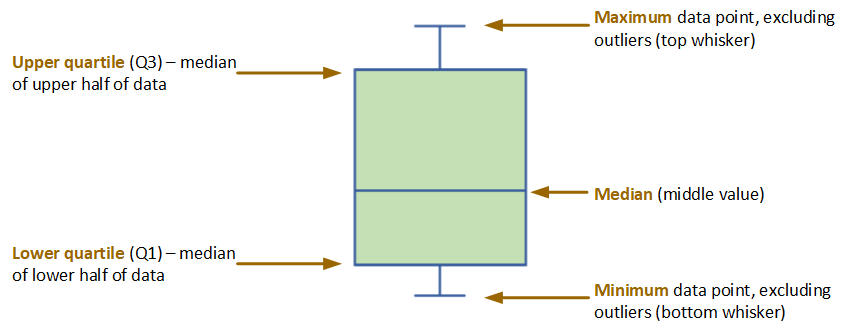
As the figure below illustrates, this chart type, also known simply as the box plot, is a graphic representation of what statisticians commonly refer to as the five-number summary:
- The maximum and minimum data points (excluding outliers) are represented by the lines above and below the box (the two “whiskers”).
- The line in the middle of the box represents the median.
- The upper boundary of the box represents the upper quartile (Q3). This is the median of the data points in the top half of the set.
- The lower boundary of the box represents the lower quartile (Q1). This is the median of the data points in the bottom half of the set.

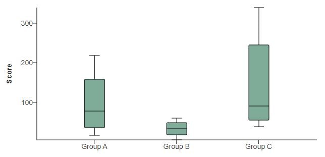
In the example at the top of the page, the values in Group B are generally lower than those in Groups A and C. That’s the first thing most readers will notice. But the chart tells us a good bit more. It’s clear that within Groups A and C the data are skewed towards the higher range. It also tells us that the data for Group B are more tightly distributed than the data for Groups A and C.
The box plot can also show actual outlier and non-outlier values, as illustrated in the “live” examples at the bottom of the page.
Data Requirements
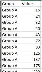
To generate a box plot, you need simply the raw values and their category labels, as the Excel image below illustrates. The WCMS calculates the five numbers upon which the visualization is based.

Usage
Consider these best practices when deciding when and how to use a box plot.
- Your audience may not be familiar with the conventions of the box plot. Consider including a brief explanation or a link to a resource. (The chart designer offers several options for supplemental text such as this. For example, you can place it as “subtext” between the chart and the data table or as footnotes below the data table.)
- Make certain the box plot aligns with the public health messages you’re trying to convey. Bar charts are appropriate for counts and rates while box plots communicate characteristics of data distribution. How relevant are the skewness and symmetry of the data to your story?
- Consider the importance of outliers to your story and any applicable standards for outlier definition. Unlike bar charts, box plots can show outliers. (Even if you choose not to include them in the visualization, they are automatically included in the supporting data table.) The WCMS uses the standard “IQR 1.5” rule to calculate outliers, but this rule may not be appropriate for your purpose. The definition of an outlier may vary from one scenario to the next. It may be case-dependent or based on industry- or sector-specific guidelines. See an example plot with outliers, along with more information on how the WCMS calculates outliers.
- Be careful with colors, especially if you choose to plot non-outliers in the visualization. (See example.) Generally, lighter box colors work best.
- Go to ExamplesSee examples on this page that illustrate key options.
- Building in the WCMSSee key tips and guidelines for working with box plots in the WCMS.
- TP4 UX Best Practices [PPT - 14 MB]For general guidance on colors, layouts, and overall presentation, see this overview of TP4 best practices.
Box Plot with Outliers Plotted
The WCMS uses the “IQR 1.5” rule for calculating outliers. “IQR” stands for interquartile range, which is Q3 – Q1 (i.e., Q3 minus Q1). Any data points above Q3 + IQR * 1.5 are plotted as outliers above the top whisker; any data points below Q1 – IQR * 1.5 are plotted as outliers below the bottom whisker.
If your data have outliers, you can decide whether to include them in the visualization. In this example, Groups A and C both have outliers. Note that the data table also provides information on outliers, along with other information such as the standard deviation and value totals. (Currently you cannot exclude any of the additional table rows, but you can relabel them.) Download sample data [XLS – 449 B].
Box Plot with Non-Outliers Plotted
You can choose to include non-outliers in the visualization. Each dot between the whiskers represents a non-outlier value. As you can see, adding non-outliers to your visualization can result in clutter, so use this option with discretion. Download sample data [XLS – 449 B]. (Note that the same data are used for both chart examples.)