Bar Chart
Best Practices
Visit our new and updated gallery!
Overview
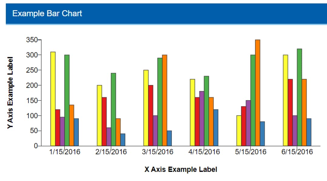
The primary use of a bar chart is to show comparisons between time periods or categories. One axis shows items to compare while the other displays the value being measured; the longer the bar the greater its value. The primary goal of a bar chart is to showcase the relationship between the two axes. A grouped bar chart displays if the data set includes multiple data series.
Note that the WCMS also offers the combo chart if you need to represent multiple data series with a mix of bars, areas, and different line styles.
Chart is an interactive content type in the WCMS. Go to examples at the bottom of this page to try out “live” charts.
- Go to ExamplesSee examples on this page that illustrate key options.
- Building in the WCMSSee key tips and guidelines for working with bar charts in the WCMS.
- TP4 UX Best Practices [PPT - 14 MB]For general guidance on colors, layouts, and overall presentation, see this overview of TP4 best practices.

Interacting with the labels in the legend will highlight or isolate the selected data series. Each data series can be toggled on and off individually, allowing users to view a wide variety of combinations.

Sorting: Selecting the top row of a column sorts the entire table by the content within the selected column. Selecting the same column multiple times rotates the sorting feature between three states: Descending, Ascending and Off. Only a single column can be sorted at one time.
Source: When referencing information from outside of the current page, you should provide a source link. Source links should be short and descriptive; they should not be the full URL. Source links are always displayed directly above the table.
Show Vertical Data: You have the option in the build process to reorient your data vertically instead of horizontally. This may improve the data table’s readability.
Add Column: If the vertical orientation of your data table is selected, you have the option to add an additional column of information to your data table. This column can be additional information your users may find useful, and will not influence the rendered visualization.

Usage
Bar charts are used to easily compare data among categories and between groups at a glance. They reveal patterns, trends, relationships and exceptions in data values that are not readily apparent from a table of values.
Use:
- When comparing categories
- When showing big changes in data
Don’t Use:
- When showing small incremental changes
Other Guidance
- Chart Title: Good titles are invaluable. Your chart title should be long enough so that your audience can make sense of the chart. A glance at the title should clearly convey what the chart contains. A good title requires a balance between a short title and one with enough descriptive information to describe the chart clearly.
- Visual Clutter: Consider the mental burden you are placing on your users. For example, if your chart has a lot of data series, consider using multiple charts, or remove or hide unnecessary chart elements. For example, if you chart has only one data series, consider hiding the legend (Visual panel). Consult with your UX specialist when in doubt.
- Grid Lines: In most cases, both horizontal and vertical grid lines should be hidden to reduce chart clutter. Approximate values can be perceived without grid lines. When the difference in data values is close, horizontal grid lines can be shown to better support data value comparison.
- Data Source: The data source makes your graphic more reputable. It also allows those who are interested to dig deeper.
- Outliers in Series Bar Data: If the data set includes one or more extreme outliers, the visualization can be difficult to process. If the variation can be seen only on a single bar and the rest are flat, do one of the following: Modify the data set to remove / adjust the outlier issue, split the chart into multiple charts, or select a different chart type.
- Confidence Intervals: Confidence intervals give an indication of the certainty of the dataset. You can configure the chart to show confidence intervals in the configuration tab. See chart example.
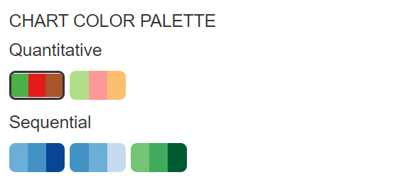
Chart Color Palettes

Deviation Bar Chart
A deviation bar chart uses color-coding to show how data points in a single data series compare to a reference data point, such as a target or goal. All values above the reference point are coded in one color, with values below the reference point in a contrasting color. Chart designers set the reference point in the WCMS admin tool. See example data file [XLS – 54 B]
Horizontal Bar Chart
This horizontal bar chart allows room for longer data labels and provides new layout options. Note that this example demonstrates the chart animation feature. (Check “Visualize Animation” in the Visual panel.) See example data file [XLS – 195 B]
Lollipop Style Bar Chart
The “lollipops” in this variation of the horizontal bar chart create visual interest, all while retaining the extra space for longer data labels. To achieve an uncluttered minimalist look, the chart designer has hidden the the value axis. “Two-Tone” is selected as the Lollipop Color Style (Visual panel). Note also that animation has been turned on. See example data file [XLS – 195 B]
Standard Time-Based Bar Chart (Vertical)
Note how selecting a data series in the legend isolates the series. See example data file [XLS – 250 B]. Note that you do not have to chart all the data series in the source file. This source file contains 6 data series, but in the Data Series section of the Chart Configuration tab, the developer has selected only 3 series for the chart.
Standard Categorical (Non-Time-Based) Bar Chart
Bar charts also support non-time-based data, as illustrated below. See example data file [XLS – 159 B].
Stacked Bar Chart (Isolate Option in Legend)
To create a chart like the one below, select “Bar ” as the visualization type and then select the “stacked” chart subtype under the general section of the configure tab. Stacked bars can work well to show percentages when every bar totals 100. See example data file [JSON – 382 B]
In this example, the legend interaction option is set to “Isolate” meaning if you interact with the legend, bars will be isolate, and will by default align to the axis instead of floating in their current location.
Stacked Bar Chart (Highlight Option in Legend)
In this example, the legend is configured to highlight the values when chosen in the legend. This will highlight the chosen items, and dim others that were not selected.
Bar with CIs in Visualization
If you have high and low interval bounds in your source data (such as confidence intervals), you can easily display them in the visualization area. In the Data Series panel of the Configuration tab, select the high and low data using the drop-down selectors.
Note that, to reduce clutter, the chart designer has hidden the legend for this single-series chart. See example data file [XLS – 113 B].
Bar Chart with Suppressed Values
You can suppress data in a bar chart for a number of reasons, including privacy concerns or preliminary data. Use the “Special Bar” section under the Data Series panel.
Please note that for best results and because users can download the raw data, you will want to use text to suppress the data in your dataset (replace suppressed values with “SUP” or “ABC” or something similar), rather than just relying on suppressing by numeric value. See example data file [XLS – 443 B].