Forecast Chart
Best Practices
Visit the new and updated Gallery!
Overview
The WCMS forecast chart is essentially an area chart for showing the lower and upper bounds of one or more series of confidence intervals (CIs) across trendline stages. It is typically used to show estimated and/or forecast data. In the example below, there are three stages along the trendline based on the type of CI data: Estimate, Estimate Based on Partial Data, and Forecast. (This example is a static image. To interact with a “live” chart, go to the Examples at the bottom of this page.)

If your forecast chart needs to show one or more data series as lines or bars (for example, to represent confirmed values), use the combo chart. Like the forecast chart, it shows confidence intervals across trendline stages but also allows mixing of visualization types.
The examples at the bottom of the page include a basic forecast chart with a single CI series and one with multiple CI series.
Data Requirements
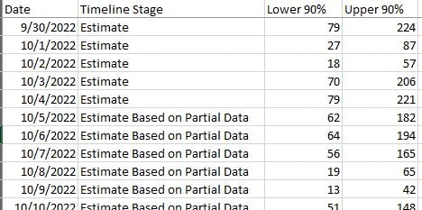
For each date represented in a forecast chart, your source data must include a timeline stage and lower CI and upper CI bounds (one pair for each CI series). The Excel file pictured below shows the minimum data required for a forecast chart with a single CI series.

- Go to ExamplesSee examples on this page that illustrate key options.
- Building in the WCMSSee key tips and guidelines for working with forecast charts in the WCMS.
- Common Configuration Settings for Maps and ChartsLearn about the common settings for maps and charts.
- TP4 UX Best Practices [PPT - 14 MB]For general guidance on colors, layouts, and overall presentation, see this overview of TP4 best practices.
Guidelines
- Timeline stages and CI values are not automatically included in the chart tooltips that display when a user interacts with the forecast chart. However, there are options for including both data elements in the chart editor. (The example charts do include these data in tooltips.)
- Ensure that you have provided adequate supporting text in the chart title, description, legend, etc. to help your users interact with and comprehend the chart easily.
- Consider which data columns needs to be included in the supporting table. CI columns are not automatically included, but they can be added (Columns panel).
Forecast Chart with Single CI Series
This example is a “live” version of the chart pictured at the top of the page but with different colors. Users can hover over the visualization to see data details, including the CI values. (On mobile screens, users can click in the visualization area.) See example data file [XLS – 4 KB].
Forecast Chart with Multiple CI Series
The chart below is the same as the example above except that, in addition to a 90% CI series, it has a 50% CI series. Note that sequential shading is used to differentiate the CI series. The example source data [XLS – 10 KB] has columns that are not included in the chart or supporting data table. Any additional columns such as these can be included in the data table via the Columns panel in the WCMS chart designer.