Common Configuration Settings for Maps and Charts
Data Visualization Instructions
Overview
The WCMS offers many configuration options and properties to help you control the look and behavior of data visualizations. This page describes the settings that are common to all or most charts, maps, or both. (Single-data-point visualizations like the waffle chart and data bite are a bit different from charts and maps, so many of these settings do not apply to those visualization types.)
If you are a WCMS user who regularly creates data visualizations, we encourage you to become familiar with these options.
General Settings
The General panel allows you to control the text elements that describe your data visualization.
Title Settings
A descriptive Title can guide user perceptions and queue users to how data were calculated. A title is required for data visualizations, but you can hide the title with the “Show Title” option below the title entry field. When not hidden, the title displays in a color bar above the visualization. (You can control the color of the bar in the Visual panel.)
Supporting Text
Supporting text is often required to help end users understand a visualization. For maps and charts, the tool provides several options for supporting text:
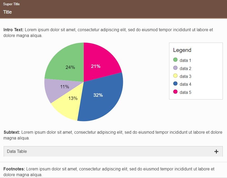
- Super Title — To keep the main title as short as possible, considering adding extra details in a super title, which displays in small font just above the main title in the visualization’s title bar. (If you hide the regular title, the super title does not display.)
- Message — Explain how to use the chart, introduce any special concepts, etc. This text displays above the visualization (and below the title bar, if displayed).
- Subtext — Any text added here displays below the chart (and above the data table). Consider including information about the data source, which can enhance credibility.
- Footnotes — Use this text element for any supplemental information that should display below the data table.
Click “View Larger” below the chart screenshot to see the placement of these text elements.
Inline Styles
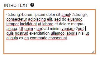
Inline style tags can be applied to any supporting text element. This markup can create variations in text such as italics, underlining, and bold. Inline markup is reflected in the chart preview. The example shows the use of the strong tag for boldface text and the em tag for italics.
Column Settings
For maps, the Columns panels is critical to map visualization. It’s where you specify columns from the source data for the required map elements, as well as additional categories to future-proof your visualization as data updates are applied to categorical maps. For charts as well as maps, the Columns panels allows you to specify optional content from the source data to display in tooltips, the supporting data table, or both.
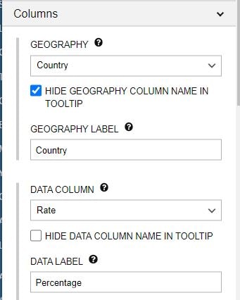
Partial screen capture of Columns panel for a data map
Required Settings (for Maps)
For most charts, the configuration options in the Columns panel are optional. For all data maps, there are required settings:
- Geography: Select the column containing location names.
- Data Column: Select the column containing the values to be charted. If the values are non-numeric, make certain that Data Classification Type (Type panel) is set to “Categorical.”
To format numeric data, pay attention to the following properties in the Columns panel: Prefix, Suffix, Round, and Add Commas to Numbers.
(Important Note: If a map is for visualizing categorical rather than numeric data, make certain “Categorical” is selected in the Type panel for Data Classification Type before defining columns.)
Special Classes (for Maps)
The data categories in a map legend are called data classes. Generally, these are automatically generated from the source data. An exception occurs with numeric maps that have non-numeric values in the source data, such as “NA.” But with the Add Special Class button, you can easily add these “special values” to the legend. In the following example, the special classes are Not Funded and Not Available. As special classes, they are automatically coded in shades of gray.
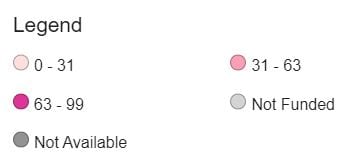
Map legend with two special classes
The annotated screen capture below shows source data on the left and the configuration of the special class for the asterisk on the right. Rate is the Data Key (the column containing the special class value), and * is the Value. An override for the Label has also been entered so that Not Funded displays in place of the asterisk in the legend.
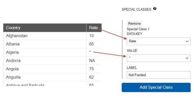
COVE options for defining special classes for a data map
(Tip: The tool automatically places special classes first in the legend, but in the Legend panel there is an option for placing them last.)
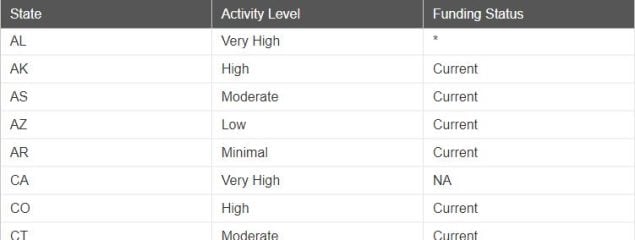
Special classes can also be created to handle lookup values. For example, with the source data below, assume that the content owner wants a data map that color-codes the Activity Level, but wants to show NA in the legend (instead of Activity Level) whenever NA displays in the Funding Status. The solution is to create a special class with Funding Status as the Data Key (and NA as the value).
Additional Map Categories
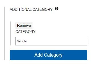
At times a categorical (non-numeric) map may call for a data class that does not actually occur in the data. Perhaps map users expect it, or perhaps it’s a logical member of a set of data classes. For example, if the current dataset has only the classes Home, Vehicle, and Work, but School is often included in similar visualizations or reports, you could use the Add Category button in the Columns panel to include School. (Note that School would show up in the Legend even when not represented in the data.)
“Additional” Columns
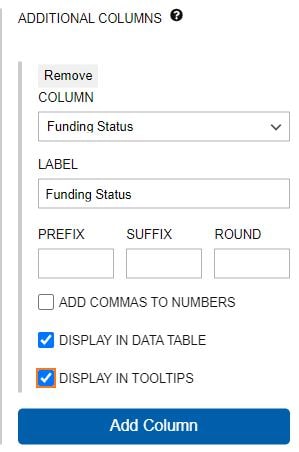
If you have one or more extra columns in the source data and you would like to include them in the data table, tooltips, or both, you can include them as additional columns. Just click the Add Column button and then select a column and enter a label if you would like to override the source label. Don’t forget to check Display in Tooltips and/or Display in Data Table.
Filter Settings
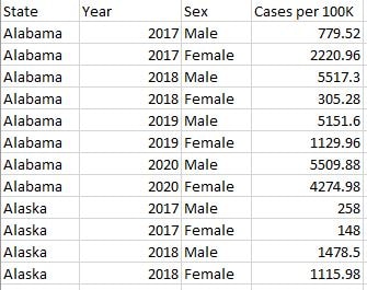
Map data with duplicate Year and Sex values
For maps and charts, if your source data are filterable, in the Filters panel you must provide your end users with filter controls. In the map data shown here there are repeating values for Year and Sex, so filter controls would be required for both Year and Sex.
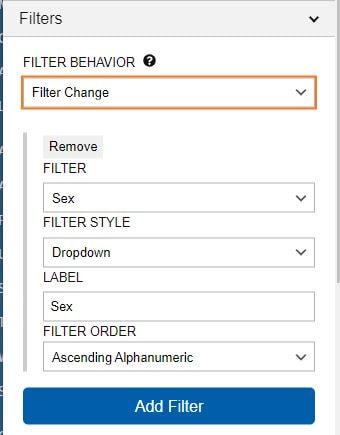
The following screen capture shows the configuration of Sex as a filter control. With this configuration, end users would be able to filter the data based on whatever values are in the Sex column.
Screen capture of Filters settings
As the capture above illustrates, you can also control the Filter Behavior. Select “Filter Change” to have the visualization automatically refresh when the end user changes a filter selection. Set it to “Apply Button” to have the end user click a button for the refresh. The Apply Button is recommended for Section 508 compliance.
For each filter, you can also set a Filter Style: Dropdown, Pill, Tab, or Tab Bar. (Tip: Try to avoid mixing more than two filter styles.)
Data Series Settings (Charts Only)
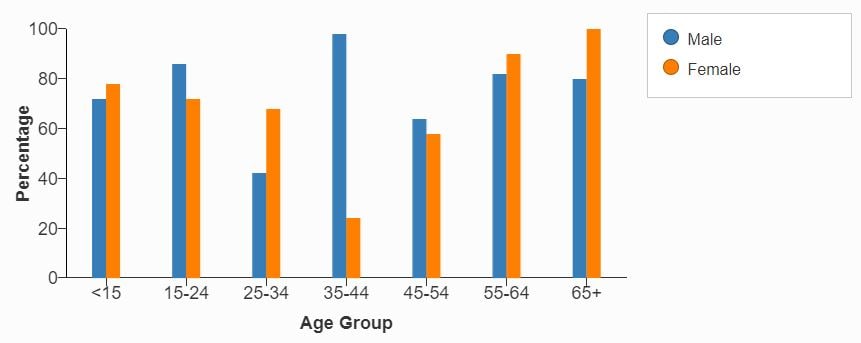
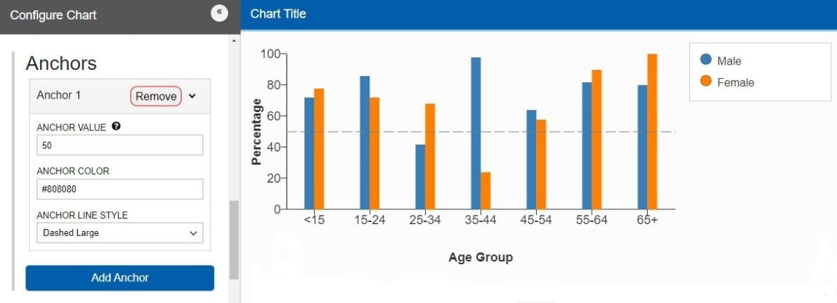
The Data Series panel is critical for charts. Generally, a chart’s data series are the categories of data represented in the legend. For example, the chart below has two data series, Male and Female. If we were to flip the chart so that the age groups are in the legend and sexes on the X axis, the age groups would be the data series.
Series Setup
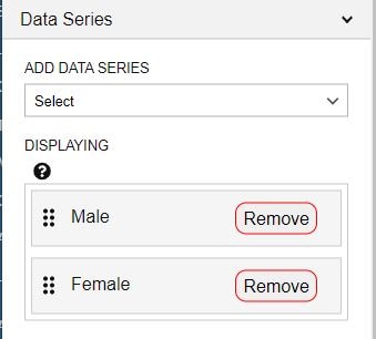
From the Data Series panel, you must specify at least one data series to include in each chart. For example, if the source file has the data series Male, Female, and All, you can choose to chart any or all of the three data series. The screen capture on the right shows the specification of Male and Female as data series.
The options available to you in the Data Series panel depend on the source data file (its content and structure) and your answers to the data mapping questions on the Import Data tab. (Note that some charts, such as the scatter plot, require that the source data be in a specific format. There are no data mapping questions for those charts.) If you don’t see the data series options you expect, you should revisit the Import Data tab.
Series Scenarios
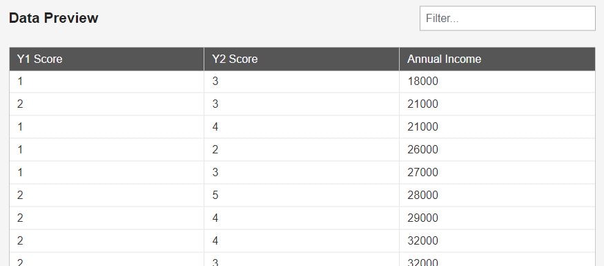
To define a chart’s data series, you may need to select columns or rows that include the numeric values to be charted. For example, the source data below can generate a chart in which Y1 Score and Y2 Score are the data series.
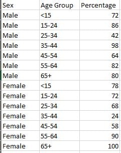
In other scenarios, you may need to select categories from the source data to define the series. For example, the source data on the right shows a common data structure for a bar or line chart that has multiple data series to select from. The numeric values to be charted are in the Percentage column. But the data series could be based on the Sex column or the Age Group column. In other words, the data series could be Male and/or Female or they could be age groups such as <15, 15-24, 25-34, etc. This is a prime example of a case where the options for data series depend on the answers to the data questions on the Import Data tab. (This is also an example of vertical source data involving multiple data series spread across rows — key information when you’re answering questions on the Import Data tab.)
Special Series Options
For certain chart types, such as the combo chart and line chart, the tool offers special options for each data series, such as visualization style. An arrow to the right of the series label indicates that special options are available. Sometimes one or more of these options is required to fully configure a chart. To see the options, click the series label or the arrow.
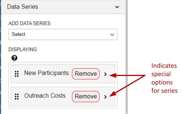
When applicable, these options are explained in a chart’s “Building in the WCMS” instructions.
Value Axis Settings (Charts Only)
For charts, the Value Axis panel allows you to control chart visual details like tick marks and gridlines, number formatting, and the type of scale. (For a combo chart, the visualization can have both a left axis and a right axis. Each axis has its own configuration panel, so you may see the panels “Left Value Axis” and “Right Value Axis.” For vertical charts of all types, the Value Axis panel may be labeled “Left Value Axis.”)
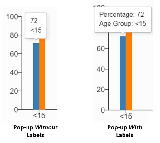
A key configuration setting is the axis Label. The label displays on the value axis. For some chart types, it also displays as critical information in pop-ups when an end user interacts with a chart. The illustration on the right is for a combo chart with two value axes. Note how important the axis labels are in this case.
Tip: Always test visualization pop-ups in preview mode to ensure that they are easy to follow.
Controlling Visual Details
To control visual details (and potentially reduce unnecessary clutter) pay attention to the following settings:
- Number of Ticks
- Display Gridlines
- Hide Axis
- Hide Label (to hide numeric labels on axis)
- Hide Ticks
- Add Padding to Value Axis Scale
To fine-tune the distance between the label and the axis, set the Size (Width).
Formatting Numbers
To format the numbers on the value axis, use these settings:
- Add Commas (highly recommended for high numbers)
- Abbreviate Axis Values (to display 10,000 as 10K, for example)
- Round to Decimal Point
- Prefix and Suffix (typically for symbols like % and $)
Scale Setup
You can also manage the type and range of the numeric scale. For example, if a few data points are much greater than the other data points, you may want to set Use Logarithmic Scale. You can also control the scale’s Max Value and Min Value.
From the Value Axis panel, you can add one or more lines called Anchors as numeric reference points. For example, in the screen capture below, a gray anchor has been added for the value 50. (The color can be entered as a hex value. You can also enter predefined HTML color labels, such as LightGray or Red.)
Date/Category Axis Settings (Charts Only)
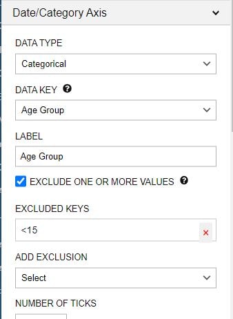
In addition to the value axis, the cartesian charts — bar, line, and combo — have a Date/Category Axis. The primary fields are the Data Type, Data Key, and Label. For most charts, the options for Data Type are Date or Category. The Data Key is the set of variables upon which the X axis is based. You can select multiple data series (in the Data Series panel), but you can select only one data key.
Excluding Axis Values
Note the option Exclude One or More Values. If you check this option and the Data Type is Category, you can then select categories to exclude (see screen cap on the right). If the Data Type is Date, you can select start and end dates.
Note that, if you select Date as the Data Type, you must specify the Date Parse Format (i.e., the date format in the source data). You also have the option of specifying a different Date Display Format.
For example, if dates in the source file are in the format mm-dd-yy and you want them to display as mm/yyyy, use the following entries. (The capital “Y” indicates a 4-digit year.)
Date Parse Format: %m-%d-%y
Date Display Format: %m/%Y
For more details, see this resource on date formatting.
Formatting the Axis
To format the axis, pay particular attention to the following fields: Prefix, Suffix, Number of Ticks, and Add Commas. To fine-tune the spacing between the axis label and the chart, adjust the Size (Height).
Note that, as with the value axis, you can specify anchors from the date/category axis. An anchor is a line that acts as a reference point. To specify an anchor from the date/category axis, you must enter an actual date or category from the source data.
Legend Settings
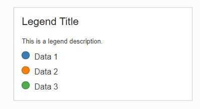
For charts with multiple data series and maps with multiple data classes, you should think carefully about the legend. A good Legend Title is critical. Also consider a Legend Description to add more detail while keeping the title as short as possible. (Like the text elements in the General panel, you can include markup in the legend title and description.)
Keep in mind that the legend is interactive. With Legend Behavior, you can control what happens when an end user interacts with one or more data series in the legend. “Isolate” hides the non-selected series; “Highlight” dims them.
You can also set the Legend Position (right, left, or bottom).
If your visualization has only one data series, consider the Hide Legend option to reduce visual clutter.
For categorical maps, you can also manage the order of classes in the Legend panel by dragging and dropping them into position. This capability is particularly important when the categories are on a continuum — e.g., Very Low, Low, High, and so forth.
Data Table Settings
The common settings for data tables are straightforward:
- Data Table Title — You can override the default title “Data Table.”
- Show Data Table — This option is checked by default because the supporting data tables for data visualizations are required for accessibility. Do not uncheck it unless you are providing an alternative means of complying with Section 508. Consult with your program’s usability officer for more information.
- Show Vertical Data — This option is checked by default with certain types of charts, such as the scatter plot, to ensure that the data are presented in the best online format.
- Index Column Header — In some cases the data table may be missing a header for the first column. For accessibility and general usability, make certain there’s a meaningful column header here.
- Screen Reader Description — To support accessibility, enter a description of the data table. (This description does not display on the page, but it is included in the HTML of the parent page once the data visualization is inserted into content.)
- Limit Table Height — To address the issues of an overly tall data table, you can specify a height limit in pixels. To constrain the height, the tool renders the table with a vertical scroll bar.
- Exclude Columns — Remove unneeded columns from the data table to reduce visual clutter.
- Collapsible — Toggle on or off the ability to collapse the table. Toggling off is not recommended for large data tables. You may instead choose to have the table Expanded by Default.
- Display Image Button — Check this option to allow end users to download an image of the chart or map.
- Table Cell Min Width — Sets the minimum width of the table cells. If this makes the table too wide to fit on the page, the table will render with a horizontal scroll bar.
- Group By — Sets grouping values by merging a row across with the value and listing each associated row of data beneath.
Visual Settings
For many visualization types, the Visual panel presents a wide variety of type-specific settings. The following settings are common to most charts and maps:
- Font size — Control the relative size of text throughout the visualization.
- Header theme — Select a color for the header bar (if displayed).
- Chart color palette — Select a sequential or nonsequential palette for the visualization. Note the option to reverse the palette.
- Data Cutoff (charts only) — Values below this number are included in a special “less than” category. This is helpful for handling suppressed values.
- Animate Visualization (charts only) — Select this option to animate the visualization when page is refreshed. This will slow the load time of your page and is not recommended for pages that have numerous visualizations or other slow-loading features.
- No Data Message (charts only) — Customizable message that appears for blank values. Defaults to “No Data Available.”
Text Annotations
Available for charts and U.S. Maps
- Show Annotation Dropdown — Checkbox to show an accordion below the data table listing all of the annotations by number. This is very helpful when it is expected users will be viewing on mobile, as the mobile view of annotation will only display a number.
- Annotation Dropdown Title — Change the title of the annotation accordion.
- Add Annotation — Add up to three annotations to your chart. Use the caret to change the text, opacity of the text box, subject, label, connection type, and marker (arrow or circle). To change the positioning of the annotation, drag and drop the dashed circles at the ends. These circles will not display on the published visualization.
