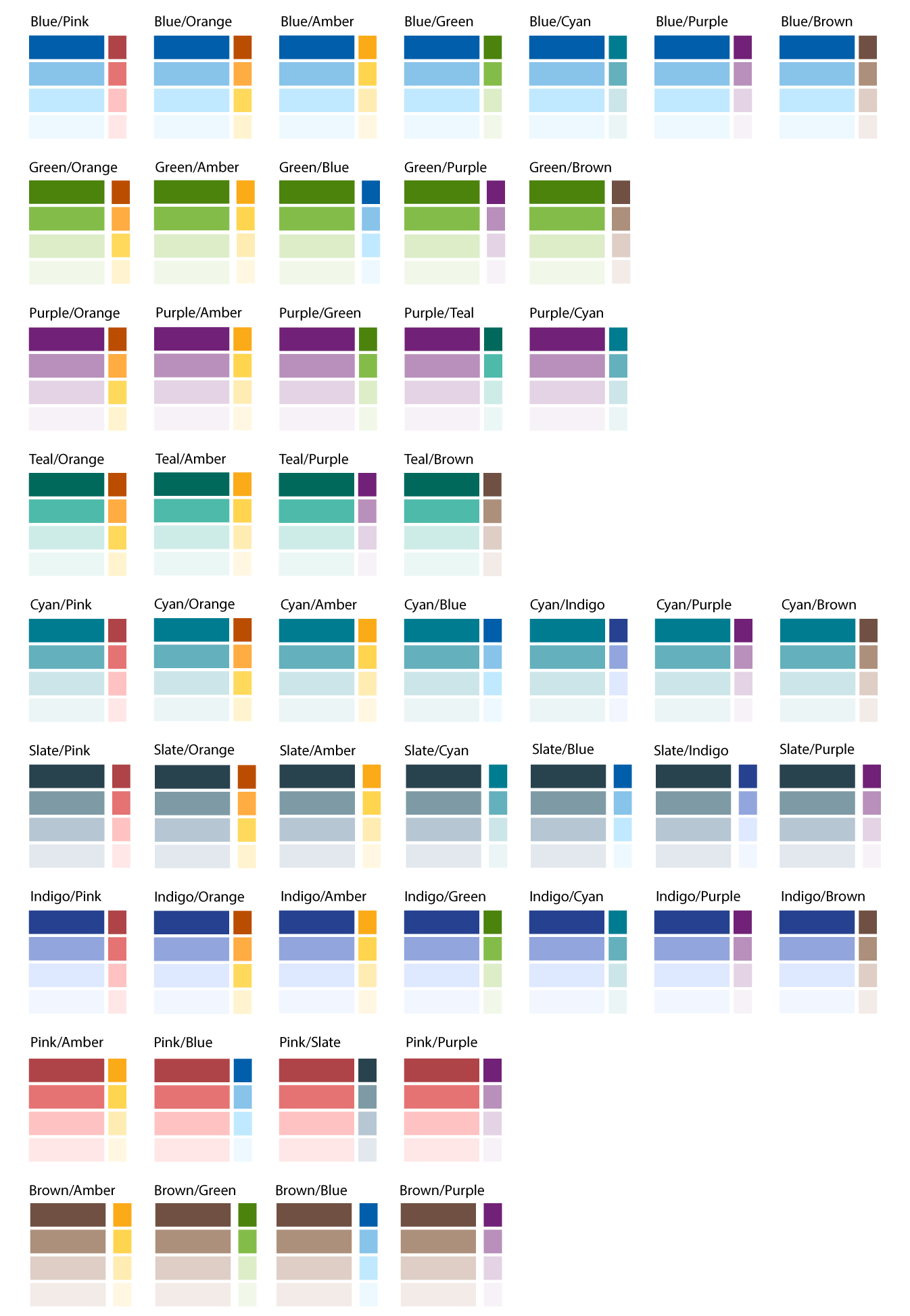
Preferred Color Pairings
Main and Accent Theme Colors
The purpose of having both a main and an accent theme is to be able to use the accent color to highlight important content.
There are 11 possible theme colors in TP4. When choosing colors, each website may use up to two different palettes for a website:
- Main Color Theme
- Accent Color Theme
Each color has four shades, including:
- Primary
- Secondary
- Tertiary
- Quaternary
Programs may use to up 15 different colors in developing a website:
- A main theme (4 shades)
- An accent theme (4 shades)
- A palette of grays (6 shades)
- White

508 Accessibility
All of the colors have been tested for contrast ratios using the font colors (black or white) as shown on the first screenshot. Each combination of background color and text color has been selected to pass AA WCAG guidelines.
Primary Colors
- All of the primary colors (with the exception of Amber) use white text
- Black text is used on the Amber primary color
Secondary, Tertiary, Quaternary Colors
- Use black text
| Color | Primary | Secondary | Tertiary | Quaternary |
|---|---|---|---|---|
| Amber | fbab18 |
FFD54F |
FFECB3 |
fff7e1 |
| Blue | 005eaa |
88c3ea |
c0e9ff |
edf9ff |
| Brown | 705043 |
AD907B |
decec6 |
f2ebe8 |
| Cyan | 007B91 |
65b0bd |
cce5e9 |
ebf5f6 |
| Green | 497d0c |
84BC49 |
DCEDC8 |
f1f8e9 |
| Indigo | 26418f |
92a6dd |
DEE8FF |
f2f6ff |
| Orange | bb4d00 |
ffad42 |
ffe97d |
fff4cf |
| Pink | af4448 |
E57373 |
FFC2C2 |
ffe7e7 |
| Purple | 712177 |
b890bb |
e3d3e4 |
f7f2f7 |
| Slate | 29434e |
7E9BA5 |
B6C6D2 |
e2e8ed |
| Teal | 00695C |
4ebaaa |
ceece7 |
ebf7f5 |
| Color | Lightest | Lighter | Light | Standard | Dark | Darker |
|---|---|---|---|---|---|---|
| Gray | f5f5f5 |
f0f0f0 |
e0e0e0 |
bdbdbd |
555555 |
333333 |