Pie and Donut Charts
Best Practices
Visit the new and updated Gallery!
Overview
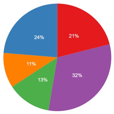
A pie chart is a visual display of numerical proportions split between data series. With a pie chart you can quickly:
- Compare the differences between multiple data series
- See the numerical total of a single data series against the whole
- Identify the largest and smallest items within a data set
Chart is an interactive content type in the WCMS. Go to the examples at the bottom of this page to see “live” pie charts.

- Go to ExamplesTo experience a "live" chart, go to the examples at the end of this page.
- Building in the WCMSSee key tips and guidelines for working with pie charts in the WCMS.
- TP4 UX Best Practices [PPT - 14 MB]For general guidance on colors, layouts, and overall presentation, see this overview of TP4 best practices.
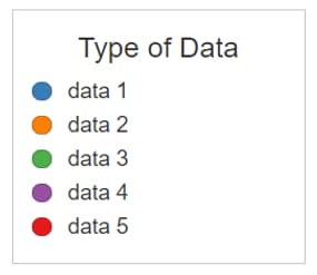
Interacting with the labels in the legend will highlight or isolate the selected data series. Each data series can be toggled on and off individually, allowing users to view a wide variety of combinations.

Sorting: Selecting the top row of a column sorts the entire table by the content within the selected column. Selecting the same column multiple times swaps the sorting feature between Descending and Ascending. Only a single column can be sorted at one time.
Source: When referencing information from outside of the current page, you should provide a source link. Source link text should be short and descriptive; it should not be the full URL. Source links are always displayed directly above the table. Source information can be added to the Subtext/Citation section in the General panel of the editor.

Usage
Pie charts are used to display a comparison between multiple data series. Pie charts are best when focused on 3-6 data series with clear differences between their numerical proportions. Pie charts are not recommended if the user is expected to compare or analyze precise information.
Use:
- To compare multiple data series
- To easily showcase largest & smallest series in a data set
Don’t Use:
- When displaying data series that are very similar to each other
- When showing data the user is expected to analyze precisely
Other Guidance
- Chart Title: Good titles are invaluable. Your chart title should be long enough so that your audience can make sense of the chart. A glance at the title should clearly convey what the chart contains. A good title requires a balance between a short title and one with enough descriptive information to describe the chart clearly.
- Number of Series: Too many series slices result in visual clutter and make the chart difficult to interpret. One to four slices with a maximum of six is recommended. The Chart Builder supports up to nine different colored slices in a pie chart. However, if you have more than six sets of quantitative values, consider breaking them into multiple charts.
- Data Source: The data source makes your graphic more reputable. It also allows those who are interested to dig deeper.
Variation: Donut Chart
A donut chart is recommended for use when comparing very few slices where there is an large difference in the relationship between elements.
Use:
- To showing a single portion of a whole value (1/2, 1/4, etc.)
- When 2-3 points of data are being compared
Don’t Use:
- For displaying subtle differences in quantitative values.
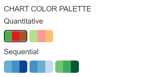
Chart Color Palettes

Pie Chart
See a sample sample CSV data file [XLS – 68 B].