Pie Chart
Building in the WCMS
Chart Source Data
Each WCMS chart requires a data file or a URL to a data set. The data must be in CSV or JSON format. Sample data file:
CSV_Source_Data_Example_Pie [XLS – 79 B]
CSV_Source_Data_Example_Donut [XLS – 79 B] [XLS – 34 B]
Tip regarding special characters: Data files containing special characters such as “=” and “>” are currently not supported. Excel files containing formulas will convert into final calculated values.
Note regarding instructions below: These instructions are for pie chart creation with the new data visualization editor. Instructions on the old charts content type are still available.
Creating the Chart
From the WCMS content browser, click the blue “+New Content Item” button in the top right of the window and then select “Data Visualization” when prompted. Once the new visualization has opened, click on the “Open Visualization Editor” button in the middle to begin work on your chart.
Choosing Visualization Type
The first step is to select the type of visualization you want to develop.
- A new Visualization Editor window will open on the “Choose Visualization Type” tab.
- On this tab, select the type of visualization you want by clicking on the icon for that type. (Note that sparkline is not currently listed on this tab. Choose Line Chart and then, when configuring the chart as instructed below, change the Chart Type to “Sparkline” in the General tab.)
- Once you select your visualization type, you will be taken directly to the next tab, “Import Data”.
Importing the Data
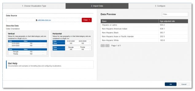
Note: The visualization editor has sample data that can be selected, allowing you to experiment with the various configuration options. This example data can be loaded into the editor by clicking the hyperlinks.
- You can Import data in one of three ways:
- Drag and drop a supported data file into the area marked with a document icon
- Select a file from your computer using the blue hyperlink.
- Load data from a URL by selecting “Load from URL” (Note that if you select Load from URL, you can also check “Always load from URL” to keep the chart data in sync with the data source.)
- If formatted correctly, your data will populate in the “Data Preview” on the right. If the editor detects issues in the file or file type, a warning box will appear under file area with the detected issue.

- Select the Orientation of your data as either Vertical or Horizontal.
- If your data is horizontally listed or has multiple data series represented, you may need to make additional selections in the data orientation options below the data import fields before progressing to the Visualization Type. Simply select the options that best fit your data.
- Click on the “Configure your visualization” button that appears after those selections are made. This will take you to the “Configure” tab.
Chart Configuration
The Visualization Editor helps you to configure the chart through a series of selections to the left. Each selection is grouped by type. Depending on the type of chart you selected, you will see red exclamation icons alerting you to the required fields to make the chart work correctly.
Once you make the required selections, you may select the “I’m done” button in the preview window to see your chart preview. This preview will update as customization selections are made.
An explanation for each selection, grouped by type, is provided below:
General
- Chart Type: This provides another way to change your chart type (Pie, Line, Bar, Combo, Paired Bar, or Spark Line)
- Pie Chart Type: Pie charts can be styled as Regular or Donut.
- Orientation: Stacked and Bar charts can be either horizontal or vertical.
- Title: Text entered here displays in a title bar along the top of the chart
- Super Title: Text entered here displays above the title in the title bar in smaller font
- Intro Text: Text entered here appears under the title bar as an opportunity to give your chart user context and alignment for the best way to read the chart information.
- Subtext: Text entered here appears under the chart to help communicate data source and any additional clarifying text not added to the Intro Text.
- Footnotes: Text entered here displays under the data table that can be used for explaining symbols in the data and the like.
- Chart Height: This number sets the fixed height of the chart. Most charts will not require configuration.
Data Format
- Data Column: Use the dropdown to select the source data you want to display.
- Prefix/Suffix: Text entered in these fields will be added to the beginning or the end of the numbers displayed on the pie chart and in the Data Table.
Segments
- Segment Labels: Select the option from your data that contains the names of the sections.
- Exclude one or more values: This allows you to remove entries in your data that you don’t want displayed.
Legend
- Reverse Legend: Selecting this option reverses the display order of the legend elements in the legend box only.
- Hide Legend: Selecting this option hides the legend from the page.
- Color Code by Category: Selections in this dropdown adjust the legend and coloring options. Selecting the option “Select” returns the chart to the original configuration.
- Legend Behavior (When Clicked): This determines how the legend behaves when the viewer clicks on an item in it. The “Isolate” option removes the data not selected from view in the chart. The “Highlight” option reduces the contrast of the data not selected. Multiple selections can be made by the viewer. The reset button returns the chart to its original state.
- Title: Text entered here appears at the top of the legend
- Position: This moves the legend either to the left or the right of the chart
- Legend Description: Text entered here displays along the top of the Legend
Filters
Filters can be added to a chart to allow the user to select portions of information to display on the chart. The local filters added here are drawn from your data. The option you select can be given a title and be ordered based on your selection in the order dropdown. The top item, based on the order you select, will be the option that first displays when the user loads the page.
Visual
- Font Size: This selection effects the size of all the text in the chart. This includes both the values on the X and Y-axis, the labels, and the data table fonts.
- Header Theme: This option sets the theme color for the title header if one is entered in the title field.
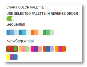
- Color Chart Palette: Select the color options that best fit the chart selections you’ve made. Consult your team UX for best practices for visualization usability and readability.

Data Table
- Show Table: This will hide or show the Data Table. The data table should only be hidden if the data information is being presented elsewhere on the page.
- Data Table Caption: The text entered here is read by text readers
- Limit Table Height: For lengthy data sets, this option will allow you to set the maximum height and allow the user to scroll the Data Table to view additional information.
- Expanded by Default: This sets the behavior of the Data Table on page load. It can be set to display expanded or collapsed by default. Large data sets may benefit from loading in the collapsed state.
- Display Download Button: This will hide or show the button that allows the viewer to conveniently download the data to their device.
- Label: This text displays at the top of the data table
- Index Column Header: Text entered here will populate in the first column as a header.
Saving the Visualization
Once you’ve completed the Configuration, the chart is now ready for displaying on your pages. Click on the “OK” button at the bottom right to close the Editor and return to the Module page. To save the visualization for use on your pages, add a title and file name in the required fields. Click the “Save” button. Your new chart is now available in the Content Browser where you added it.
If the contrast of the percentile numbers becomes an issue for legibility in your pie chart, select one of the other color palettes provided in the Visual section of the Configure tab.
To increase and decrease the size of your pie chart, use the Chart Height adjustment in the General section of the Configure tab.