Waffle and Gauge
Best Practices
Visit the new and updated Gallery!
Overview
The waffle and the linear gauge provide a visually engaging way to display a data point in relationship to a whole, much like a pie chart. To create these chart types, you must specify a numerator and a denominator. The chart tool calculates the ratio and, depending on the chart type, represents the result as circles, squares, or person icons in a square grid or as a linear bar (a gauge).
The linear gauge is often used to show progress towards a goal while the waffle is used to show proportion (of a population, for example).
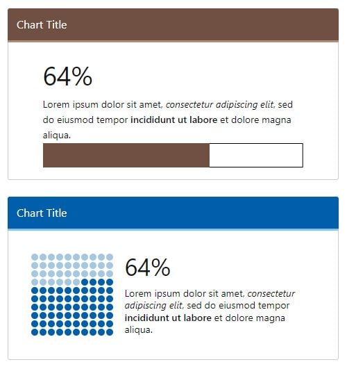
Illustrated below are a gauge and a waffle showing the same data point and supporting text.

- Go to ExamplesSee examples on this page that illustrate key options.
- Building in WCMSSee key tips and guidelines for building a waffle chart in the WCMS.
- TP4 UX Best Practices [PPT - 14 MB]For general guidance on colors, layouts, and overall presentation, see this overview of TP4 best practices.
Chart Elements
Both the waffle and the gauge support the same basic chart elements: a visualization and numeric result, along with optional supporting text. Go to examples at the bottom of this page to see some of the additional design and configuration options.

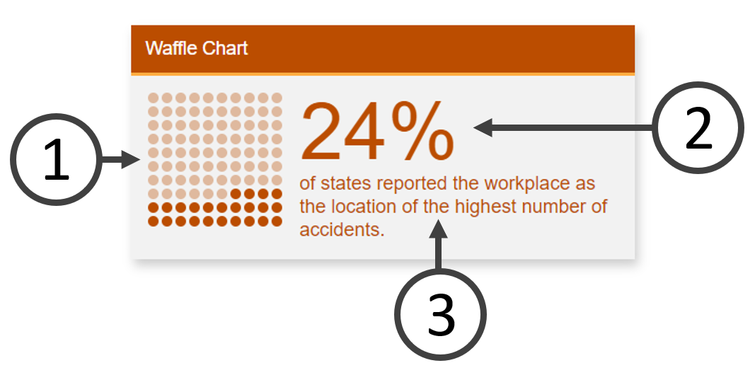
1. Chart Visual
The visualization reflects the calculation of the data selections made in the Visualization Editor. Style and location variations are available. Waffle charts can be displayed as circles, squares, and person icons.
2. Numeric Result
In addition to the visualization, the tool shows the number calculated from the data specified in the Visualization Editor. For the numerator, you select the source data and a function (Sum, Median, etc.). You can also apply a condition. For the denominator, you can specify a number (the default is 100) or you can select source data and a function. (At the time of this writing, you cannot specify a condition on the denominator calculation, but a fix is planned.)
With a data source that includes a column for Total Cases and a column for Sex, here is how a chart showing the percentage of male cases could be set up:
Numerator = Sum of Total Cases where Sex = Male
Denominator = Sum of Total Cases
3. Supporting Text
The customizable message can provide context for the number and visualization above. You can also provide a citation/subtext.
Usage Do’s and Don’ts
- To place emphasis on parts-to-whole contribution
- To visualize whole number percentages. These charts can show the value of a single percentage point more clearly than a pie or donut chart.
Don’t use:
- If isolating one point of data tells an incomplete perspective
- If there are many points of data contributing to a whole
- For visualizing precise percentages with fractions of a percent
- For values that exceed 100%
Additional Guidance
- Reserve waffles and gauges for key data points. A data point may be interesting and merit pointing out somewhere on the page, but if doesn’t support the primary public health messages you’re trying to convey, don’t highlight it.
- You can use waffles and gauges singly or in groups. Grouped visualizations invite readers to compare data points, so you should make certain grouped data points are comparable in terms of public health messaging and presentation. While there may be exceptions to the rule, generally this means that all charts in the group are the same type — waffle or gauge — and that the numeric results are based on the same denominator.
- When grouping linear gauges, stack them vertically if possible. This arrangement helps the reader scan the information more easily. (Remember to test your data visualizations in both small and large viewports.)
- Good titles are invaluable. The chart title should be long enough so that your audience can make sense of the relationships between the elements. A glance at the title should clearly convey what the chart contains.
- Chart supporting text can highlight key public health messages, but keep the text brief.
- Providing a data source makes your graphic more reputable. It also allows those who are interested to dig deeper. (You can use the Citation / Subtext element to provide a data source for an individual waffle or gauge.)
Customization
Customizations exist for colors, font, and imagery in the Visualization Editor. If a series of visualizations is presented on a page or across related pages, we recommend that you use consistent visual settings.
Most inline styling can be applied to the text elements (such as boldface, italics, etc.).
Examples
Waffles and gauges, like data bites, are static, non-interactive visualization types, unless used in a dashboard. The examples below show just a few of the various ways visual information can be arranged through different layouts and data configurations.
Count Comparison
This waffle chart shows the percentage of Federal inputs out of the total number of inputs. The chart designer achieved this result by setting the numerator as the sum of inputs where type = Federal and the denominator as the sum of all inputs. Note that the supporting text is short.
Filtered Minimum Compared to Total Amount
This waffle chart has been filtered within the Visualization Editor to reflect only data from California in the year 2019.
Linear Gauge
The linear gauge can be used in place of the waffle chart to show proportion. The options are essentially the same, except for some visual settings. As with the numerator, you can have the tool calculate the denominator from the source data. Or you can enter a denominator.
Linear Gauge without Message
The linear gauge is often used to show progress towards a goal. At times you may want to keep visual details to a minimum by omitting the message text. Just make certain that the context for the data visualization is clear. You can also control the size of the numeric result.