Scatter Plot
Best Practices
Visit the new and updated Gallery!
Overview
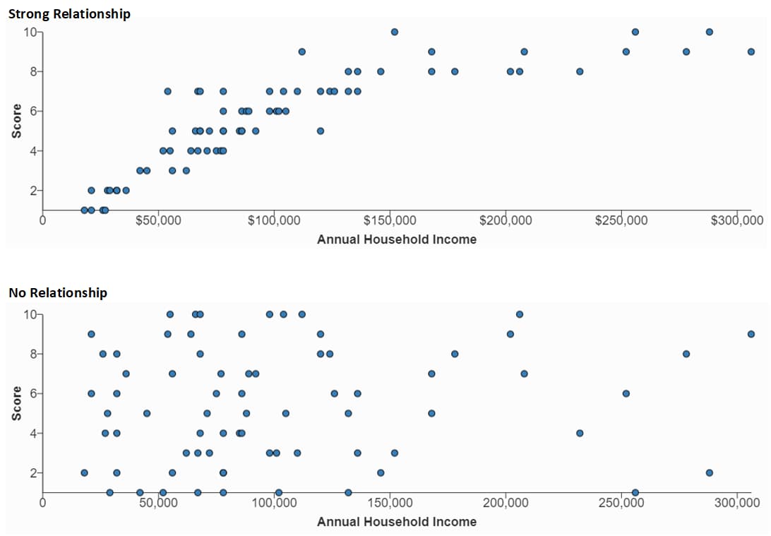
The dot patterns in a scatter plot indicate the degree to which the two numeric variables represented by the X and Y axes are related. When a relationship exists, the closeness of the dots indicates the strength of the relationship.
In the first example below, the dot pattern suggests a fairly strong correlation between Annual Household Income (X axis) and the Score data (Y axis). The second example shows no relationship at all between the same two variables. (These examples are static images. You can interact with “live” examples at the bottom of the page.)

Data Requirements
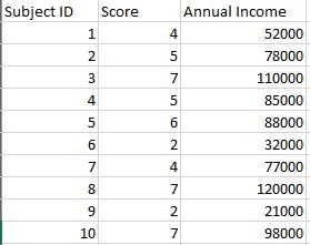
Each dot in a scatter plot requires two paired variables. The following image from Excel shows 10 paired variables for Score and Annual Income. (These are a subset of the data used to generate the first example above.) Additional columns, such as Subject ID in this example, can remain in the data source file but are not used to generate the chart.
These data are for a single-series plot. You can use the WCMS to plot multiple series.

Usage
Consider these best practices when deciding when and how to use a scatter plot.
- When it comes to the minimum number of data pairings, the guidance varies, with most guides recommending a number in the 30-to-50 range. Generally, the more, the better.
- Include a thorough description of what is being measured and label the variables clearly.
- If your plot shows outliers, consider whether the outliers require explanation or commentary.
- With many scatter plots, one variable can be characterized as independent and the other as dependent. The independent variable stands alone and isn’t changed by the other variable. In the examples on this page, Annual Household Income is an independent variable. The independent variable should always go on the X axis.
- Sometimes it’s not obvious which variable is independent and which is dependent. That’s okay, but you may need to explain the dependent/independent nature of each.
- Be careful with the wording in your plot description and other text. Remember that scatter plots do not prove causation. They can only imply a correlation between variables.
- Go to ExamplesSee examples on this page that illustrate key options.
- Building in the WCMSSee key tips and guidelines for working with scatter plots in the WCMS.
- TP4 UX Best Practices [PPT - 14 MB]For general guidance on colors, layouts, and overall presentation, see this overview of TP4 best practices.
Positive vs. Negative Trends
Scatter plots show not only the strength of a relationship but the trend direction as well. In this example, the correlation between Annual Household Income and Score is considered negative due to the downward direction of the trend. Download sample data [XLS – 931 B].
Multiple Data Series
The WCMS can color-code multiple data series in scatter plots. This example shows Year 1 vs. Year 2 scores as they relate to Annual Household Income. Note that a legend is required only when multiple series are plotted. Download sample data [XLS – 872 B].