Scatter Plot
Building in the WCMS
Overview
Once you have your data formatted and imported into the WCMS, the essential steps to configuring a scatter plot are as follows:
- In the Data Series panel, select the set of variables upon which the Y axis will be based. (If you’re creating a multi-series plot, you would select multiple variable sets.)
- In the Value Axis panel, enter a label for the Y axis.
- In the Date/Category Axis panel, select the variable set that will be the basis for the X axis.
- Also in the Date/Category Axis panel, enter a label for the X axis.
- If you want users to be able to filter the chart (e.g., by demographic group), set the filter options in the Filters panel.
Beyond that, it’s a matter of entering the text elements in the General panel and setting various options to fine-tune the display. This document will help you identify the key configuration properties to pay attention to.
Data Requirements
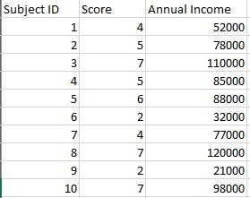
That source data must be in JSON or CSV format. Each dot in a scatter plot requires two paired variables. The following image from Excel shows 10 paired variables for Score and Annual Income. The first column, Subject ID, is not required.
These data are for a single-series plot. You can use the WCMS to plot multiple series.

Creating the Scatter Plot
- From the WCMS content browser, select “New Content” and then select “Data Visualization” (under “Media and Visualizations”) as the content type.
- Enter a title and a file name ending in .JSON.
- Then click “Open Visualization Editor” and complete the fields in the following sections.
Choosing Visualization Type
In the Visualization Editor, from the Choose Visualization Type tab, select Scatter Plot.
Importing Data
In the import data tab, select “Upload file” or “Load from URL.” When loading from a URL, you can check “Always Load from URL” to keep the visualization in sync with the source data. This causes the data to load from the URL endpoint each time the visualization is rendered. Note: If a URL is used, the host of the URL must be set to allow for cross-domain web requests.

Once the import has completed successfully, you can preview the data in the table on the right. If the data looks correct, click “Configure your visualization” to proceed.
Configuration
The critical panels for creating a scatter plot are the Data Series panel, where you select the variables for the Y axis, and the Date/Category Axis panel, where you select the variables for the X axis.
Don’t forgot to apply labels for the X and Y axes. These are critical for on-hover pop-ups. The X axis label is in the Date/Category Axis panel; the Y axis label is in the Value Axis panel.
Most scatter plots use a “continuous” scale on the X axis. This option is set by default in the Date/Category Axis panel.

General
The General panel allows you to add descriptive information for your chart:
- Title — A descriptive title guides user perceptions and queues users to how data were calculated.
- Super Title –- To keep your main title as short as possible, consider adding a super title, which displays in small font just above the title in the chart’s title bar.
- Message — Explain how to use the chart, introduce any special concepts, etc. This information displays just below the title bar and above the chart.
- Subtext/Citation –- Providing the source of the data can add credibility. Any text added here displays below the chart (and above the data table).
- Footnotes — Use this text element for any supplemental information that should display below the data table.
Note: Most inline styling can be applied to the text elements. This markup can be added in each text field to create variations in the text such as italics, underlining, and bold. Inline markup is reflected in the chart preview.
Data Series
In the Data Series panel, select the variables on which the Y axis will be based. This is typically the dependent variable. Note that, as illustrated in the screen capture on the right, you can select multiple data series if, for example, your dataset has variables for different years. The tool will automatically color-code the dots based on the data series.


Value Axis
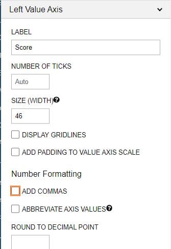
In the Value Axis panel, set the format for the Y axis. In particular, pay attention to these fields:
Label — Make certain your Y axis is clearly labeled. This label is also used for pop-up information when a user interacts with the chart.
Size (Width) — If the chart preview shows too much (or too little) space between the label and the Y axis, try adjusting this value.
Add Commas — Check this option to make large numbers easier to read.
Number of Ticks — If the axis is too cluttered, try adjusting this number.
Date/Category Axis Panel
This panel is where you set up the X axis. The primary fields are the Data Type, Data Key, and Label.
The Data Key is the set of variables upon which the X axis is based. Unlike the Data Series, you can select only one variable set as the key. If one variable set is clearly independent of the other, you should select that set for the X axis.
Note the default “continuous” option for the Data Type. Most scatter plots have a continuous scale on the X axis. This scale is automatically formulated based on the values in the Data Key. But you can also select Date or Category as the type, if one of those options makes more sense for your data.
To format the X axis, pay particular attention to the following fields: Prefix, Suffix, Number of Ticks, and Add Commas. If you find that there is too much space between the axis label and the chart, adjust the Size (Height).


Filters
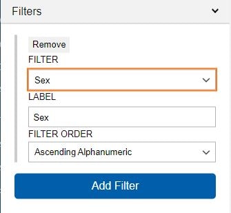
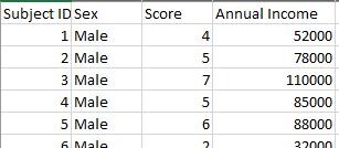
If your source data are filterable and you want end users to have filter controls, don’t forget to visit the Filters panel. For example, the source data illustrated below has an attributive “Sex” column that can be used for filtering. The screen capture on the left shows the configuration of Sex as a filter property. With this configuration, end users can filter the data based on whatever values are in the Sex column.

Other Configuration Options
Legend panel — If your plot has only one data series, consider checking Hide Legend to reduce unnecessary clutter.
Visual panel — Change the color of the dots here.
Data Table panel — To avoid having a blank top-left cell in the supporting data table, enter a Column Index Header. This should be a general term to categorize the column headers. For example, if the column headers are income values, the Column Index Header might be “Annual Income.”
Finalization
Once configuration is complete and you have tested the interaction with the chart, click the “OK” button in the bottom right of the window to exit the editor. BE SURE TO SAVE YOUR PROGRESS before you leave the data visualization page.
The scatter plot can now be added to your page like any other data visualization module. When the page is published, you’ll be prompted to publish the visualization modules as well.