Dashboards
Best Practices
Visit our new Gallery!
Overview
Dashboards offer the ability to use a single source of data to drive multiple visualizations. Each visualization in a dashboard is linked with shared functionality such as dashboard-wide filtering. A site visitor’s filter selection cascades across all data visualizations to provide different perspectives on the data.
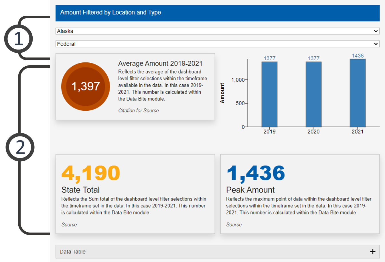
The picture below is a static dashboard example featuring a bar chart and three data bites. Go to examples at the bottom of this page to try out “live” dashboards.
- Go to ExamplesSee examples on this page that illustrate key options.
- Building in the WCMSSee key tips and guidelines for working with bar charts in the WCMS.
- TP4 UX Best Practices [PPT - 14 MB]For general guidance on colors, layouts, and overall presentation, see this overview of TP4 best practices.

- Filters Filters can be configured to give a page visitor the ability to customize their view at the dashboard level. When a filter is selected, the changes apply to all elements within the dashboard. The style of how the filters display will change based on the viewport (screen size) of the browser. Note: The dashboard filters you create influence the working logic of the individual visualizations, so you should configure the dashboard level filters first to avoid conflicts with the individual visualizations.
- Dashboard Elements Most visualizations available in the data visualization content editor are available in the dashboard editor. These categories include charts, maps, and miscellaneous elements. The arrangement of the elements within the dashboard should look familiar to the page builder in the WCMS. A drag-and-drop editor makes layout more versatile.
Usage
Dashboards allow you to provide several perspectives on a data set in one glance. Highlighted information reacts to the filters selected by the user, providing a customized experience.
Use:
- When several visualizations require common filtering.
- When relationships between visualizations need to be emphasized.
Don’t Use:
- When one visualization could support the required communication alone.
Other Guidance
- Dashboard Title: Good titles are invaluable. Your dashboard title should be long enough so that your audience can make sense of the relationships between the elements. A glance at the title should clearly convey what the dashboard contains. The title should also suggest the kind of filters available to the user.
- Visual Clutter: Consider the mental burden you are placing on your users. Make decisions on which visualizations to include and what settings to select based on overall clarity and usability. Consult with your UX specialist when in doubt.
- Data Source: The data source makes your graphic more reputable. It also allows those who are interested to dig deeper.
- Data Series: Follow the best practices provided for each visualization to build the data best supported by each element selected for the dashboard.
Customization
Most customization occurs at the level of the individual visualization elements. You can set options such as color palette separately for each element. Make certain you keep the overall dashboard in mind as you set up the component elements.
Dashboard Filtered by Location and Type
This dashboard allows the user to filter the information shown by Location and by the type of data. See example data file [CSV – 15 KB]
Dashboard Filtered by Location and Year
This dashboard allows the user to filter the information shown by Location and by Year. See example data file [CSV – 15 KB]
Dashboard with No Filter
A dashboard can be built without filtering to highlight a specific data set. See example data file [XLS – 971 B].
Dashboard Filter Controlled by Map
This dashboard is filtered by location by clicking on the map. This example was built with the “United States: State Sample Data” in the COVE Editor.