Forest Plot
Building in the WCMS
Overview
Once you have your data formatted and imported into the WCMS, the essential steps to configuring a forest plot are as follows:
- Specify the source-data column for the study IDs/labels.
- Specify the source-data columns for the result and lower and upper CI bounds.
- Specify the “weight” column, if available, and indicate the minimum and maximum size of the result indicator.
- Specify the data row for the total or pooled results, if available and if you would like this result to use the special diamond convention for total results.
- Set up any additional columns to include in the chart and/or the supporting data table.
xxx
Data Requirements
For each study represented in a forest plot, your source data must include a study label/ID, a numeric result estimate (“Relative Risk” in example data below), and the lower and upper bounds for the 95% confidence interval (in separate columns). Each study graph is automatically generated from the result and the CI values. A weight column can be specified for determining the size of each result indicator. The chart designer also supports additional text columns from the source data, such as the number of study participants.

For forecast charts, there are two critical configuration panels: the Data Series panel for specifying the source data for the timeline stages and the Date/Category Axis panel for setting up the date axis.
The labels for the timeline stages and the CI values do not automatically display in the chart tooltips. However, there is a “Show in Tooltip” option for the timeline stages and for each CI group/series.
CI values do not automatically display in the supporting data table. You can add them via the Columns panel. Don’t forget to select “Show in Data Table” for each column you add.
If you wish to chart additional data with bars or lines, use the combo chart instead of the forecast chart.
Creating the Chart
- From the WCMS content browser, select “New Content” and then select “Data Visualization” (under “Media and Visualizations”) as the content type.
- Enter a title and a file name ending in .JSON.
- Then click “Open Visualization Editor” and complete the fields in the following sections.
Choosing Visualization Type
In the Visualization Editor, from the tab “Choose Visualization Type,” select Forecast Chart.
Importing Data
In the import data tab, select “Upload file” or “Load from URL.” When loading from a URL, you can check “Always Load from URL” to keep the visualization in sync with the source data. This causes the data to load from the URL endpoint each time the visualization is rendered. Note: If a URL is used, the host of the URL must be set to allow for cross-domain web requests.

Once the import has completed successfully, you can preview the data in the table on the right. If the data looks correct, click “Configure your visualization” to proceed.
Configuration
The instructions below focus on the most important — and most commonly used — settings for configuring a forecast chart. For more information on settings to consider, see Common Configuration Settings for Maps and Charts.
Data Series
- In the Data Series panel, select the source column that contains the labels for the timeline stages (e.g., “Estimate,” “Forecast”).
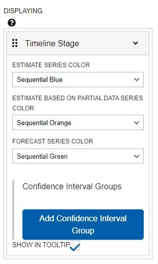
- Then click the series label to see the series options.
- In the series dropdown, select the color for each timeline stage. The chart editor automatically provides a color selector for each unique timeline stage label. In the screenshot on the right, the chart has three timeline stages. You may have to experiment with color selections to achieve the results you want. (Note that the color palette options in the Visual panel do not work for forecast charts.)
- Check “Show in Tooltip” at the bottom of the settings dropdown if you want to include the timeline stages in the interactive chart tooltips. (See screenshot on the right.)
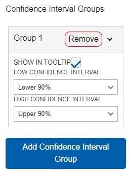
- To add the first CI group (series), click “Add Confidence Interval Group.”
- Then click the “Group 1” label to select the lower and upper bounds for the CI. Also, we recommend that you select “Show in Tooltip” for each CI group/series.
- Repeat as necessary if additional CIs are to be included in the chart.

Value Axis Panel
This panel is where you format and manage the value axis (the “y axis” in vertical charts). An important field in this panel is the axis Label. To adjust the distance between the label and the chart, set the Size (Width).
For more information, including date formatting, see “Value Axis” in Common Configuration Settings for Maps and Charts.
Date/Category Axis Panel
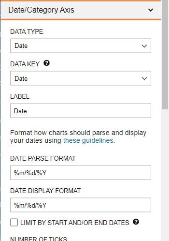
This panel is where you set up the X axis. The primary fields are the Data Type, Data Key, and Label.
For forecast charts, the Data Type is typically Date. (The “Continuous” data type applies to specialized chart types like scatter plot.) The Data Key is the set of variables upon which the X axis is based.
For Date, you must specify the Date Parse Format (i.e., the date format in the source data). You also have the option of specifying a different Date Display Format. For more information, including date formatting, see “Date/Category Axis” in Common Configuration Settings for Maps and Charts.

Data Table
You can explore settings for the data table in Common Configuration Settings for Maps and Charts.
Do note that the forecast chart does not automatically include an Index Column Header. You should therefore enter one (e.g., “Date”) so that the supporting data table does not have an empty cell at the top of the first column.
Other Configuration Options
The instructions highlight the settings that are most critical for generating a forecast chart. We highly recommend that you become familiar with common configuration settings so that you can fine-tune the look and behavior of your data visualizations. This document also provides more in-depth information on some topics included here.
Finalization
Once configuration is complete and you have tested the interaction with the chart, click the “OK” button in the bottom right of the window to exit the editor. BE SURE TO SAVE YOUR PROGRESS before you leave the data visualization page.
The visualization can now be added to your page like any other data visualization module.
