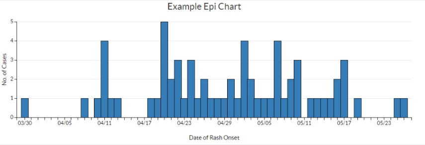
Epi Chart
Best Practices
Overview
An epi curve is a visual display of the onset of illness among cases associated with an outbreak. You can learn a lot about an outbreak from an epi curve, such as:
- The outbreak’s time trend, that is, the distribution of cases over time
- Outliers, that is, cases that stand apart from the overall pattern
- General sense of the outbreak’s magnitude
- Inferences about the outbreak’s pattern of spread
- The most likely time period of exposure
Chart is an interactive content type in the WCMS. To see a “live” chart, go to the examples at the end of this page.
- Go to ExamplesTo experience a "live" chart, go to the examples at the end of this page.
- Building in the WCMSSee key tips and guidelines for working with epi charts in the WCMS.
- TP4 UX Best Practices [PPT - 14 MB]For general guidance on colors, layouts, and overall presentation, see this overview of TP4 best practices.
Sorting: Selecting the top row of a column will sort the entire table by the content within the selected column. Selecting the same column multiple times rotates the sorting feature between 3 different states: Descending, Ascending and Off. Only a single column can be sorted at one time.
Source: When referencing information from outside of the current page it is highly recommended that a source link is provided. Source links should be short and descriptive; they should not be the full URL. Source links are always displayed directly above the Table.

Usage
Epi charts are used to showcase onset of illness associated with an outbreak. Epi charts are best when focused on a single illness, presented as a data series, across a set period of time. If the data series has significant gaps between outbreaks then it’s recommended that it’s split into two charts.
Use:
- To showcase the onset of an illness
Don’t Use:
- To display data on multiple illnesses
- To show multiple outbreaks
Recommended Settings
When creating an epi chart it’s recommended that you start with the following settings in the WCMS chart configuration:
- Chart Type: Bar/Histogram
- Bar Border Thickness: 1
- Automatically Pad X Axis Data: Enabled
- Bar Width Ratio: 1
- Center Labels to Data: Enabled
- Show Chart Legend: Disabled (if data contain only a single series)
Other Guidance
- Chart Title: Good titles are invaluable. Your chart title should be long enough so that your audience can make sense of the chart. A glance at the title should clearly convey what the chart contains. A good title requires a balance between a short title and one with enough descriptive information to describe the chart clearly.
- Number of Series Bars: Too many series in a data set results in visual clutter and makes the chart difficult to interpret. One to four data series is recommended with a maximum of six. The Chart Builder supports up to nine colors for a stacked bar chart. If you have more than nine sets of quantitative values, the data will have to be broken up into multiple charts.
- Grid Lines: In most cases, both horizontal and vertical grid lines should be hidden to reduce chart clutter. Approximate values can be perceived without grid lines. When the difference in data values is close, horizontal grid lines can be shown to better support data value comparison.
- Data Source: The data source makes your graphic more reputable. It also allows those who are interested to dig deeper.
- Outliers in Series Bar Data: If the data set includes extreme outliers, the visualization will be difficult for users to process. When only a single or a few bars are distinguishable and the rest are flat, consider doing one of the following: Modify the data set to remove or adjust the outlier, split the chart into multiple charts, or select a different chart type.
- Epi Chart Axis:
- X-Axis: The horizontal x-axis is the date or time of illness onset among cases.
- Y-Axis: The vertical y-axis is the number of cases.
- Cases: Cases (represented by bars) are placed along the x-axis according to the date when their earliest symptoms began. If symptoms for more than one case began on the same date (or time), the bars are stacked one above the other.
- Time Intervals: The unit of time for the x-axis is based on the incubation period of the disease under investigation and the length of time over which cases are distributed. As a general rule, the unit of time is set at roughly 1/4 (0.25) of the average incubation period for the illness under investigation. If the incubation period of an illness is short, the interval on the epi curve might be indicated in hours or even minutes.
Average incubation period
 multiplied by .25 = Intervals
- Regions: The WCMS chart editor supports regions on the X axis. These are periods or points in the timeline such as the average incubation period or the index case. The primary settings are the start and end dates, but you can also control the background shading and text. While you can create multiple regions in the same chart, depending on how well they display, you may want to create a separate chart for each region. See example chart (single region).
- Social Media Sharing: The Chart Configuration tool allows you to specify a URL, title, and description for social media posts. It also supports display of the chart embed code for copying.
