Mobile Columns
Best Practices
Overview
Previously, the TP4 template package did not offer columns on mobile (everything was 100% width). With the increasing amount of traffic on mobile devices and the need to improve mobile layouts, the Template Package now includes support for mobile columns in:
- Viewport 1
- Viewport 2
- Viewport 3
Usage
Use mobile columns when images do not need to be 100 percent width and can be placed to the right or left of content.
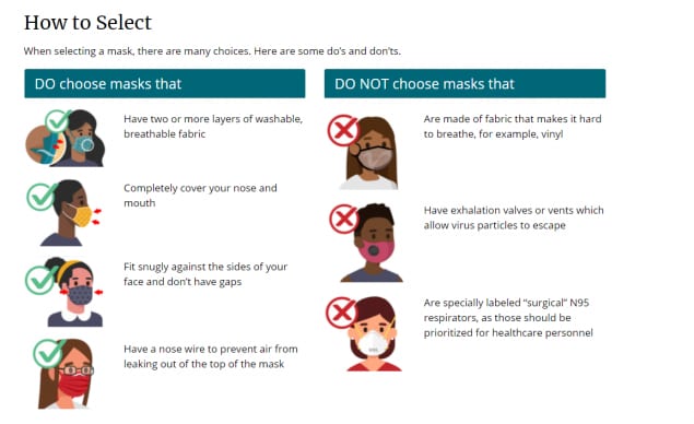
Here is an example of a page from the COVID-19 website on desktop viewports:

Without mobile columns, the images are shown at 100% width on mobile:

By enabling columns on mobile, the content becomes easier to digest:

Setting Mobile Columns
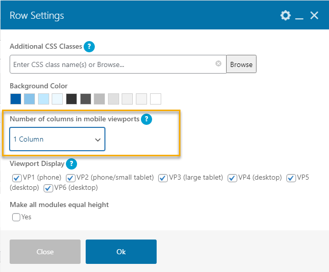
The mobile columns are set in the row settings.

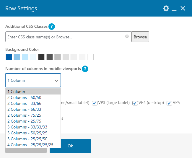
There are several presets to select from in the dropdown menu.

| 1 Column |
|
| 2 Columns |
|
| 3 Columns |
|
| 4 Columns |
|