Waffle and Gauge
Building in the WCMS
Overview
A waffle or linear gauge aggregates numbers within a data set using selections you make in the editor for both the numerator and the denominator. It then displays that number as a part of a whole. The calculations and filtering are handled within the visualization natively. When used inside a dashboard, waffle charts provide calculated summary information that reacts to dashboard level filtering as an interactive page element. Waffle and Gauge Best Practices can be used to inform the content owner about best practices and module options during page planning.
As a reusable data visualization module type, waffles and gauges can be placed in pages across a site and updated in a single editor. These charts are added to a page with Visual Composer.
Data Requirements
To create a waffle or gauge, you need a CSV or JSON file containing at least one piece of numerical data. These chart types aggregate numbers found in a single column of your data file. The calculated numbers can be filtered further in the editor. Only cells containing numbers can be calculated, but you can add prefixes and suffixes to your data in the editor during the build process. Data containing text may be used to determine conditional data parameters. Commas should be removed from the data; they may be added while building the waffle or gauge in the editor.
If a chart is built in a dashboard visualization, the data needs to meet the overall dashboard requirements. This is because one data source drives the entire dashboard.
Example Waffle Chart CSV file:
Creating the Chart
- From the WCMS content browser, select “New Content” and then select “Data Visualization” (under “Media and Visualizations”) as the content type.
- Enter a title and a file name ending in .JSON.
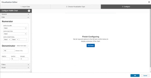
- Then click “Open Visualization Editor” and complete the fields in the following sections.
- When prompted to choose a visualization type, select either Waffle Chart or Gauge Chart.
Importing Data
In the import data tab, select “Upload file” or “Load from URL.” When loading from a URL, you can check “Always Load from URL” to keep the waffle or gauge in sync with the source data. This causes it to load from the URL endpoint each time it is rendered. Note: If a URL is used, the host of the URL must be set to allow for cross-domain web requests.

Once the import has completed successfully, you can preview the data in the table on the right. If the data looks correct, click on the “Configure your visualization” button or the “3. Configure” tab.
Configuration
Inline styling can be added to the title, message, and subtext of the chart directly in the input fields.
The chart visualization can calculate numbers like the sum result without the formula existing in the data file.
You can use either the tabs along the top of the visualization editor or the blue navigation buttons within each tab to progress through the building process. The “OK” button closes the editor.
Look for feedback from the visualization editor throughout the process to guide choices and troubleshoot errors.
Published changes to a chart reflect on any published page that includes it regardless of the publishing status of the parent page.
Your data selections must be configured in the “Data” tab before your visualization will render in the preview window to the right.


General
- Title– A descriptive title will guide user perceptions and queue users to how data was calculated.
- Message– This optional text provides context for the calculated number. Keep the message as brief as possible.
- Subtext/Citation – Providing the source of the data can add credibility. Any text added here displays at the bottom of the module.
Note: Most inline styling can be applied to the Title, Message, and Subtext portions of the visualization text. This markup can be added in each text field to create variations in the text such as: italics, underlining, and bold. Inline markup will reflect in the preview.
Data
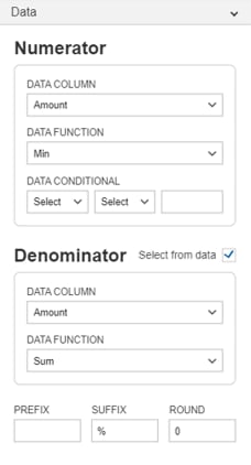
The “Data” tab is used to select what numbers are used in the calculation. Each selection refines the numbers further. This allows a specific set of numbers to be used from a possibly large data set.
Numerator
- Data Column – This drop down allows you select the column that has the numbers you want to calculate.
- Data Function – Select the mathematical function to apply to the numbers you’ve targeted. This calculation occurs natively within the module itself.
- Data Conditional– Column selections are generated by the headers in your data. Select the data column, the qualifier, and the value you want to reference. Additional filters can be added in the filter section to refine the result.
Denominator
You can manually add the denominator, or you can use data selections to generate one.
- Data Column – This drop down allows you select the column that has the numbers you want to calculate.
- Data Function – Select the mathematical function to apply to the numbers you’ve targeted. This calculation occurs natively within the module itself.
The Prefix, Suffix and Round values can be set to refine the result that is displayed in the Waffle Chart

Filters
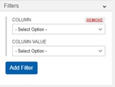
Filters can be used to focus on a specific subsection of your data. For example, if your data is configured with a “State” column you can choose to filter the results of your waffle chart to focus on a single State’s data. Several filters can be applied to dial in your results further.
- Column – The selections in this dropdown are generated by the column labels in your data.
- Column Value – Select the value that you want to filter by.


Visual
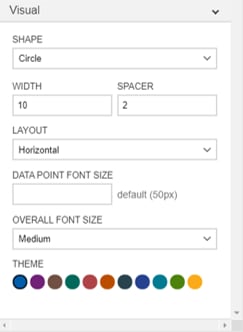
Once your visualization configuration is complete, you can change design elements such as font size and color palette in the “Visual” Tab.
- Shape – There are currently 3 shapes you can choose from in your waffle charts: Circle, Squares, and a Person icon
- Width and Spacer – Adjust these values to modify the style of the graphic in the waffle chart.
- Layout – The waffle chart can be configured vertically or horizontally
- Data Point Font Size – This adjusts the size of the calculated number in the visualization.
- Overall Font Size – The selection made in this dropdown determines the message font size.
- Theme – This section changes both the title bar and the highlighted data or graphic. If multiple waffle charts are used on a single page or in proximity to each other, it is recommended to use a single color to maintain uniformity.
Finalization
Once configuration is complete, click the “OK” button in the bottom right of the window to exit the editor. BE SURE TO SAVE YOUR PROGRESS before you leave the data visualization page.
The chart can now be added to your page like any other data visualization. When the page is published, you’ll be prompted to publish the visualization modules as well.