Sankey Diagram
Building in the WCMS
Overview
Creating a Sankey diagram in COVE involves only a few required fields (although, as with all COVE diagrams, you have additional options for controlling the visual display and the supporting text). The key to success is a clean source file in JSON format. For information on the file structure and specifications, see the Best Practices page for the Sankey diagram.
Creating the Sankey Diagram
- From the WCMS content browser, select “New Content” and then select “Data Visualization” as the content type.
- Enter a title and a file name ending in .JSON.
- Then click “Open Visualization Editor” and complete the fields in the following sections.
Choosing Visualization Type
In the Visualization Editor, from the Choose Visualization Type tab, select Sankey Diagram.
Importing Data
In the import data tab, select “Upload file” or “Load from URL.” When loading from a URL, you can check “Always Load from URL” to keep the visualization in sync with the source data. This causes the data to load from the URL endpoint each time the visualization is rendered. Note: If a URL is used, the host of the URL must be set to allow for cross-domain web requests.
Once the import has completed successfully, you can preview the data in the preview pane on the right side of the screen. Click “Configure your visualization” to proceed.
Configuration
To display tooltip text from the source file, check Enable Tooltips in the General panel.
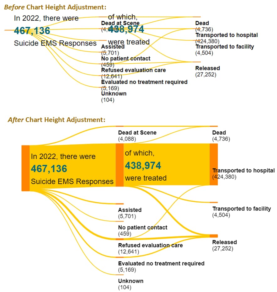
If the diagram does not display well when you click “I’m Done,” increase the Chart Height in the General panel.
Have your organization’s usability officer review color selections and data table display.
General
The General panel allows you to add descriptive information for your chart:
- Title — A descriptive title guides user perceptions and queues users to how data were calculated.
- Super Title –- To keep your main title as short as possible, consider adding a super title, which displays in small font just above the title in the chart’s title bar.
- Message — Explain how to use the chart, introduce any special concepts, etc. This information displays just below the title bar and above the chart.
- Subtext/Citation –- Providing the source of the data can add credibility. Any text added here displays below the chart (and above the data table). Note that for the Sankey diagram this is currently a required field.
- Footnotes — Use this text element for any supplemental information that should display below the data table.
Note: Most inline styling can be applied to the text elements. This markup can be added in each text field to create variations in the text such as italics, underlining, and bold. Inline markup is reflected in the chart preview.
Sankey Settings
In the Sankey Settings panel you can add text before and/or after diagram nodes. This text, called story node text, is typically added to provide additional context. COVE supports story text for a maximum of three nodes.
If your source file has tooltip specifications and you want to display the tooltips, check Enable Tooltips at the bottom of the Sankey Settings panel.
Click “I’m Done” in the preview area once you have reviewed the settings.
Important notes:
- If the diagram displays poorly in the preview pane (e.g., link lines are too thin as illustrated in the example below), increase the Chart Height in the General panel.
- Regardless of how the diagram displays in preview, make certain you test the display in different browser sizes.

Other Configuration Options
Visual panel — You can change the colors of the diagram components and the title bar (if a title is entered).
Data Table panel — Confirm that the data table displays as expected. (At the time of this writing, number formatting is not available for Sankey diagrams.)
Important: For both color selections and data table configuration, we recommend that you consult with your organization’s usability officer.
Finalization
Once configuration is complete and you have tested the interaction with the chart, click the “OK” button in the bottom right of the window to exit the editor. BE SURE TO SAVE YOUR PROGRESS before you leave the data visualization page.
The Sankey diagram can now be added to your page like any other data visualization module. When the page is published, you’ll be prompted to publish the visualization modules as well.