Data Map OLD Instructions
Building in the WCMS
Overview
The configuration of a data map can highlight or obscure the public health messages the content owner is trying to convey. It can also affect the usability of the map. Before publishing a data map in the WCMS, make certain the owner is aware of the mapping options and work with the owner to design the map. See Data Map Best Practices for more information.
The WCMS data map is a reusable component. Once you create a data map, you can insert it into multiple pages or modules.
Data Requirements
To create a data-driven U.S. map, you need a CSV or JSON file containing the source data. The data file can be saved in the WCMS, uploaded to the map editor directly, or provided via API call.
Here are the basic requirements for the data file:
- A record for each of the states and U.S. territories for which you have data values (no more than one record per state/territory)
- A column for state / territory name or abbreviation*
- A column for the data to be represented in the map
- Optional: a column with URLs for navigation to state-specific information or a column with the actual state-specific text (“contextual”) content formatted in HTML (See example map with contextual content.)
*Abbreviations are preferred. A CSV file with approved state names and abbreviations [XLS – 847 B] is available for download. The sample data file [XLS – 5 KB] used for the example filterable data map is also available.
The data file must adhere to formatting standards as described below.
CSV Format
The CSV format must contain a header row naming the columns in the data. Each subsequent row must represent the state/territory data. Below is an example snippet of dummy data for flu prevalence:
State,Prevalence
ME,None
NH,Local
VT,Sporadic
MA,Sporadic
RI,None
You can easily generate data in CSV format from an Excel spreadsheet. Just save the spreadsheet as a comma-delimited CSV file. (In the “Save as type” drop-down, select “CSV (Comma delimited).”
Tip regarding special characters: With CSV files produced in Excel, special characters (such as the equal sign) may display incorrectly as other characters upon upload into the WCMS. If you encounter converted characters, use a plain-text editor such as Notepad to edit the CSV file and then try the upload again.
JSON Format
The example Flu prevalence data above are formatted as follows in JSON:
[
{
“State”:”ME”,
“Prevalence”:”None”
},
{
“State”:”NH”,
“Prevalence”:”Local”
},
{
“State”:”VT”,
“Prevalence”:”Sporadic”
},
{
“State”:”MA”,
“Prevalence”:”Sporadic”
},
{
“State”:”RI”,
“Prevalence”:”None”
}
]
Creating the Map
Load the Data
- From the WCMS content browser, create a new “Data Map.”
- If you wish to use a data file uploaded to the WCMS, select it in the “WCMS Data File (Optional)” field at the top of the map form. Then save the map (with JSON extension). Otherwise, go to the next step.
- In the Data Import Wizard (“Import & Configure Map Data” tab), select “From URL” or “From Local File.” When loading from a URL, you can check “Automatically Update Data” to keep the data map in sync with the source data. This causes the map to load from the URL endpoint each time it is rendered. Note: If a URL is used, the host of the URL must be set to allow for cross-domain web requests.
Describe the Source Data
Once the data have loaded, configure (describe) the source data by selecting the appropriate options in the “Import & Configure Map Data” tab:
State Column Name: Select the column in the CSV or JSON file that contains the state/territory names or abbreviations. The state column must comply with data map standards. See the template data file [XLS – 847 B] for approved state name spellings and abbreviations.
State Column Type: Select “Name” or “Abbreviation” to indicate the format of the State Column Name.
Data Classification Type: Based on the type of data and the public health message, select how data classes are to be handled. There are three options: the two numeric types “Equal Number (Quantiles)” and “Equal Interval” and a third type for text-based data called Categorical. To understand the uses of the two numeric types, see example numeric maps. For categorical data, see example categorical maps.
Data Column Name: Select the data column to map. (The source data may have several columns of data, but only one can be color-coded in the map visualization.) You can provide a friendly display name in the Map Designer.
Classification Values (Categorical maps only): If you selected Categorical as the Data Classification Type, you must specify the categories from your source data that you would like to map, separated by commas. For example, if you have a data column called “Frequency” with values such as Yearly, Quarterly, Monthly, and Daily, enter “Yearly, Quarterly, Monthly, Daily” (without the quotation marks). If your data classification is based on intensity, place the values in order of intensity, from low to high or vice versa. You can specify three to eight categories.
Special Class Values: If your mapped data include values such as “*” or “NA,” list these values, separated by commas. Up two to special values are supported. They are color-coded in shades of gray in the map visualization. If you use this option, make certain that the same data values are not listed in “Classification Values.” (Note: Do not include blank rows in the source data.)
Navigate URL Column and Contextual Column: If your data file has URLs (for state profile pages, for example), you can make the data map a navigation aid by selecting a Navigate URL column. If your data file has raw HTML markup for contextual information, select the Contextual Column. See example maps showing the two approaches to providing state-specific information.
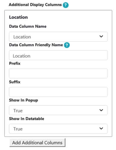
Additional Display Columns: To include non-mapped data in the data table and/or in the state pop-ups that display when a map user interacts with the map visualization, provide the column information here. To include other non-mapped columns, click “Add Additional Columns.”

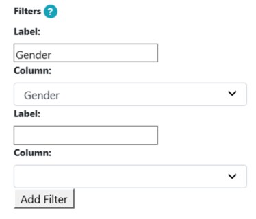
Filters: Include a filter control by indicating the label for the filter and the data column to filter on. Click “Add Filter” to create new filters.

Apply Data to Map
Once you have configured the map data, click “Apply Data to Chart.” Then proceed to the “Map Designer” tab to set the display options for the map. (See notes below on specific display options.)
Once you have finished setting the display options, save the map with JSON extension.
Notes on Display Options
Most of the fields in the Map Designer are self-explanatory, but a few require a bit of explanation. If you do not see the options below in the Map Designer tab, the data table preview is probably obscuring them. Collapse the data table by clicking the collapse/expand toggle on the right side of the table.
- Color Palette: If your data represent values that fall along an intensity continuum, choose any of the color palettes not specified as “Qualitative.” Each of these color palettes has an array of colors from light to dark or dark to light. If you do not want to show intensity, choose any of the “Qualitative” color palettes. View map color palettes.
- Number of Colors: In effect, when you select the number of colors, you are selecting the number of data categories. If you are mapping categorical data, select the number of categories listed in the Classification Values field (“Import & Configure Map Data” tab). Exclude any values in Special Class Values (which are automatically displayed in gray shades).
- Map Subtext: This text displays between the map and the data table. Use it to describe the map or anything you want users to know about the map data. Don’t forget to explain any special values such as * or NA.
- Separate Zero: For numeric data, check this option if you want to separate the value zero as its own data class. When this option is checked, zero uses one of the colors in the map palette, so you may want to adjust the Number of Colors after checking this option.
For the source data file, the state column must use approved state names or abbreviations [XLS – 847 B].
For the source data file, you can select a file uploaded to the WCMS or a local file or you can enter a URL. If you enter a URL, you can check “Automatically Update Data” to keep the map data in sync with the source data.
If a state / territory has no data to map, leave it out of the data file. Or use a special class value (such as “*” or “NA”).
For categorical maps that are based on an intensity scale, list the categories in the order of intensity, from high to low or low to high (Classification Values field in “Import & Configure Map Data” tab).
When selecting the number of colors for a categorical map (which should be based on the number of categories), do not include special class values (such as * and “NA”). Those are mapped automatically in gray shades.
You can include filter controls based on or one or more columns. If your data support filtering, indicate the filtering column label and select the column for filtering in the “Import and Configure Map Data” tab. See example filterable map.
You have the option to include data for cities and counties with your state data. Cities and counties are represented by color-coded shapes below the map (like territories). In the data table, they display under their respective parent states/territories. For usability reasons, we recommend that you do not include more than four or five cities/counties. To add this functionality, have your WCMS POC log a ticket with WCMS Support and let them know the cities/counties you would like to include.