Data Presentation
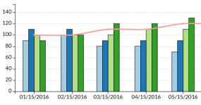
Bar charts are used to show a comparison among different items, or they can show a comparison of items over time.
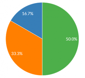
A pie chart is used to show the numerical breakdown or proportion between multiple data sets in a circle chart.
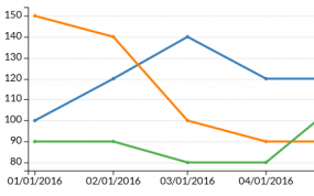
Line charts are used to reveal trends or progress over time. They can show multiple categories of data at a time.
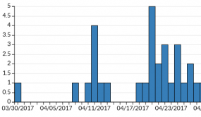
An epi chart (epi curve) is a visual display of the onset of illness among cases associated with an outbreak.

A data map displays numeric or categorical data for U.S. states / territories in a color-coded country map.
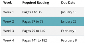
A data table is used to structure information in rows and columns so that visitors can easily read and analyze the information.
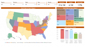
Power BI is an interactive data visualization tool administered and maintained by ITSO. If you are interested in embedding a Power BI chart or report in a TP4 web page, please read this topic.
Bar charts are used to show a comparison among different items, or they can show a comparison of items over time.
A pie chart is used to show the numerical breakdown or proportion between multiple data sets in a circle chart.
Line charts are used to reveal trends or progress over time. They can show multiple categories of data at a time.
An epi chart (epi curve) is a visual display of the onset of illness among cases associated with an outbreak.