Pie Chart
Building in the WCMS
Chart Source Data
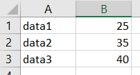
Each WCMS chart requires a data file or a URL to a data set. The data must be in CSV or JSON format, for example:

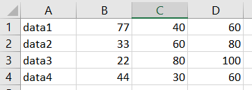
The picture above shows a spreadsheet for a pie chart with three segments. Note that the chart tool can aggregate multiple columns of data and render the chart segments based on the totals. For example, using the spreadsheet below, you could have the tool sum all three data columns. The pie segment for data1 would be based on [77 + 40 + 60]; segment data 2 would be based on [33 + 60 + 80], etc. The percentage for each segment would be based on the sum of all values in the three columns.

Tip regarding special characters: With CSV files produced in Excel, special characters (such as the equal sign) may display incorrectly as other characters upon upload into the WCMS. If you encounter converted characters, use a plain-text editor such as Notepad to edit the CSV file and then try the upload again.
Creating the Chart
From the WCMS content browser, click “New Content” and then select “Chart” when prompted.
Note that the chart editor opens with default data, allowing you to experiment with the various configuration options.
Importing the Data
- Open the “Import Data” tab and select the Chart Type.
- If applicable, select a chart sub type (line and pie chart types only).
- Under “Load Your Data,” click the link for the location of the data: “From URL” or “From Local File.” (Note that if you select “From URL,” you can also check “Automatically Update Data” to keep the chart data in sync with the data source.)
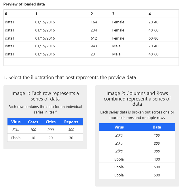
- Specify the data source as prompted. Once the data have imported successfully, the chart editor shows a preview of the imported data and asks you to select from two illustrations to indicate which best represents the preview data.
- Indicate the structure of the data source by selecting one of the illustrations. (In the screen capture below, the second illustration best illustrates the preview data.)

Mapping the Data
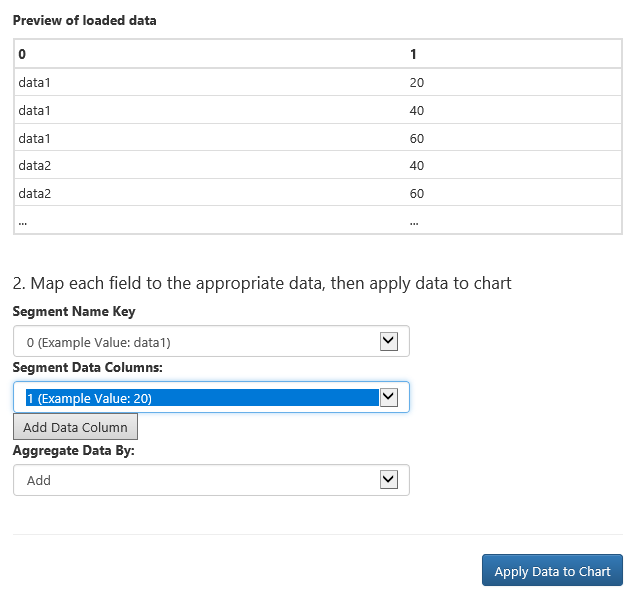
If you selected the illustration on the right in step 5 above, the chart editor needs to know how to parse the source data. This involves selection of the column containing the pie segment data names and the column of values. (Note that you can override the data labels in the Chart Configuration tab.) If there are multiple values for each data segment, you can also select “Add” or “Average” for the Aggregation method.

Applying Data to Chart
Once you have mapped the data, don’t forget to click “Apply Data to Chart” (the blue button at the bottom of the Import Data tab).
Chart Configuration
Before designing your chart, make certain you have applied the data. (In the Data Import tab, click “Apply Data to Chart.”) Then open the Chart Configuration tab.
The design configuration options are grouped by topic with links at the top of the tab. Key options for pie charts are explained below by group.
General
- Font Size: There are five size options for font. These options affect all fonts on the chart by preset amounts.
Visualization
- Color Palette: Select from four color palettes:

- Display Labels Outside Segment: If there are more than four or five pie segments, checking this option may improve readability of the data.
Table
- Date Display Format: Use this option change how dates in the data table. To see a reference of formatting options, click the tooltip icon (the question mark to the right of the field).
- Number Display Format: Select for format for numbers in the table.
- Table Data Header: For pie charts, provide a header for the table.
- Show Percentage: For pie charts, indicate whether to include percentages in the table.
- Date Display Format: Use this option change how dates in the chart timeline display. To see a reference of formatting options, click the tooltip icon (the question mark to the right of the field).
Share
The Share section allows you to set the title, description, and URL for social media posts. It also allows you to share embed code for the chart.
You can include/exclude specific data series from the chart visualization. If one or more data series you are charting do not display in the visualization, select each missing series in the Data Series section (Chart Configuration tab).
For pie charts, two options to note are in the Table section (Chart Configuration tab): “Table Data Header” and “Show Percentage.” These fields allow you to set a label for the data column in the supporting table and to include percentage values in the table.