What to know
Data are the foundation for making sound public health decisions. The NSSP BioSense Platform hosts several tools for monitoring production-level data for timeliness, completeness, and validity of Priority 1 and 2 data elements. Combined, these tools provide a thorough approach to monitoring, evaluating, and staging interventions for all data elements.
Assessing your data
During new site and new facility onboarding, NSSP business rules require 80% or higher completeness of Priority 1 elements to successfully process data in the staging environment. Once a site or facility has onboarded and data are flowing in the production environment, we recommend that site personnel continue to work on the completeness of Priority 2 elements because these are meaningful to interpreting data trends.
Guides and manuals
Data Quality Dashboard User Manual—The NSSP Data Quality Dashboard can assist in monitoring data flow, timeliness, completeness, and validity of a subset of Priority 1 and 2 data elements. Users can view data for the previous 120 days in different formats and further refine the underlying query by Feed, Parent Organization, Vendor, Facility Type, County, Calculated Patient Class, Facility Name, and individual data elements. Users can also build, preview, store, and manage custom rules to detect data quality anomalies and alert other users. An account is required to use this tool.
Data-Quality-on-Demand Programs User Manual—The NSSP Data Quality on Demand (DQOD) Report Generator, accessible via the Data Quality Dashboard, can be used to build, format, store, and manage granular, custom-formatted data quality completeness reports as multi-sheet workbooks that contain counts, percentages, and additional metadata for 181 data elements. The accompanying Message Explorer functionality allows users to sample parsed HL7® messages with incomplete values from a specified element or explore them using one or more matching text values. An account is required to use this tool.
The manual focuses on output and interpretation of reports:
- Includes all data elements, not just priority 1 and 2.
- Includes completeness, timeliness, and validity reports by visit date.
The Daily Site Processing Summary emails will quickly alert site administrators of potential issues with data processing and end-to-end data flow. The Daily Site Processing Summary Quick Start Guide describes how these emails delve into data processing (e.g., filtered records, exceptions, production backlogs) and facility activity, including alerts and volume anomalies. In addition, the Monday email displays anomalies associated with visit and message volume.
ESSENCE Quick Start Guide—ESSENCE, the data visualization and syndromic surveillance component of the BioSense Platform, hosts completeness, validity, and timeliness reports for key data quality elements. Users have the flexibility to change the period of evaluation and facilities included and to obtain visit-level data quality metrics. An account is required to use ESSENCE.
FAQs
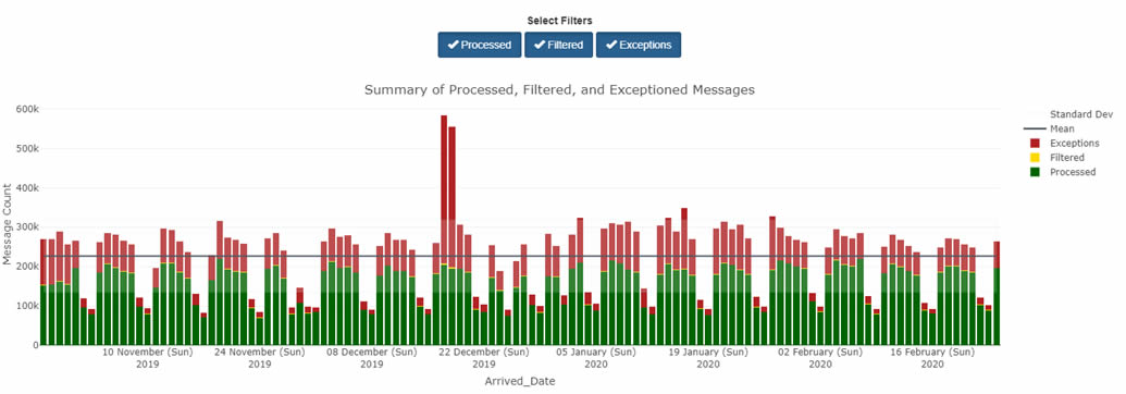
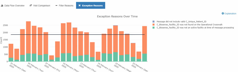
The Data Flow tab provides both an at-a-glance and a detailed view of Processed, Exceptions, and Filtered records.
By default, the Data Quality Dashboard shows all your site's data—every feed, every facility. The view you'll see in the bar chart will look something like this:
By using other tabs, however, you can see different views that apply different metrics—and each serves a different purpose.
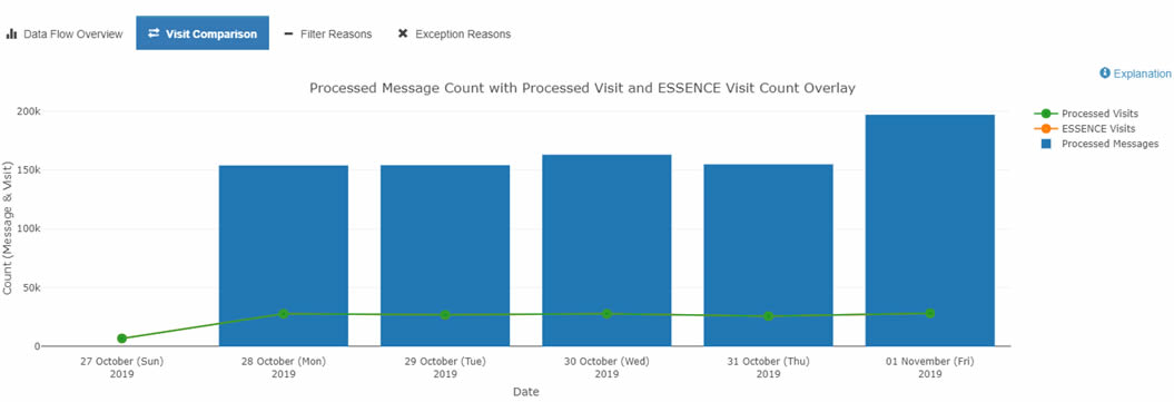
For example, you can use the Data Quality Dashboard's Data Flow tab to identify ESSENCE backlogs and other processing issues. To do this, select the Data Flow tab and click the Visit Count Comparison graph. This option lets you see a bar chart with the Count of your site's Processed Messages by arrived_date as well as your site's Processed and ESSENCE visit counts by c_visit_date. The y-axis shows the message count, and the x-axis shows the arrived_date. You can drill down even more by selecting any one metric (e.g., Processed Visits versus Processed Messages) to get a better sense of comparison.
If you notice a backlog or see only the sent messages from an earlier Visit Date, you should see a jump in the Processed Message count without a corresponding increase in the ESSENCE and Processed Visit trendlines. Here is an example:
Detailed information about these graphs can be found in the BioSense Platform User Manual for the Data Quality Dashboard. Contact your site inspectors for more information by emailing NSSP@cdc.gov.
To get Processed, Exceptions, or Filtered records for the site, you need to make a few changes. The default selection for Feed is All Feeds. To see Filtered or Exceptions by facility, start by clicking Deselect All feeds.
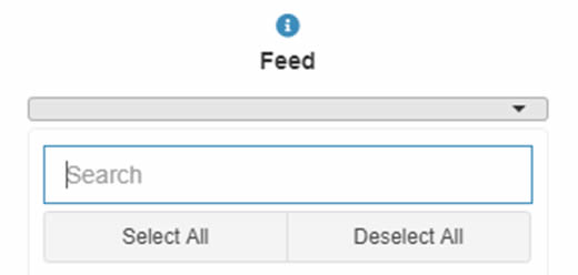
Once done, select the facility of interest. Change the Date Range to match dates of interest. Give the dashboard a few minutes to realign and display facility-level metrics.
Now you will see data flow metrics for the facility of interest. Here is an example:
The Daily Summary is an automated email sent to site administers and their designees each morning. The Daily Summary provides a snapshot of processing metrics and issues and is designed to help site administrators identify potential data processing issues quickly. These emails contain collated details on the data's journey through various processing steps. In addition, the Monday email displays changes in weekly facility status and anomalies associated with visit and message volume.
The Daily Summary has two parts: (1) Site Overview, which contains six sections that delve into how a site's data are processed, and (2) Feed and Facility Alerts. At the top of the Daily Summary there are convenient links to lead you to each section. The Daily Summary is organized as follows:
- Site Overview
- Daily Processing Summary
- Daily Filtered Records
- Daily Exceptions Records
- Daily Production Data Flow Backlog Metrics
- Weekly Summary of New Active Facilities*
- Weekly Summary of Facilities Pending Activation*
- Feed and Facility Alerts
- Daily Facility Alerts
- Weekly Feed and Facility Visit Volume Anomalies (Monday only)
- Weekly Site Record Volume Anomalies (Monday only)
TIP: Refer to the Daily Summary Often. (Yes, each day!) A quick scan of the email will show the status of your site's data. If you have questions, suggestions for improving the Daily Summary, or concerns about data processing, please submit a Service Desk ticket to support.syndromicsurveillance.org.
The Quarterly Summary provides a high-level assessment of production data accompanied by a qualitative review of the findings. For example, the Quarterly Summary shows data timeliness, completeness, and validity for the previous quarter. This will help you identify key Priority 1 data elements that could require your immediate attention. The qualitative findings will provide insight on why certain data elements may be incomplete or invalid. For example, you will be provided with the number of facilities sending valid Facility_Type _Code metrics, which, in turn, contributes to calculated C_Fac_Type_Patient_Class validity.
The Quarterly Summary complements the Daily Site Processing Summary and Monthly Data Quality reports by providing a bottom line on data quality for the previous quarter. Here's what the Quarterly Summary will contain:
- Processing Overview—High-level metrics that show the volume of messages and visits and distribution of those processed successfully.
- Timeliness—Summary of time taken for site messages to arrive on the BioSense Platform.
- Completeness—Visit-level percentages of Priority 1 data elements that were accurately received in the incoming message on the BioSense Platform and are available for downstream processing.
- Validity—Information about adherence of facility type, patient class, and chief complaint to current PHIN Guide Standards.
- Personally Identifiable information (PII)—Indicates known PII issues with data (in accord with NSSP's routine monitoring of PII).
- High-Level Summary of Findings—Qualitative review of data that can be used to identify key issues a site might want to focus on to improve data quality.
NSSP provides 30-, 60-, and 90-day email alerts when active facilities are not sending data.
Articles


Contact us
Data are the foundation for making sound public health decisions. NSSP distributes reports that flag potential problems early so that corrective actions can be taken immediately. If you have questions about the reports described above—the Daily Site Processing Summary or Quarterly Summary—our NSSP site inspectors are willing to assist. Please contact the NSSP Service Desk to ask questions or speak with a site inspector.