Key points
Best Practices
Stacked area charts allow the user to see how the whole behaves across time. However, stacked area charts may be misleading for the progression of individual groups within the whole. An individual may be progressing upwards but seem to be diminishing in comparison to the progress of the other groups in the chart.
Use:
- When there are six or more time periods to compare
- When you are communicating an overall trend, not specific values
- To show the rise and fall of data series over time
- When all data has a relationship with zero
Don't Use:
- When the differences between the data are small
- When there is only a single data series
- When several series of data show volatile changes
Quick Build Notes
- Select Area Chart as the Visualization Type.
- Upload your data.
- Type in the Title and other text fields in the General tab.
- Set the Chart Subtype to Stacked in the General tab.Select the Data Series.
- Set the Date/Category Axis.
Configuration Options
The example visualizations below highlight options available for stacked area charts. Key configuration selections are in the build notes section under each example.
For in-depth configuration information visit the Configuration Options section.
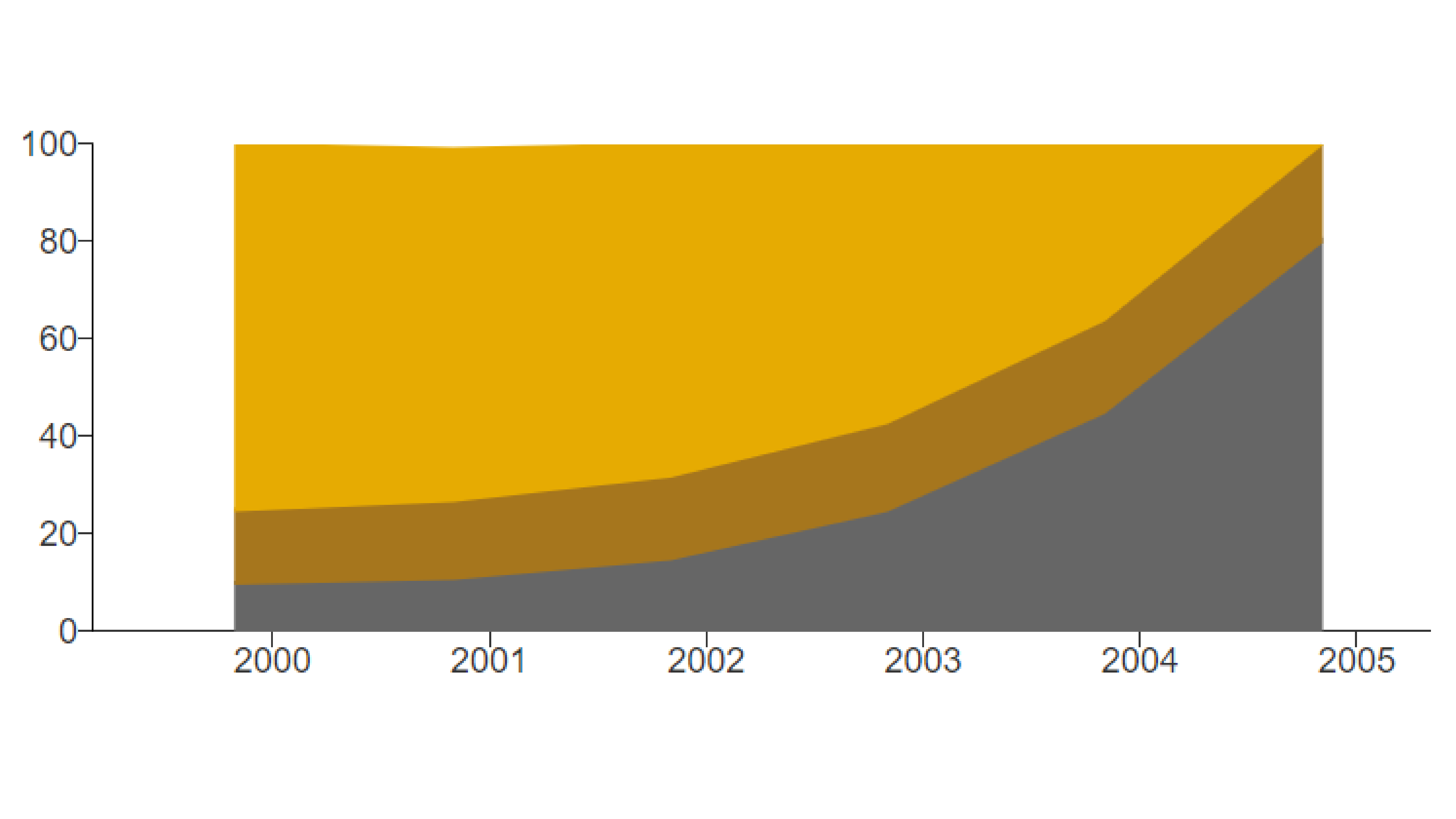
Example Stacked Area Chart
Use the stacked area chart to show progress as a whole.
Sample Data: Example Stacked Area Chart
- Vertical
- Multiple series: yes
- Multiple Rows
- Row is describing Year
- Category/date axis is B-value
- Numeric attribute is Value
- C-value
- B-value
- A-value
Example Area Chart with Annotations
Add annotations to provide context or call out specific points of your visualization. In smaller viewports, only the numbers will appear, with the text displaying in the Annotation Dropdown below the Data Table. It is best practice to always include this for mobile users.
Annotations are also available on line, bar, and combo charts as of August 2024.
Sample Data: Area Chart Sample Data
- Vertical
- Multiple Series: No
- Data 1
- Data 3
- Data Scaling Type: Date (Linear Scale)
- Date Parse Format: %m/%d/%Y
- Axis Date Display Format: %m/%d/%Y
- Position: Bottom
- Single Row Legend
- Show Annotation Dropdown
- Annotation Dropdown Title: Annotations
- Annotation Text: Annotations can have a circle
- Opacity Slider: middle range
- Edit Subject
- Edit Label
- Connection Type: Elbow
- Marker: Circle
Annotations: Add Annotation
- Annotation Text: or they can have an arrow
- Opacity Slider: upper-middle range
- Edit Subject
- Edit Label
- Connection Type: Line
- Marker: Arrow
Example Area Chart with Categorical Value Axis
Use a categorical axis to show data by category. Applying a categorical axis will remove numerical values and the axis label from the value axis. It is recommended to use the Message area to describe the categories.
Categorical value axis are also available on line and bar charts as of August 2024.
Sample Data: Area Chart Sample Data
- Vertical
- Multiple series: No
- Data 1
- Data 2
- Data 4
- Data 6
- Axis Type: Categorical
- Size (Width): 75
- Show Gridlines
- Category Height: 2000
- Color: Green
- Note: the color fields also work with hex values
- Label: Low
- Category Height: 3000
- Color: Yellow
- Label: Medium
- Note: If the label does not show in the category, you may need to widen the axis (see "Size: Width" above).
- Category Height: blank (this fills to the top of the chart)
- Color: Tomato
- Label: High