Key points
A heat map is a data visualization that uses color intensity to represent the magnitude or frequency of values across a matrix of categories, locations, or time periods. By translating numeric patterns into color patterns, heat maps help users quickly identify trends, clusters, anomalies, and areas of high or low activity.
Best Practices
Heat maps are especially useful for public health data because they make large, complex datasets easier to interpret at a glance. They can help reveal geographic disparities, seasonal patterns, service utilization trends, outbreak hotspots, or changes over time in a way that supports faster analysis and decision-making for both experts and public audiences.
Use:
- When you want users to quickly identify patterns, trends, or hotspots.
- When the primary goal is comparison rather than precise values.
Avoid:
- When users need to understand exact values or small differences between values.
- When the dataset is very small or lacks meaningful variation.
Quick Build Notes
- Select "HeatMap" as the Visualization Type.
- Upload your data.
- Select Heat Map as the Chart Type in the General tab.
- In the Data Series panel, use the Add Data Series dropdown to select the columns from your data that represent the values to display. Each series will be a row in the visualization.
- In the Data/Category Axis panel, select the Data Key. This data key column will serve as the x-axis of the visualization.
- In the Heat Map Settings panel, configure the particular settings for your visualization.
- Configure additional settings as desired.
Configuration Options
The example visualization below highlights options available for heat maps. Key configuration selections are in the build notes section under the example.
For in-depth configuration information visit the Configuration Options section.
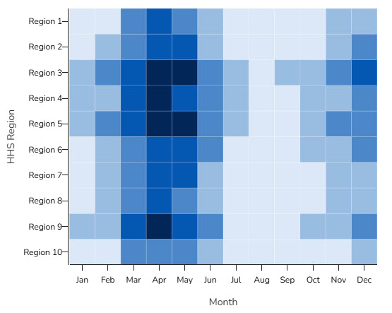
Example Heat Map
Sample Data: Heat Map Sample Data
Data Format
- Vertical
- Multiple Series: Yes (Single Row)
General
- Chart Type: Heat Map
Data Series
Add Data Series:
- Region 1 through Region 10
Left Value Axis
- Label Placement: Side
Date/Category Axis
- Data Scaling Type: Categorical (Linear Scale)
- Data Key: Month
- X-Axis Position: Bottom
Heat Map Settings
- Cell Padding: 0
- Row Label Gap: 2
- Column Label Gap: 25
- Data Grouping: 5
Legend
- Position: Right
- Legend Style: Boxes
Content Source:
Office of Communications