Welcome to the Community Counts Data Visualization Tool

What to know

Browse the Community Counts Data Visualization Tool to view recent data on bleeding disorder prevalence, demographics, treatment, and more.

Charts, magnifying glass, and data floating over a keyboard

Welcome to the Community Counts Data Visualization Tool

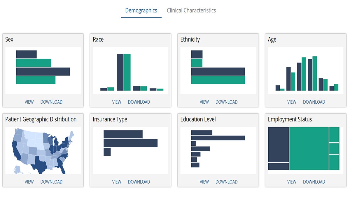
The Community Counts Data Visualization Tool displays de-identified data on patients with bleeding disorders who are enrolled in Community Counts in an interactive, visual format. This tool can be used by clinicians, patients, and policymakers to learn more about the burden of bleeding disorders in the United States.

To access the tool, click here!

Help, tools, and feedback

Check out the Help and Tools page for resources to learn about and use the Data Visualization Tool.

Submit feedback for the Data Visualization Tool here.

Note: This tool is best viewed with Internet Explorer or Google Chrome browsers. If the tool will not load on your computer, adjust your settings. In Internet Explorer, go to settings and remove cdc.gov from Compatibility View Settings by unchecking "Display intranet sites in compatibility view."