Using Dashboards to Present NSSP Data

Partner-Developed Dashboards
ACEP: COVID-19 in U.S. Emergency Departments
State and Local Dashboards
Behavioral Health
Environmental Health
Firearm Injuries
Infectious Diseases/Respiratory Illness
Mental Health
Opioids/Overdoses
Overall Data
Reports
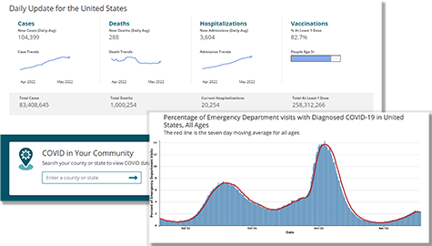
CDC COVID Data Tracker is CDC’s home for COVID-19 data. Interactive maps, charts, and other visuals show surveillance data from across the response, including hospitalizations, vaccinations, demographic information, and daily and cumulative case and death counts reported to CDC since January 21, 2020. The tracker follows the burden of COVID-19 among healthcare personnel and across multiple Health Care Settings, including trends in U.S. emergency department visits (NSSP data).

The CDC DOSE system analyzes data from syndromic surveillance systems to rapidly identify outbreaks and provide situational awareness of changes in drug overdose-related emergency department visits at local, state, and regional levels. DOSE uses near real-time syndromic data captured by health departments to gather aggregate data on emergency department visits involving suspected all drug, all opioid, heroin, and all stimulant overdoses. Aggregate data include demographic characteristics of those who overdosed, such as sex, age, and county of patient residence.
Overdose Data to Action (OD2A)
Extreme heat events threaten public health. The CDC Heat and Health Tracker displays NSSP data (rate of emergency department visits) associated with health-related illness per 100,000 emergency department visits by U.S. Department of Health and Human Services region for the selected week.
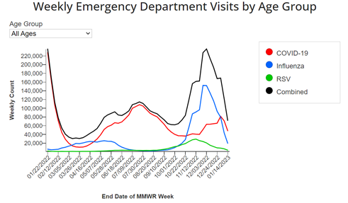
This interactive dashboard provides a combined view of NSSP’s emergency department visit data for multiple respiratory conditions. Data are available before and after diagnosis, with initial symptoms available to NSSP in near real-time and rapidly updated with diagnoses as soon as available. Data presented on this dashboard for COVID-19, influenza, and respiratory syncytial virus (RSV) use the diagnoses only. A companion guide describes the diagnostic codes and clinical terms used to create definitions for diagnosed COVID-19, influenza, and RSV; describes the data and interpretation; and explains the calculation of percent of visits. The dashboard is hosted by the National Center for Immunization and Respiratory Diseases as part of CDC’s viral surveillance.

Tick bites can lead to many diseases of public health concern. The Tick Bite Tracker uses NSSP data to display tick bites by U.S. Department of Health and Human Services region, week/month, and age/sex. Updated weekly, these data can indicate when people in different parts of the country are at greatest risk for tick bites.
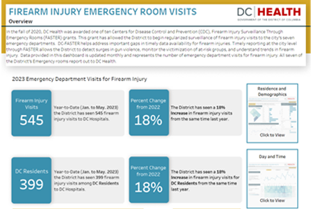
Funded by a CDC grant in 2020 for “Firearm Injury Surveillance Through Emergency Rooms” (FASTER), the District of Columbia Department of Health’s (DC Health) Center for Policy Planning and Evaluation now conducts surveillance of firearm injury visits to city emergency departments. The FASTER dashboard pulls data from discharge diagnosis codes. Dashboard data are updated monthly and represent the number of emergency department visits for firearm injury—including assaults and accidental or self-harm shootings. DC Health uses FASTER to monitor the victimization of at-risk groups and to understand trends in firearm injury. Dashboard demographics include ZIP Code, ward, age, and ethnicity. Firearm injuries show those affecting District versus non-District residents, monthly trends, and incident heatmaps for day of the week and time of day. The dashboard is a tool for healthcare coordinators, academic researchers, policy makers, gun violence experts, and the public.

Data from the National Syndromic Surveillance Program are shown by U.S. Health and Human Services region on the American College of Emergency Physician’s website. The visualizations show total emergency department visits, COVID-like illness visits, and influenza-like illness visits. Data are updated weekly.
Dashboard excerpt reproduced by permission from the American College of Emergency Physicians (July 2022).
Behavioral Health
- Public Health–Seattle & King County monitors emergency department visits involving suicidal ideation or suicide attempt among King County, WA, residents as part of community health assessment. Public Health–Seattle & King County also monitors family violence indicators, including emergency department visits involving suspected child abuse/neglect and domestic violence.
Environmental Health
- Maine Tracking Network includes a comprehensive data portal of public health indicators, including dashboards that use NSSP data: Tracking Cold-Related Illness, Tracking Heat Illness, and Tracking Tickborne Diseases. (Note. Maine’s dashboard and surveillance activities were featured in the August 2021 NSSP Community of Practice call “All-Hazards Approach to Syndromic Surveillance.” These calls feature the nation’s best practices for using near real-time data, pairing complementary data to better understand health events and threats, and sharing information publicly to improve people’s health.)
- Virginia Department of Health produces the Virginia Heat-Related Illness Surveillance dashboard. Virginia monitors emergency department (ED) and urgent care visits for heat-related illness from May through September each year (2015–present). The dashboard displays daily ED visits for heat-related illness and visualizations for visits by patient city/county, age, and sex.
Firearm Injuries
- The District of Columbia Department of Health’s (DC Health) Center for Policy Planning and Evaluation conducts surveillance of firearm injury visits to city emergency departments. The “Firearm Injury Surveillance Through Emergency Rooms” (FASTER) dashboard pulls data from discharge diagnosis codes. Dashboard data are updated monthly and represent the number of emergency department visits for firearm injury—including assaults and accidental or self-harm shootings. Dashboard demographics include ZIP Code, ward, age, and ethnicity.
Infectious Diseases/Respiratory Illness
- Arizona provides a dashboard of Hospital COVID-like and Influenza-like Illness Surveillance. Syndromic surveillance detects key terms and codes within the electronic health record: chief complaint field (patient’s reason for visit), discharge diagnosis field (codes for final diagnosis when patient is released), and specific free-text fields.
- Kansas displays emergency department visits for Acute Respiratory Illness, Respiratory Syncytial Virus (RSV), COVID-19, and Influenza (Flu). The layout works well with mobile devices. The time series can be restricted to specific regions of the state.
- Minnesota developed a comprehensive Weekly COVID-19 Report to support emergency response efforts that includes syndromic data (see example).
- With one click, the Nebraska Respiratory Illness Dashboard can show results for COVID-19, Respiratory Syncytial Virus (RSV), or Influenza. Each set of visuals shows tests performed, including positive tests and percent positive; emergency department visits; and emergency department visits by age group. This is a clean, easy-to-navigate dashboard.
- Nevada collects data from a variety of sources to monitor respiratory illnesses. Nevada’s dashboard includes influenza virus testing and subtyping results; NSSP data from emergency department, inpatient, and outpatient visits for influenza and COVID-like illnesses; mortality data; RSV infections, and statewide estimates of influenza vaccination coverage. The easy-to-use graphical displays include trends, demographics, and yearly change.
- New York City monitors emergency department chief complaints related to respiratory conditions. Options abound on this dashboard. Respiratory counts (syndromes) are shown by neighborhood ZIP Code. Users may select a syndrome, timeframe, time resolution, metric, and visual.
- Public Health–Seattle & King County use a dashboard to display emergency department visits and hospitalizations for COVID-like illness and pneumonia.
- The Virginia Department of Health (VDH) generates a Weekly Influenza Activity Report that summarizes key points about influenza activity in a text format to accompany data visualizations. VDH collects and analyzes data on visits to emergency departments and urgent care centers for influenza-like illness (ILI), including stratifying ILI activity by age and region. The report also includes laboratory results of confirmatory influenza tests, suspected/confirmed influenza outbreaks, and pediatric/adult influenza deaths.
Mental Health
- North Carolina collects near real-time emergency department data via NC DETECT (https://ncdetect.org). The state’s Mental Health Dashboard uses these data to track ED visits for select mental health-related conditions (anxiety, depression, self-inflicted injury, suicidal ideation, trauma/stressors) and provides links to other sources of mental health data. Users can view county-level ED visit trends by gender, age group, race, ethnicity, and more.
- The Tri-County Health Department (Colorado) Syndromic Surveillance Program works closely with internal programs to support local prevention efforts and interventions. They developed a Mental Health dashboard to show syndromic surveillance trends and other data sets. The dashboards are used by partner organizations and hospitals.
Opioids/Overdoses
- Arizona displays an Opioid Prevention dashboard of Emergency and Inpatient Visits for Suspected Drug Overdoses. The interactive dashboard lets users view data by visit year, visit type (emergency department and inpatient), and drug category (all suspected, heroin, opioid, or stimulant) and view total visits involving all suspected drug overdoses by month.
- Illinois Department of Public Health provides an Opioid Data Dashboardthat draws from NSSP and other sources. The dashboard shows mortality and morbidity trends, prescription opioid patterns, Medication Assisted Recovery (MAR) coverage, Naloxone distribution trends, monthly county-level ED overdoses (by recent year), and all drug overdose mortality data (from the Statewide Unintentional Drug Overdose Reporting System [SUDORS]).
- Kansas provides an All-Drug Overdose ED Visit Spike and Cluster Alert Map for categories All Drugs, Any Opioid, Benzodiazepine, Heroin, and Stimulants. Data can be filtered by month and year. Changes in usage can be observed by county.
- Maine’s dashboards use near real-time data to display demographics of Confirmed Drug Deaths, providing a multifaceted picture of the drug overdose crisis.
- Minnesota provides a Syndromic Surveillance Drug Overdose Dashboard to monitor and identify trends for unintentional and undetermined suspected drug overdoses by week.
- The Tri-County Health Department (Colorado) Syndromic Surveillance Program works closely with internal programs to support local prevention efforts and interventions. They developed a Substance Abuse Dashboard to show syndromic surveillance trends and other data sets. The dashboards are used by partner organizations and hospitals.
- Virginia Department of Health provides a data portal on Opioid Indicators–Emergency Department Visits. The portal displays emergency department visit counts and rates among residents who sought emergency department care for unintentional overdose (all drugs, opioids, heroin).
Overall Data
- North Carolina collects near real-time emergency department data via NC DETECT (https://ncdetect.org), which are also displayed in its Annual ED Visit Trends Users can view county-level ED visit trends by gender, age group, race, ethnicity, and more.
- Tri-County Health Department (Colorado) displays syndromic surveillance indicators on dashboards so that staff can readily spot anomalies or concerning trends in health indicators of interest.
- Washington State Department of Health collects near real-time data via its Rapid Health Information NetwOrk (RHINO). RHINO integrates and shares NSSP data.
Reports
- Georgia maintains Drug Overdose Syndromic Surveillance Monthly Reports that show patient emergency department visits by county, percent change in those areas, overdose emergency department visits by month, demographics, and opioid- and heroin overdose emergency department visits.
- Maricopa County (Arizona) develops Heat Associated Deaths and Hospital Visits weekly reports. Maricopa County contributes syndromic data to NSSP.
- Minnesota provides a comprehensive weekly COVID-19 Report that includes syndromic surveillance data. The Minnesota Department of Health integrates a variety of data sources (case and variants, vaccine data, hospitalization and capacity, vaccine breakthrough, mortality, and emergency department chief complaints) into customized reports and dashboards.
- Oregon Health Authority uses ESSENCE’s surveillance component to generate Hazard Reports. These reports pull near real-time data that public health practitioners and hospital staff can use to monitor what’s happening in emergency departments throughout the state (see example).
- Virginia Department of Health provides monthly statistics and quarterly reports on emergency department visits for unintentional drug overdose among Virginia residents.
