Worker Health Charts: A data visualization tool for worker health information
Recent updates improve usability, navigation, and efficiency
Worker Health Charts is a valuable tool for analyzing and presenting worker health information and data. Recently, the National Institute for Occupational Safety and Health (NIOSH) updated Worker Health Charts with new features to make it more user-friendly.
What is Worker Health Charts?
Worker Health Charts is a tool that allows users to create their own charts to assess current rates and trends in workplace injuries, illnesses, and deaths. It uses worker health information gathered by NIOSH, other CDC centers, and the Bureau of Labor Statistics. Worker Health Charts was created for many types of users, all with one main purpose in mind – “How can people better use worker health data to understand what’s happening in their workplace?”
People who may be interested in using Worker Health Charts vary, but include employers, workers, researchers, public health professionals, and the public. Using Worker Health Charts, these users can assess and visualize information and data that may be difficult to find or unavailable elsewhere in a quick and intuitive manner.
Recent Improvements
The recent improvements to Worker Health Charts include:
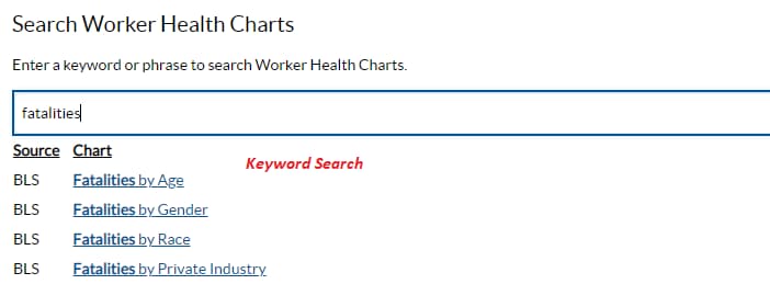
- A keyword search
- The keyword search makes it easier for users to explore outcomes or exposures of interest. This is a new feature that we are continuing to enhance.
- Quicker page response times
- Charts and data now appear immediately when the page first loads, giving users a glimpse of the data set and the ability to explore further.
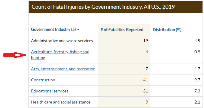
- Improved navigation
- Click within table data to easily move from general to more specific information.
-
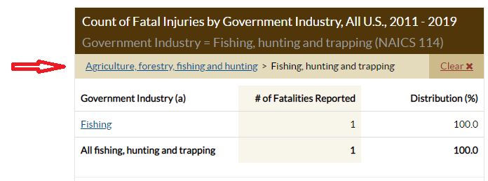
- Easily backtrack to different levels of data specificity.
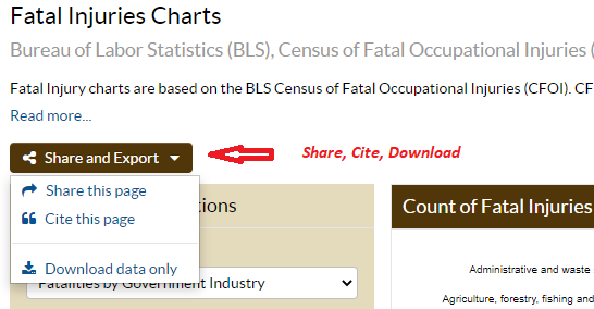
- A new menu for sharing, citing, and downloading data
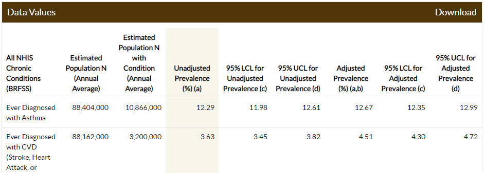
- Selected columns are highlighted for user interface clarity
- New buttons and links that increase efficiency
- Filter and group options have their own dedicated buttons so users can get right to exploring the data.
- Options to “Read More” and “Read Less” were added to increase user interface efficiency.
- “Show More” and “Hide More” buttons were added to display classification system codes.
Future Improvements
These recent improvements are only the beginning – many future updates are in the works:
- Continued keyword search improvements to account for typos, synonyms, and multiple words
- Additional chart styles and query options
- Improved table and grid sorting and interactivity
- New data sources, including NIOSH’s National Occupational Mortality Surveillance (NOMS), Fatalities in Oil and Gas Extraction (FOG), and the Commercial Fishing Incident Database (CFID) programs are expected to be added in the next year or so
Visit Worker Health Charts to try it out!
