NCHS Data Query User Guide
-
- Start your health data search in the “Select a Topic” box. Browse topics using the drop-down menu. You can scroll through the list or type keywords into the “Search topic list” field. You must select the drop-down menu to see the “Search topic list” field.
-
- Some topics, such as obesity, include data from more than one source. To learn more about topics, categories, and data sources, see NCHS Data Query System Health Topics.

-
- If you only want to view data for specific groups, characteristics, or data sources, select the hyperlink, “Advanced Topic Selection,” which is above the dropdown menu in the “Select a Topic” box.
-
- A pop-up window that allows you to select one or more options in either the “Population Characteristics” or “Sources” categories will appear.
-
- Once you have made your selections, click “Apply.”
- Only topics with relevant data based on the filters you selected will be displayed.
- Once you have made your selections, click “Apply.”
-
- When using the “Advanced Topic Selection” feature, the hyperlink in the “Select a Topic” box will change from “OFF” to “ON.
-
- To clear your Advanced Topic Selection filters, or to start a new search, choose “Clear Selections.”


-
- Based on your selections in Step 1, several topic-specific options will appear in the “Select a Group” field. Choose how you would like to group the data (for example, by age, sex, race, marital status, income, etc.).
-
- Subgroup options may appear in the “Select Subgroup” field based on your group selection (Step 2).
- No more than seven subgroup selections can be made at once.
- Subgroup options may appear in the “Select Subgroup” field based on your group selection (Step 2).
-
- When choosing a group with seven or fewer subgroups, DQS will automatically display all subgroups. When choosing a group with eight or more subgroups, DQS will automatically display the first five subgroups.
- Subgroups can be selected or deselected using the checkboxes in the subgroup drop down.
- When choosing a group with seven or fewer subgroups, DQS will automatically display all subgroups. When choosing a group with eight or more subgroups, DQS will automatically display the first five subgroups.
-
- If no options are available based on your selections in Steps 1 and 2, the subgroup filter is disabled.
-
- In the “Select Time Periods” field, choose multiple periods you would like to view, or click the checkbox to view a single period. Single periods will be displayed in bar chart format. Multiple periods will be displayed in line chart format. Note that some topics are only available in year ranges instead of single years.
Example: If you are interested in data on breast cancer (Step 1) based on demographic characteristics (Step 2), you can filter those results to only display data from a single period or multiple periods (Step 4). Subgroup options may appear in the “Select Subgroup” field based on your group selection (Step 2). The default presentation shows up to seven subgroups, but you can choose a single subgroup or multiple subgroups. If no options are available based on your selections in Steps 1 and 2, the subgroup filter is disabled.
DQS can display data in chart, table, or map formats. The default format is chart, but you can change the format by selecting the “Map” or Table” tab. Note that the map format is unavailable for topics that do not have state-level data.
Data for some topics can be presented by count, rate, and percent. Change estimate types by using the “Select Estimate Type” dropdown menu.

Confidence Interval: A confidence interval (CI) is a range of values that describes the uncertainty around an estimate. Confidence interval data are not available for some topics. If CI data are available, a “Show Confidence Interval” toggle switch will appear in Chart and Table views. When toggled on, the CI for the data is displayed. When toggled off, the CI is not displayed. In Chart view, you can also see the CI by selecting a data point.

Show All Subgroups: If there is more than one subgroup for a dataset, a “Show All Subgroups” toggle switch will appear in the table view. When toggled on, all subgroups are displayed. When toggled off, only the subgroups selected in Step 4 are displayed.

Show quartiles based on the most recent available period: “Quartiles” refer to a statistical categorization method in which data are divided into four groups. This toggle switch only appears in Map view and allows you to change how quartiles are calculated. If the toggle is on, the quartiles displayed in the legend are static and based on the most recent available period of data. If the toggle is off, the quartiles are dynamic and will adjust based on the period you select on the map timeline.

You can view and download source data on data.cdc.gov using the “View Data on data.cdc.gov” button.

In Chart and Map views, you can download an image of the chart or map using the “Download Image” button.

In Table view, you can download a CSV file using the “Download Data” button.

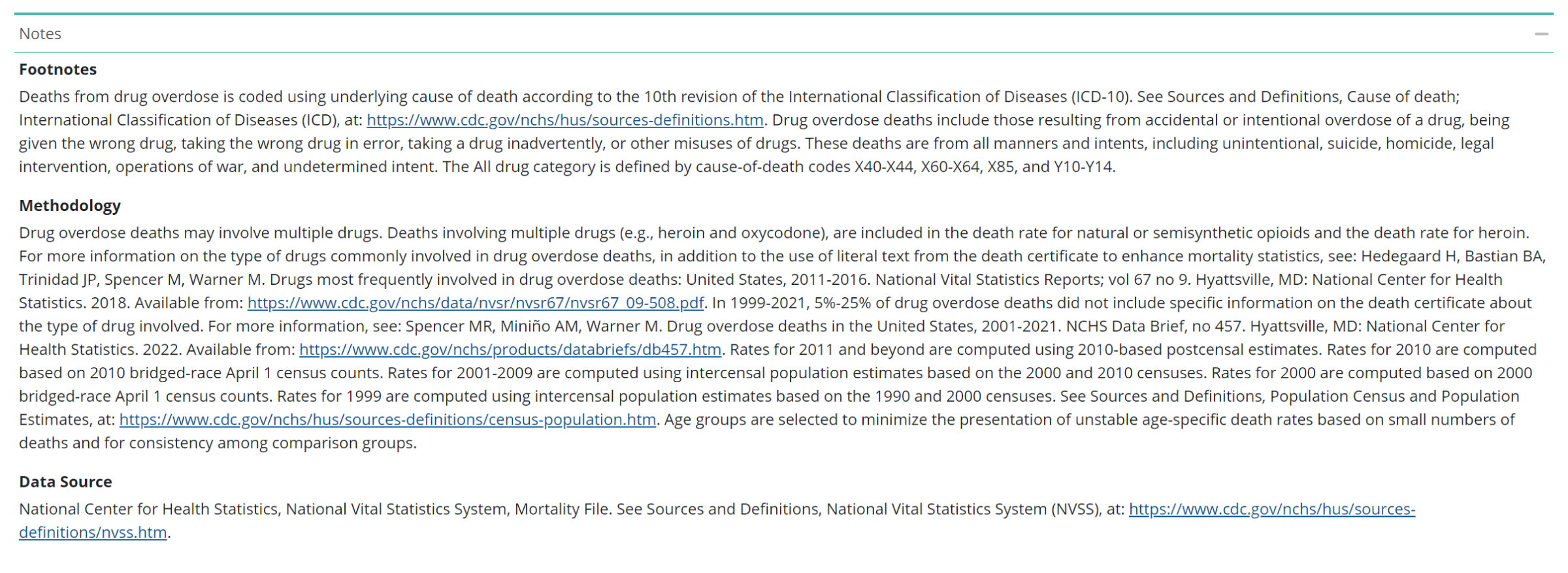
Notes based on your custom selection will be displayed beneath the data tables, charts, and maps. These may include data issues, footnotes, methodology information (how data were collected and analyzed), and data source.

.
Select the “Copy Citation” button when using DQS data in your research.

.