Appendix 2
Calculating and Visualizing Four Indicators of Alcohol Outlet Density Using QGIS
This appendix demonstrates the initial steps of data preparation and the calculation and visualization of count-based and distance-based indicators for measuring alcohol outlet density using QGIS, described in the Measuring Alcohol Outlet Density: A Toolkit for State and Local Surveillance pdf icon[PDF – 22 MB]. It was written by Elle Law, MPH, University of North Carolina Gillings School of Global Public Health and Mike Dolan Fliss, PhD, MPS, MSW, Research Scientist, University of North Carolina, Injury Prevention Research Center using QGIS version 3.
Resources
- CDC Alcohol Research in Action
- CDC Alcohol Measurement Guide pdf icon[PDF – 32 pages]
- CDC Alcohol Measurement Toolkit pdf icon[PDF – 52 pages]
Contents
- Adding Shapefiles to QGIS
- Adding CSV files as layers
- Geocoding
- Filtering to Active Licenses
- Counting Outlets per County
- Joining by Common Location Attribute (County)
- Creating a Choropleth Map of Outlets per County
Part 2: Calculating Indicators of Alcohol Outlet Density
Part 1: Project Setup Tasks
Adding Shapefiles to QGIS
When adding data into QGIS, each file will appear as a layer. The two most common types will be shapefiles and tables. Store data files in one folder for easy reference and then add each dataset into QGIS, which will create a layer for each dataset:
- Open a New Project in QGIS.
- In the top left Browser pane, navigate to the folder containing the datasets.
- Click and drag/drop each file into white space in the Layers window. Shapefiles will automatically appear in the map view once added.
Add layers using the drag/drop method into the Layers window.
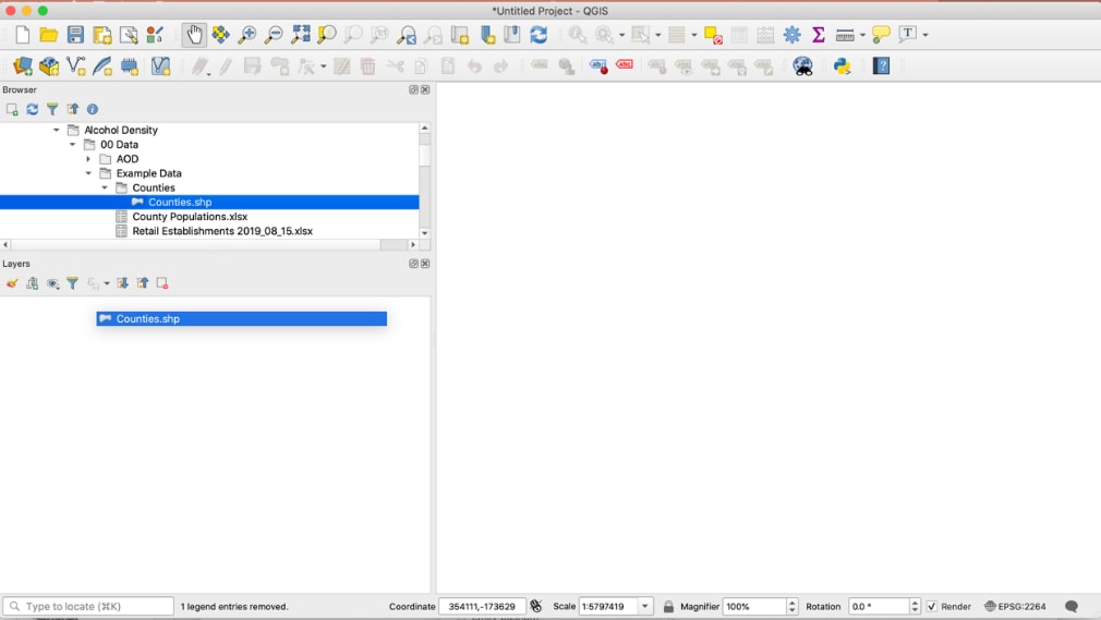
Once layers are added, you can explore your layers by right-clicking on the layer to view the Attribute layer.
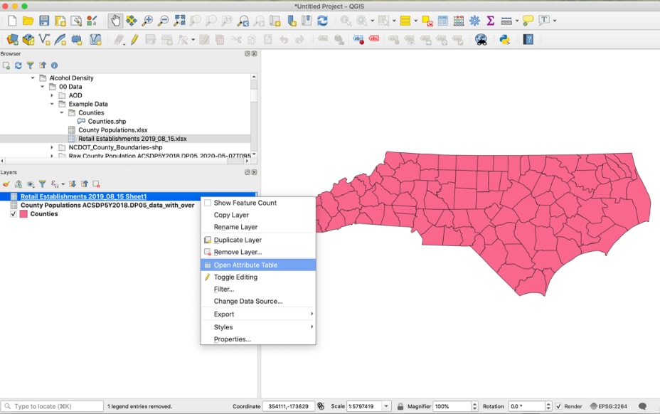
Tip: You can drag and rearrange shapefile layers so they appear in the order that you want. For example, dragging the layer containing alcohol outlets, as in the previous screenshot, the state shapefile layer will overlay outlet points on top of the state map.
Troubleshooting: If a shapefile is showing as a layer, but seems to not appear in the map view, click to View All to see if it is mapping in an unexpected location. If data does not overlay as expected, such as points in one area and the base map in another area, make sure shapefiles are on the same projection.
Adding CSV files as layers
Any tables in .XLSX format must be converted into .CSV to be imported into QGIS.
Use the drag/drop method to add CSV files that do not contain spatial data. If a CSV file contains latitude and longitude decimal degree coordinates in separate columns, you can spatially plot that data.
Example of CSV with Latitude and Longitude columns, in the attribute table view
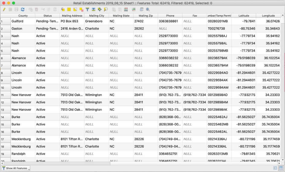
In this case, each row in the CSV file represents an outlet, and each outlet has latitude and longitude (as in the previous screenshot). To add the CSV file spatially:
- Go to Layer in Menu, Click Add Layer, Add Delimited Text Layer.
Add Delimited Text Layer
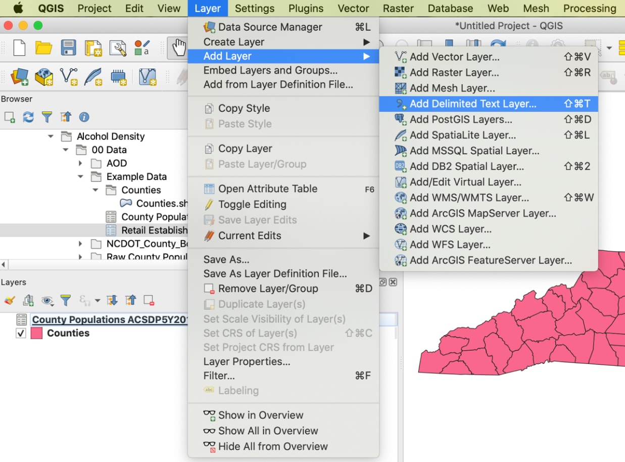
- In the window pop-up, under File Name, browse to the CSV file you want to add by clicking on the “…”, then click Open.
- Under Geometry Definition, assign your longitude column to the X field and your latitude column to the Y field.
- Next to “Geometry CRS,” select the projection system for latitude-longitude data, “EPSG: 4326 – WGS 84.”
Pop-up window for “Add Delimited Text Layer”
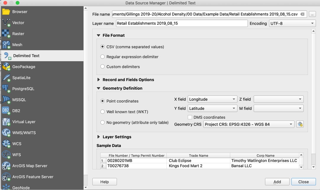
- Click Add, then Close. A new layer should appear, with outlets represented by points.
Result of plotting XY coordinates of CSV file
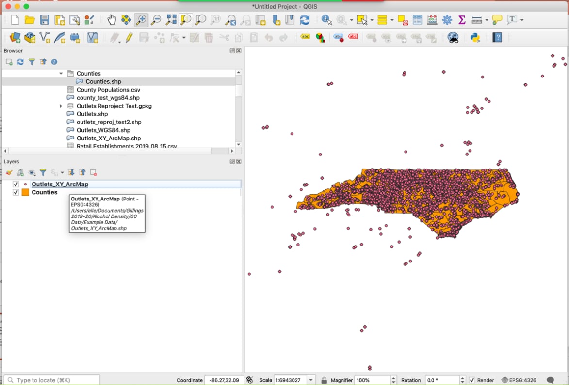
- Once you have imported the CSV with XY coordinates, it is a temporary file (you can prove this to yourself by checking the file pathway; it will be to the CSV file). You must save it as a new shapefile. To do so, right-click the newly created layer → Export → Save Features As… Click on “…” next to File name to choose your save location, choose a File Name, and provide a Layer Name (optional). Click Ok. Once the new permanent layer appears, you can delete the old temporary layer.
Tips:
- When telling QGIS which projection system to use when plotting coordinates for map viewing purposes, either the WGS84 system (EPSG: 4978) or the NA8 83 should work well in the United States. If your team has a local projection of choice, consider using that one.
- Make sure your latitude and longitude data are in decimal degrees. If they are in minutes and seconds, you will need to convert them first, before adding the CSV to QGIS.
Troubleshooting: If shapefiles are not mapping as expected, check to make sure projections match:
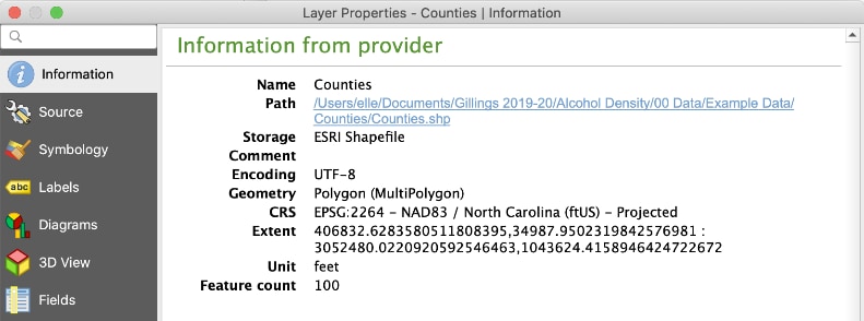
- Right-click on each layer and select Layer Properties. The Coordinate Reference System (CRS) will specify what projection is being used. Here, it is NAD83 / North Carolina in feet, or EPSG code 2264.
Layer Properties showing the CRS: NAD83 / North Carolina in feet, or EPSG code 2264
- To reproject a layer to match another: Go to Vector on the Menu, Data Management Tools → Reproject Layer…Select the layer to be reprojected and the target projection you want to transform it to. Under Reprojected, click on “…” and select where to save the output layer. Click Run, then close. Note: the default is to create a temporary layer unless you specify a new layer name and save location.
Example of projection error: state shapefile is visible at bottom, and points are clustered far North instead of overlaid
Geocoding
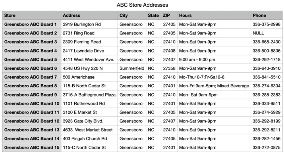
We will use QGIS to geocode the selection of ABC Stores within Greensboro, North Carolina, that is shown in the next screenshot.
15 addresses that need to be geocoded
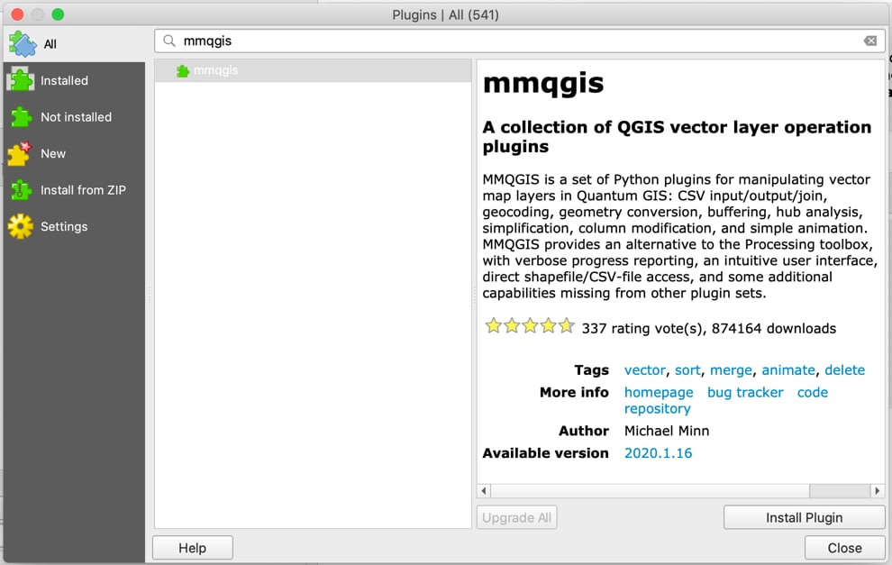
You will need to download the MMQGIS plugin for geocoding in QGIS. MMQGIS is a collection of QGIS vector layer operation plugins. It can be used to animate maps, combine CSV files, create buffers around selected points, export attributes to a CSV file, and geocode a CSV file. We will use the MMQGIS plugin to obtain the coordinates for a selection of addresses stored in a CSV file.
Adding MMQGIS plugin to QGIS
After downloading the plugin, go to the new MMQGIS menu, hover over “Geocode,” then select “Geocode CSV with Web Service.”
Geocoding using MMQGIS

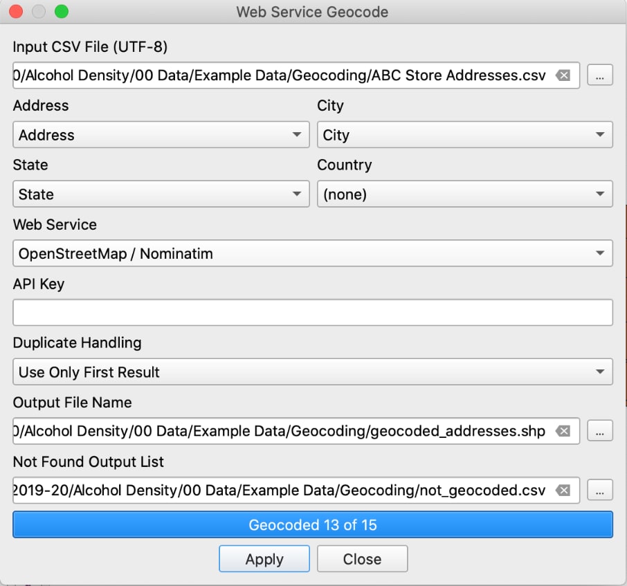
When “Geocode with CSV with Web Service” is selected, a window titled “Web Service Geocode” will pop up. For the “the “Input CSV File (UTF-8)” field, click on the “…” button and navigate to where your CSV file containing the addresses is saved.
Then, as shown in the next screenshot, ensure the following:
- For the Address field, select the correct column header from the CSV. Note that City, State, and Country fields are not required. When the window pops up, the column headers may already be automatically selected.
- For “Web Service” select “OpenStreetMap.” You can also choose “Google,” but if you lack a Google Maps API key, it may not work when searching for multiple addresses.
- For “Output Shapefile,” select a valid location to save the resulting shapefile, which will contain the plotted coordinates that have been successfully geocoded from the addresses.
- For “Not Found Output List,” select a valid location on your computer to save the resulting CSV. You will check this CSV to review what, if any, addresses were not able to be geocoded.
An example of settings for Web Service Geocode pop up. Note the bottom bar will display the number that geocoded successfully. In this case, you can see that 13 of the 15 addresses in the CSV geocoded successfully.
Click Apply to view the output shapefile in QGIS. Note that if you open the attribute table, you should see all the information present in the original CSV; QGIS will preserve any data attached to each address in the shapefile. It is helpful to have an existing map to ensure the coordinates that have plotted make sense, as shown.
Overlaying the coordinates of the geocoded addresses with a map of North Carolina counties shows that they have plotted in as expected in Greensboro

Filtering to Active Licenses
You can filter your data within QGIS, using the “Select by Attribute” feature. Here we have a map of North Carolina, along with a CSV of plotted alcohol outlets, each one represented by a dot.
Map of North Carolina with Outlets Plotted from CSV File

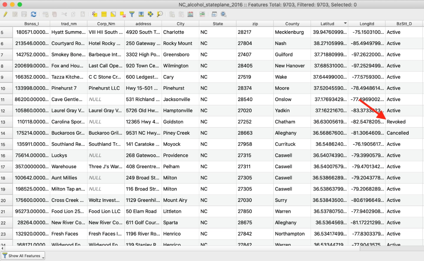
When the attribute table of the alcohol outlets is opened (as in the next screenshot), notice it also contains outlets with non-active license types. Because we only want active licenses, we will need to subset the data to a new shapefile layer. To do this, you will write a simple expression to select for rows that only have “Active” for the license type column (the last column labeled “BBzStt_D” in the next screenshot).
Active / Closed Status of Plotted Outlets
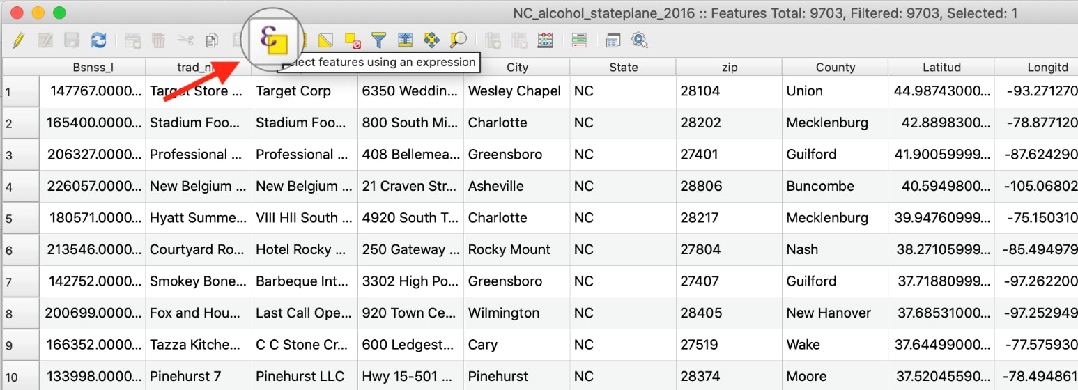
- In the attribute table view, click on the leftmost yellow button, “Select Features Using Expression.” The “Select by Expression” window will pop up.
Select features tool example in QGIS
- In the top right pane, click on the drop-down for Fields and Values to display the license type column name.
- Right-click on the field of interest and click All Unique to generate a list of all the distinct field values for that column in the right bottom panel.
Selecting by expression window in QGIS
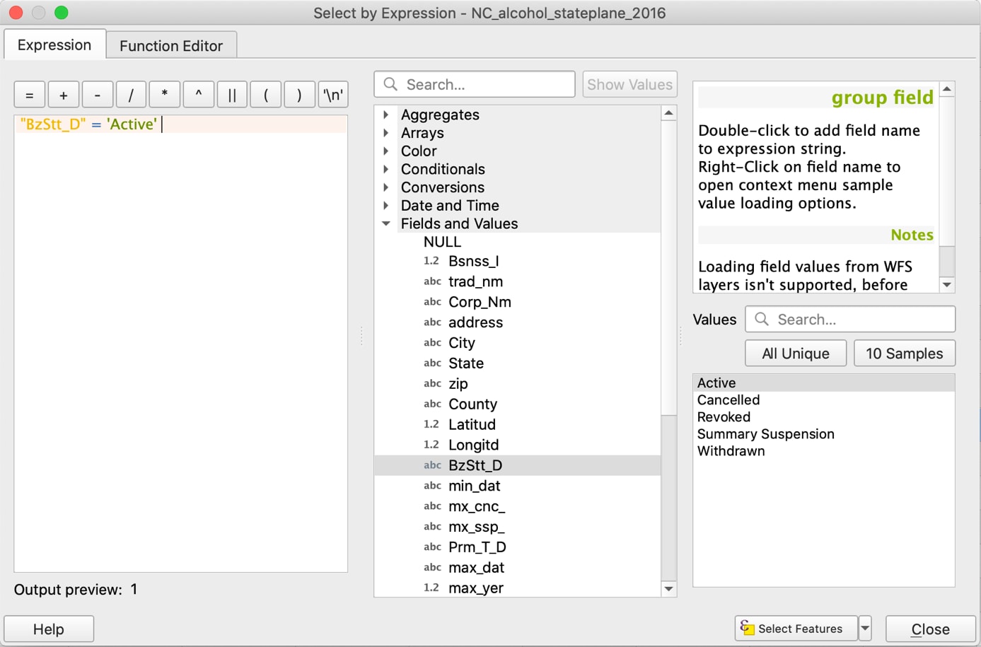
- To write the expression, double click on the license type column name, “BBzStt_D”, type “=”, then double-click on the column value to keep in the subset: “Active.”
- Click on Select Features. You may notice some rows become highlighted in the attribute table behind the pop-up box. In the attribute header, you should see the number after “Selected:” change to reflect the number of rows that qualify for your selection expression. Note that you can click on the drop-down button to the right of “Select Features,” which allows you to further refine your selection.
In the window header, note that of the total number of outlets in the attribute table (Features Total: 9703), the expression has selected 8490 “Active” outlets
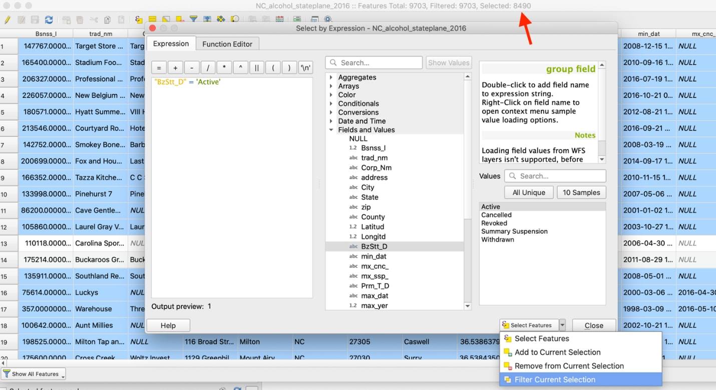
- Click Close. Notice the selected points also appear in the map view, as different colored points from the original color. To save the selection as a new file, right-click on the layer, go to Export, then select “Save Selected Features As…”.
- Click on the “…” button to the right of File name, navigate to the appropriate save folder, and enter the name of the new shapefile. Click Ok, and QGIS will automatically add the new layer for display.
Tip: Although it is possible to perform QGIS calculations with only selected features, it’s good practice to save subsets as new layers to avoid confusion during analysis.
Counting Outlets per County
Our goal is to add outlet count and population data to each county represented in the state shapefile. Once that data is present in the attribute table of the county shapefile, it can be used to calculate alcohol outlet density count indicators for each county.
First, we need to calculate outlet count per county. This can be done in two ways:
- Spatial Join. If you have two shapefiles, you can count the number of points from one shapefile within each county as represented by another shapefile.
- Tabular analysis. If you have categorical data for each outlet, you can count the number of outlets with the same category, such as the same county or census block. This method is demonstrated in the next paragraph and image.
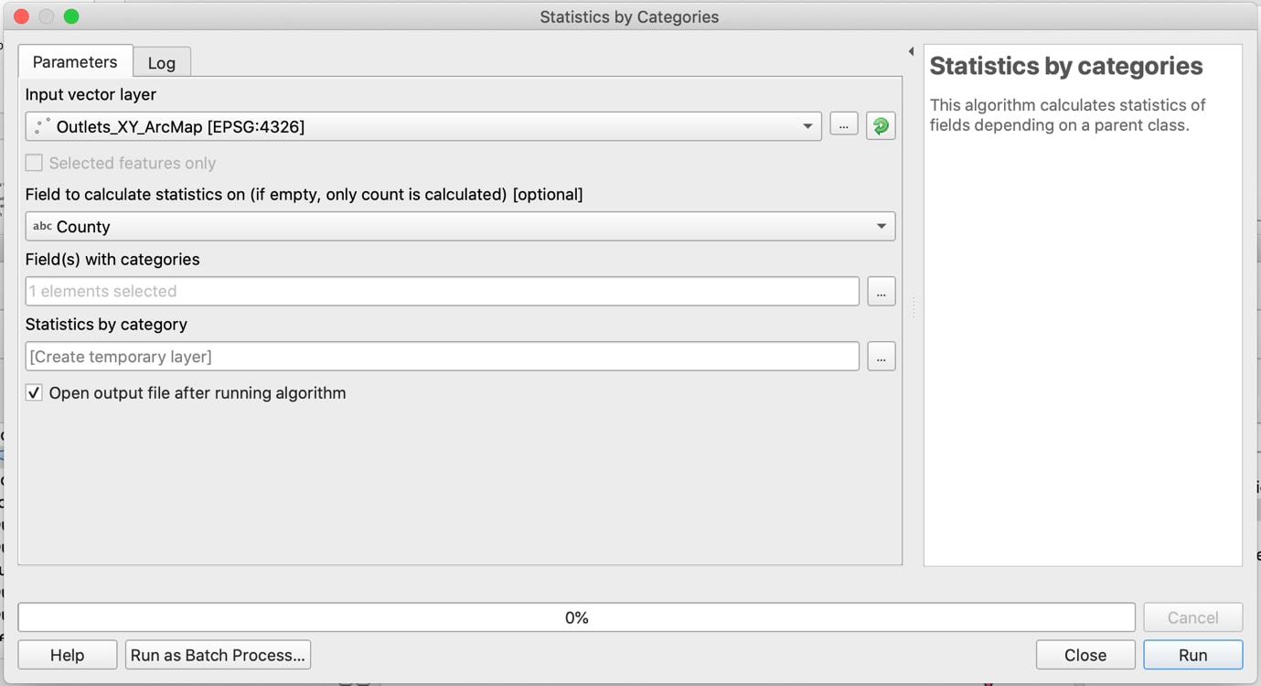
Bring up the Toolbox window by clicking on the button with the image of a cog in the upper right-hand corner of the QGIS window. In the search bar at the top of the pane that appears, type in: “Statistics by Categories.” In the resulting pop-up window, select the layer that contains a list of outlets with categorical data for each. Select the column name that contains the category of interest. Click Run.
Pop-up window when using “Statistics by categories”
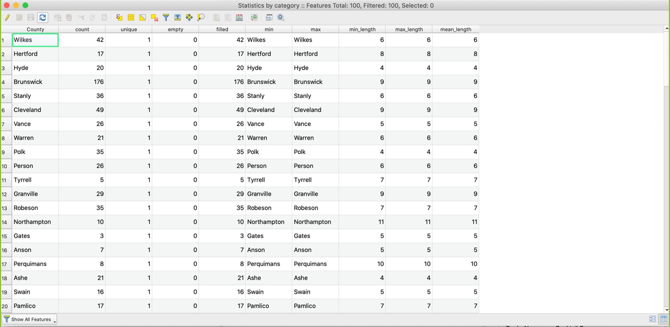
For Output of Statistics by categories, open the Attribute Table of the output layer: number of outlets per county will be listed under “count”
Joining by Common Location Attribute (County)
Before joining data, review the tables to be joined. Check that the columns to be joined are recoded properly, named consistently, and expected to match across tables.
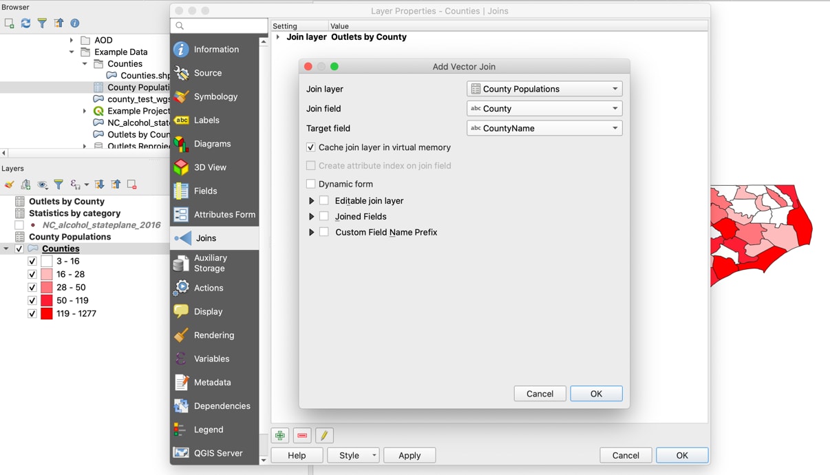
- To open the attribute table for a vector layer, activate the layer by clicking on it in the Layers Panel. Right-click on the layers you will be joining and select “Open Attribute Table.” Make note of the column names that contains the geographic information you will be joining data by (e.g., “County Name”).
- To join two layers, right-click on the layer that you want data to be added to, select Properties, then navigate to the Joins page.
- Click on the green plus (+) button on the bottom left. The pop-up window for “Add Vector Join” will appear.
- Select the name of the layer to be added for “Join Layer.”
- Select the names of the columns with overlapping data for “Join Field” and “Target Field.”
- Select Ok to close the pop-up window. The new join will appear in the Layer Properties window. Click Ok to apply the join.
- Verify the join performed as intended by opening the attribute table. The data should appear in new columns on the far right.
- The join is temporary, so make sure to re-save as a new layer, or your work will be lost if you close and re-open QGIS.
Joining CSV (number of outlets per county) to shapefile of counties, using common location attribute of county
Creating a Choropleth Map of Outlets per County
Now that a measure (outlets per county) is joined to a shapefile, you can create your first visual representation of outlet density: a choropleth map. To do this, use the Symbology pane of the shapefile:
- Right-click on the county shapefile and navigate to the Symbology pane.
- Click on the field at the very top of the window, which will have the default “Single Symbol” selected, meaning all the features have the same symbol applied to them. The three most used options are:
- Categorized: Allows you to style the layer using a categorical attribute field.
- Graduated: Allows you to classify the data by a numeric field attribute into discrete categories.
- Rule-based: Creates styling based on custom rules, based on SQL expressions.
- Select “Graduated,” then for “Value,” select the column name containing outlet counts per county.
- Change the color ramp if needed to make the map easier to read and understand.
- To populate a range of values for your selected attribute field, click on Classify. Notice how it populates the Classes pane. In this case, each color represents a different range of values. QGIS will apply a different color to each unique value in the field, based on the Mode selected. For more nuance, you can also change the number of Classes in the bottom right field.
- Click Ok. The window will close, and your map will display the updated symbol choices.
Classifying map symbol cut points and colors
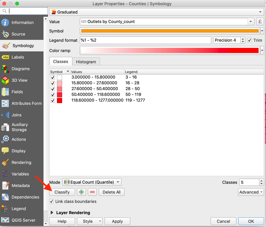
Tip: If you choose to create a new map, remember to click Classify again, or you will be using the value ranges from the previous map.
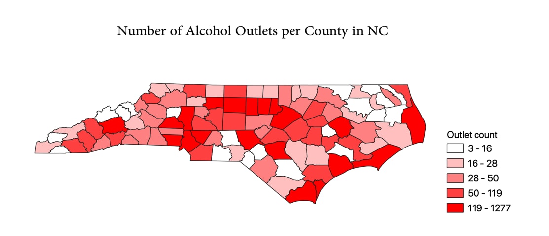
The map view should now display the counties, with a color gradient from white to red, darkening for counties with higher outlet counts. To export this map, copy it to your clipboard, save the image to your computer, or use the Print Layout mode for additional styling:
- To use the Print Layout mode, click on Project in the QGIS Menu bar, then click Layout Manager.
- Click the Add button to create and name a new layout. Click Ok, then Show.
- Click on the “Add New Map” button. Click and drag a box within the blank window, which will cause the map to appear. Position the map by clicking and dragging, then resize as needed using the boxes in the corners.
- To add a legend, click the “Add Legend” button, then click and drag a box over the location where it should appear.
Tip: When zooming in or out, click the refresh button to ensure the map is at the correct resolution when you export.
For additional guidance on how to create and export stylized QGIS maps with titles and legends, there are tutorials online at docs.qgis.orgexternal icon.
Map of number of alcohol outlets per county in North Carolina
Part 2: Calculating Indicators of Alcohol Outlet Density
Calculating Count-Based Indicators
Now that outlet count and population have been added for each county, you can begin to calculate your first set of indicators: calculate outlets per square mile and per 10,000 people. This will be done using the Field Calculator in the attribute table. See Step 6 in the Measuring Alcohol Outlet Density Toolkit for more details on communicating count-based results.
Counting Alcohol Outlets per Square Land Mile
- Open the Attribute table and click on the Field Calculator icon, represented by an abacus. The Field Calculator window will pop up.
- Make sure “Create a new field” is checked. Type the new column name into the “Output field name.” Select decimal as your Output field type. Make sure the Output field length is long enough for the number of digits you want in your output numbers.
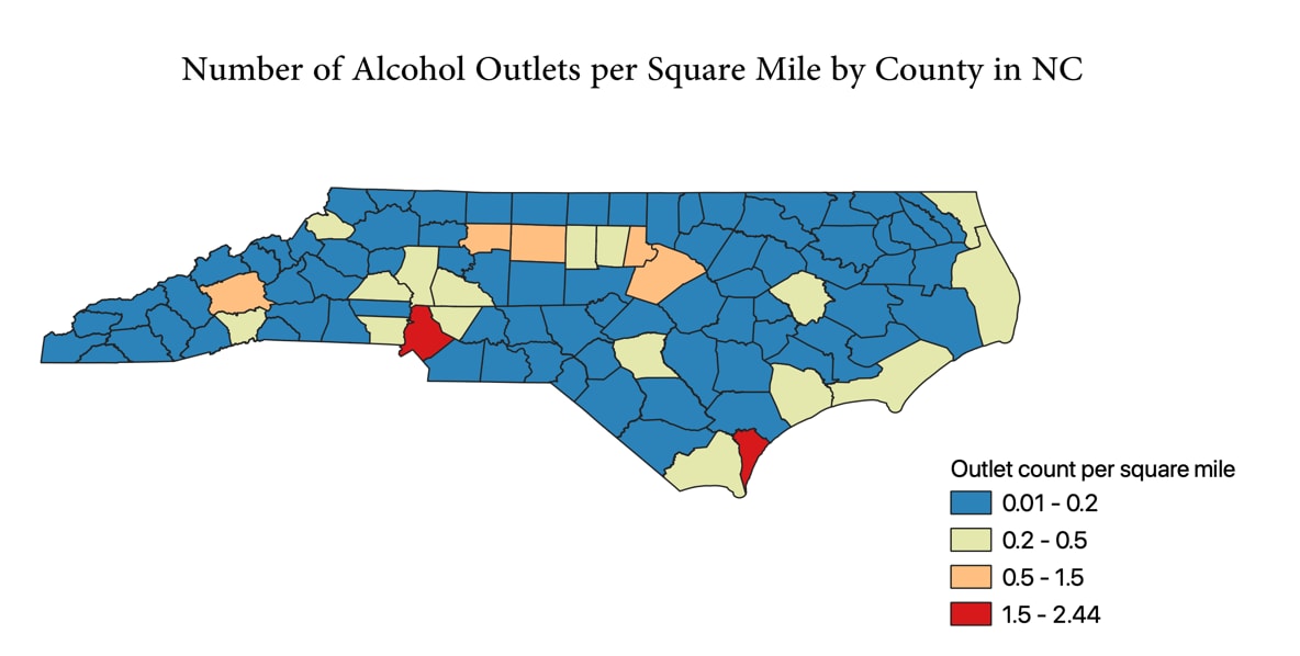
- In the Expression field, type in the formula for outlets per square mile in each county: “Outlets by County_count”/“County Area.” Click Ok. The new column will appear to the far right.
- Create a map by right-clicking on the layer, selecting Properties, and navigating to the Symbology pane. Follow the same steps as for the previous map, making sure to click the Classify button to reset the value ranges for the new indicator being mapped.
Map of Number of Alcohol Outlets per Square Mile by County in North Carolina
Tip: If the Field Calculator returns a new column with blank or NULL values, check that you are not missing data in the fields used for calculation and that those field types are not a character field.
Troubleshooting: If a field does not appear for selection within the Symbology pane, make sure you have saved changes from the Field Calculator calculations in the attribute table.
Counting Alcohol Outlets per 10,000 people
- Open the Attribute table and click on the Field Calculator icon, represented by an abacus. The Field Calculator window will pop up.
- Make sure “Create a new field” is checked. Type the new column name into the “Output field name.” Select the appropriate Output field type, which will likely be decimal. Make sure the Output field length is long enough for the number of digits in your output numbers.
- In the Expression field, type in the formula for your desired output. In this case, we want population per 10,000 in each county. The formula is: “Outlets by County_count”*10000 / “County Population”. Click Ok. The new column will appear to the far right.
Using the Field Calculator to calculate outlets per 10,000 people in a county
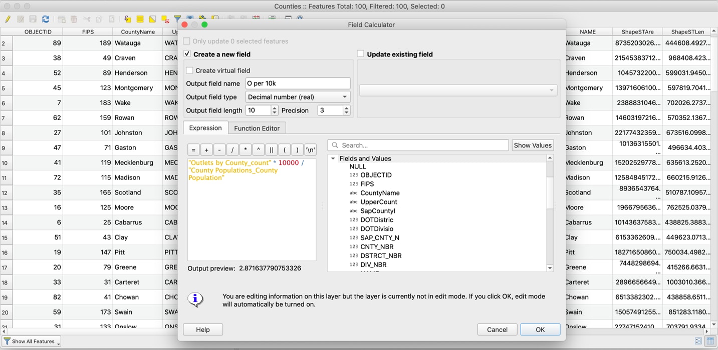
Resulting output from the Field Calculator, added as the right-most column
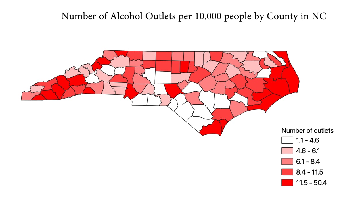
- To generate a map displaying the indicator results. If you wish to generate maps displaying the indicator results, right-click on the layer and select Properties. In the left side bar, select Symbology. Choose Graduated in the topmost field, then select the column name that contains the indicator you want visualized. Click on Ok to add the new Symbology setting to your map.
Map of number of alcohol outlets per 10,000 people by county in North Carolina
Tip: In the Search bar, you can type in the column name of interest. When it appears, double-click to autogenerate it within the Expression field.
Calculating Distance-Based Indicators
Measuring distance-based indicators involves calculating a distance matrix, the results of which can then be manipulated to provide measurements at the desired area unit.
Calculating the Average Distance from a Person to Their Nearest Alcohol Outlet (Person-to-Outlet)
The average distance from a person to their nearest alcohol outlet will be measured using the data in the bulleted list. In this demonstration, the area unit is the county level, and the sub-area units are block groups:
- Block group shapefile for North Carolina.
- The population from 2018 ACS estimates for each block group in North Carolina.
- Total block group population for each block groups in each county.
- Centroid of each block group in North Carolina.
- Distance matrix of distance measured between centroids and nearest outlet.
To calculate the average distance from person to outlet, you will need centroids: a point layer where each point represents the center of a shape. From each block group shape’s centroid, the distance to the nearest outlet (regardless of block group or county boundaries) will be measured. That distance will then be weighted by population. Once all the population-weighted block group distances are calculated, they will be averaged by county. The formula used is: (block group population / total county population) * distance. The resulting calculation from each block group is then summed together with other block groups of that county to provide the average distance from person to outlet.
Gather Block Group and Population Data
First, acquire a block groups shapefile with population data for each block group. If you cannot find a pre-linked shapefile or geodatabase on the US Census website, you may need to find and then join population data based on block group IDs. For this demonstration, there is a pre-linked geodatabase available with 5-year American Community Survey estimates for 2018–2019 at the block group level in North Carolina at the following link: www.census.gov/geographies/mapping-files/time-series/geo/tiger-data.htmlexternal icon.
Navigate to the following:
- Click on “Download these files from the FTP archive.”
- Select the desired year: 2018.
- On the resulting page, scroll down until you see “ACS_2018_5YR_BG_37.gdb.zip.” Click on it to begin the download, unzip it, and save it to your QGIS data folder. Note that “BG” stands for block group and “37” is the Federal Information Processing Standards (FIPS) code for North Carolina.
- You can drag and drop the saved geodatabase file to the layers panel in QGIS, which will open the box in the next screenshot. Select the layers you wish to import: “ACS_2018_5YR_BG_37_NORTH_CAROLINA,” “BG_METAFATA_2018,” and “X01_AGE_AND_SEX.” Then click Ok.
Choose which layers to add from the geodatabase
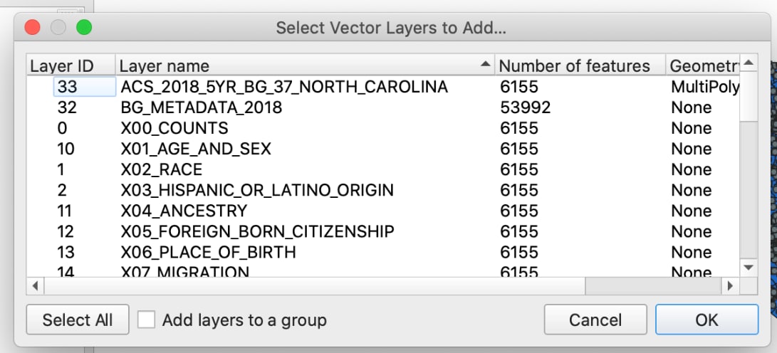
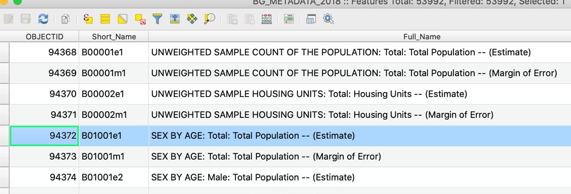
Once the layers have imported, view their attribute tables to familiarize yourself with their contents. The metadata layer will help you identify which column has your population, in this case, “B01001e1.”
Using the metadata attribute table, identify which column name contains population data of interest
Create Block Group Population CSV Layer
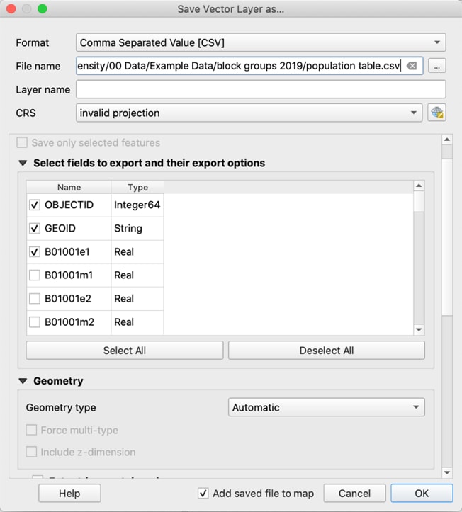
Right-click on the “X01_AGE_AND_SEX” layer, then Export, and “Save Features As” to create a new CSV with only your target population data, as shown in the next screenshot. Click “Deselect all” then select “OBJECTID,” “GEOID,” and the population per block group: “B01001e1.” Name the new layer “population table” and click Ok. Remove the “X01_AGE_AND_SEX” layer from QGIS.
Create a new CSV with only the target population data, saving only the first three columns from the “XO1_AGE_AND_SEX” layer
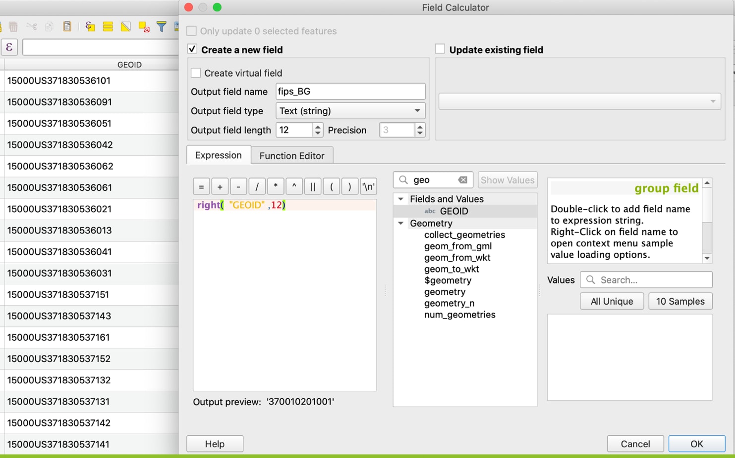
Check whether the “GEOID” column in your census sourced population file begins with “15000US,” which refers to the summary level of the FIPS code (in this case “State-County-Census Tract-Block Group”). This addition will prevent joining this dataset to other datasets that contain only the FIPS code. Next, create a new column with only the 12-digit FIPS code. Use the following code to populate a new field: “fips_BG”, taking only the rightmost 12 digits from “GEOID”: right(“GEOID”,12). This FIPS code will be used to join the population CSV to other datasets.
Creating a new field using the Field Calculator, extracting the 12-digit FIPS code from the GEOID
Create Centroids
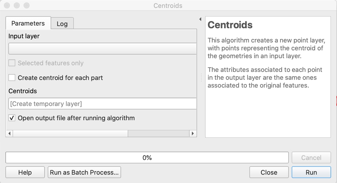
To create the centroid point layer, go to the Menu and select: Vector → Geometry Tools → Centroids. The window in the next screenshot should appear. Select the block groups shapefile as the Input layer and click Run.
The pop-up window for the Centroids creation tool
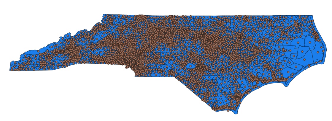
Take a moment to visually explore the resulting centroids, overlaid with the block groups shapefile as shown.
Block groups of North Carolina, with points representing their centroids
Troubleshooting: If an attempt to calculate centroids returns errors, see if they can be resolved by applying a small buffer to the shapefile. This will smooth out any issues caused by how the boundaries are drawn, and it won’t impact the accuracy of results due to the small scale. (Input Distance: enter 0.001 degrees if data has not yet been projected, otherwise use 1 foot/meter.)
Alternate Analysis: Click on the settings button (shaped like a cog) to bring up Processing Toolbox. Search for “Point on Surface.” If you are working at the county level, using the “Centroid” tool for block groups is sufficient. However, if you are working at a small scale, consider whether it is worth using “Point on Surface” instead, which adds the additional constraint that the centroid point must be placed inside the boundaries.
Tip: After using the Centroids tool, you can check to see for points that do not spatially join to their block group (e.g., plotted out on water). This is more likely to occur with strangely shaped area units. Conduct a spatial join, then use “Select Features by Value” to select for any points that have a different location FIPS code from their own.
Build Distance Matrix
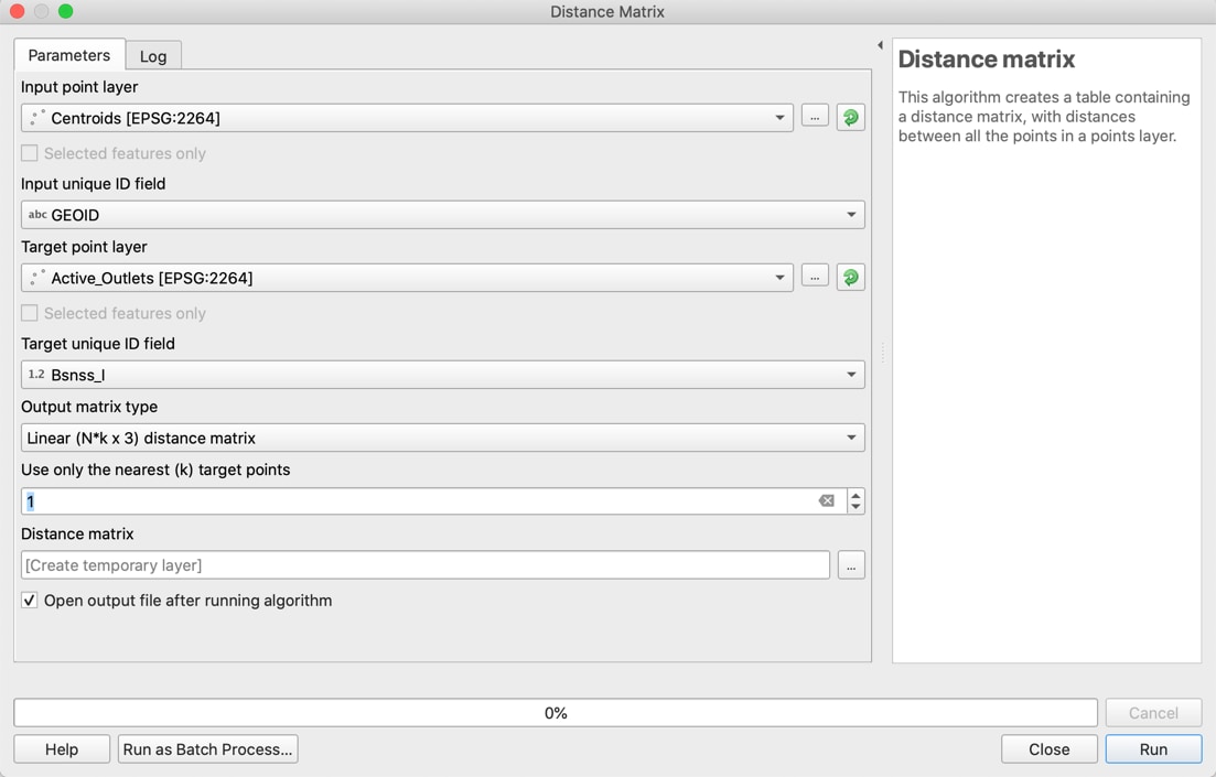
Next, calculate the distance between each centroid and its closest outlet, using the distance matrix tool. In the menu bar, select Vector, then Analysis Tools, and click on distance matrix. Once selections are entered as shown in the bulleted list, click Run, then click Close.
- For the input point layer, select the newly created centroids point layer, and “GEOID” for the “Input unique ID field.”
- For the “Target point layer,” select the points layer containing the outlets. Make sure your outlets layer contains a unique ID field for each outlet, as that is the field you will select for “Target unique ID field.”
- Make sure “Linear distance matrix” is selected for “Output matrix type” and that “1” is input for how many nearest target points to use, since you are calculating just the distance to the single closest point.
Distance matrix analysis tool
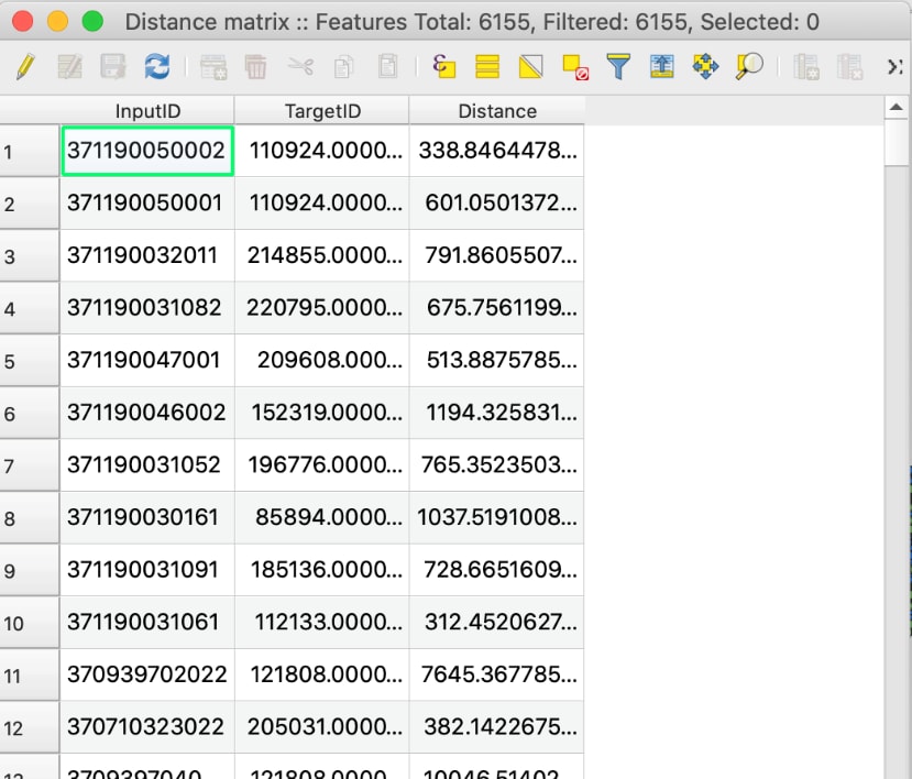
An output layer, “Distance Matrix” will appear. Open the attribute table and notice that the “InputID” contains the full 12-digit string FIPS code. “Distance” contains the distances from each block group centroid to nearest outlet, regardless of what block group or county the outlet is located in. You can examine this by visually exploring the layer.
Distance matrix layer
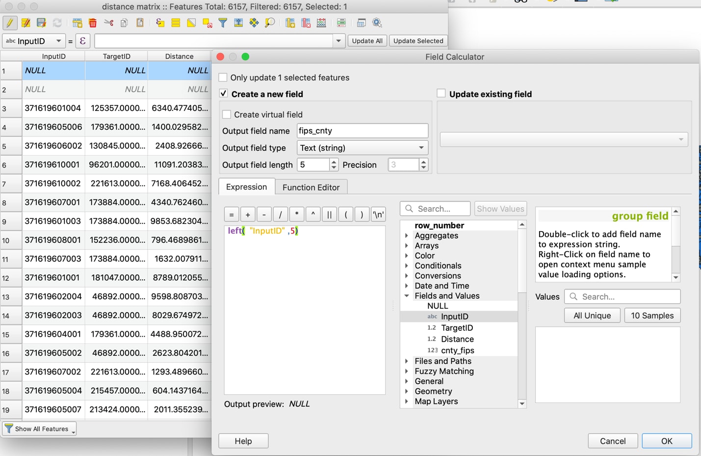
Each row will need the FIPS code for just the county, for when you later join total population data of each county to each distance. To create this, extract the county code from the 12-digit string in the “InputID” column, populating it into a new column to be named “fips_county.” Because the FIPS county code is the last 5 digits of the 12-digit string, we can use the following code (as shown in the next screenshot): left(“InputID”,5). Make sure the Output field type is “Text (string)” and the output field length is 5.
Extracting county FIPS code from detailed FIPS string
Alternate Analysis: You can also find the nearest neighbor point on another layer, such as school locations. See QGIS Nearest Neighbor Analysisexternal icon for more details.
Add Block Group Data
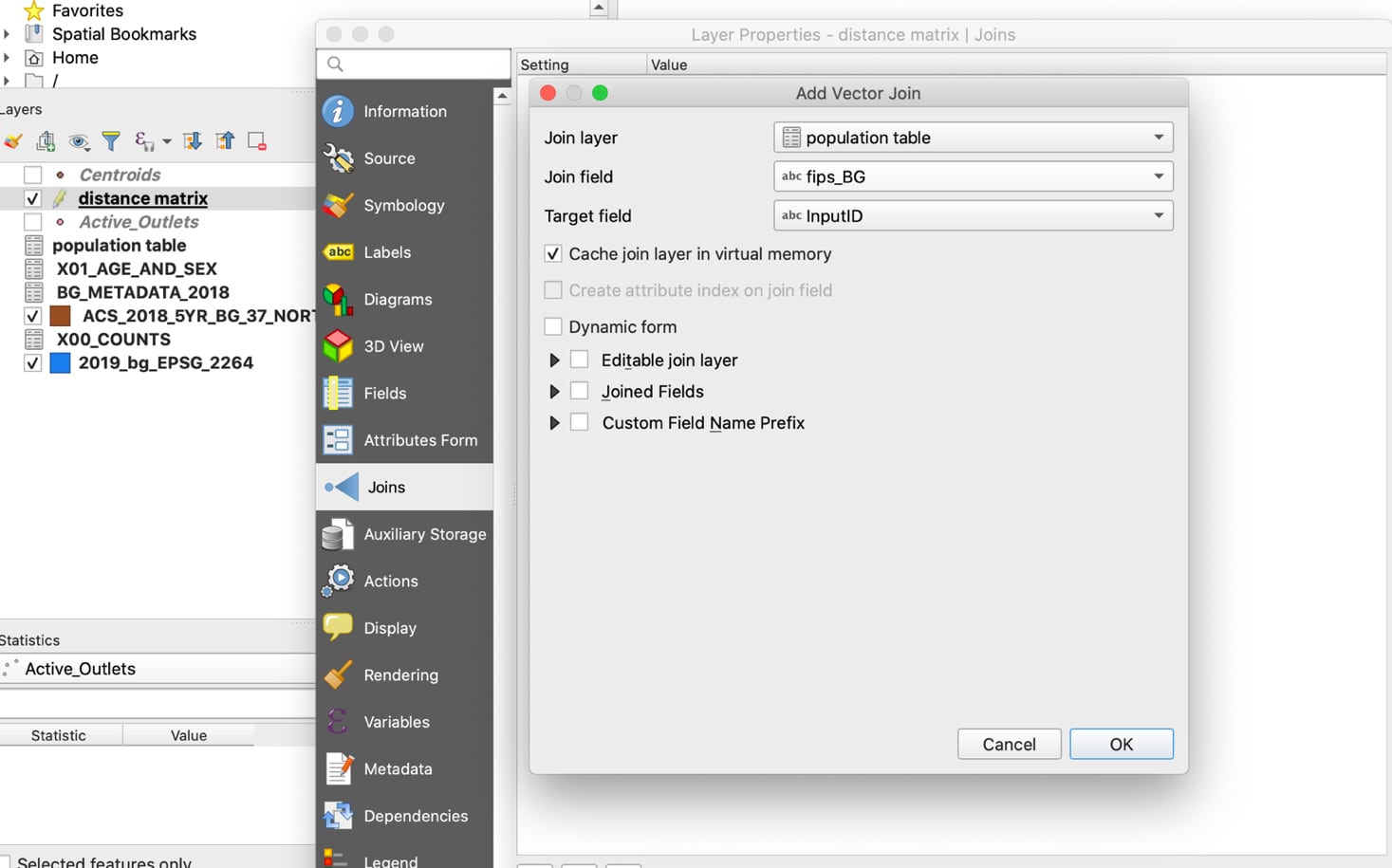
Now join block group population data to the distance matrix. Right-click on the distance matrix layer and navigate to Joins. Select “population table” as the Join layer and select the column containing the 12-digit FIPS code in each layer as the join and target fields, as shown in the next screenshot.
Join the population table to the distance matrix, using the 12-digit FIPS code columns
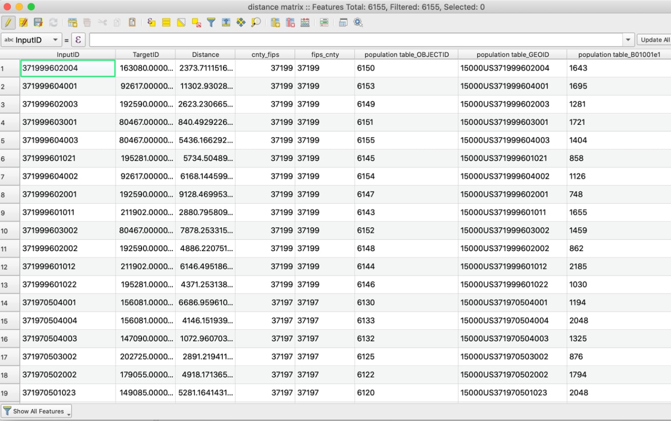
Open the attribute table to ensure the join occurs as expected. Both distance matrix and population table columns should appear together, as shown in the next screenshot. Notice QGIS added the layer name before the names of the added columns.
Convert text columns to numeric columns for calculations
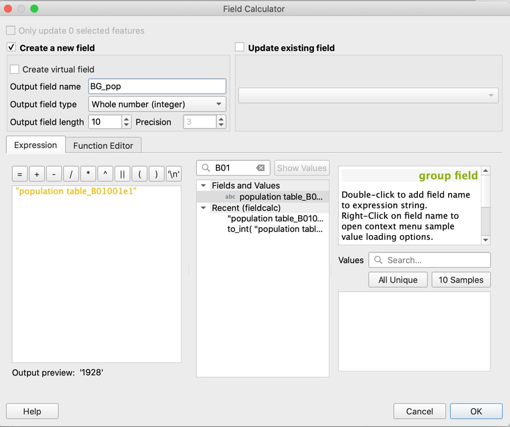
Verify that your population column is numeric rather than in text format. Text formats cannot be used in calculations. To check, click on any cell in the column, then hover over the column field name. A label will pop up, specifying the type. If it is text type, you will need to use the Field Calculator to generate a new column with output field type of “whole number,” as shown in the next screenshot. Name the new block group population column “BG_pop” and set it equal to the old column field name, making sure the output field type is whole number and the field length is appropriate for your population values. An example of this in the Field Calculator is demonstrated in the next screenshot.
Populating a new numeric column “BG_pop” from the old text column “population table_B01001e1”
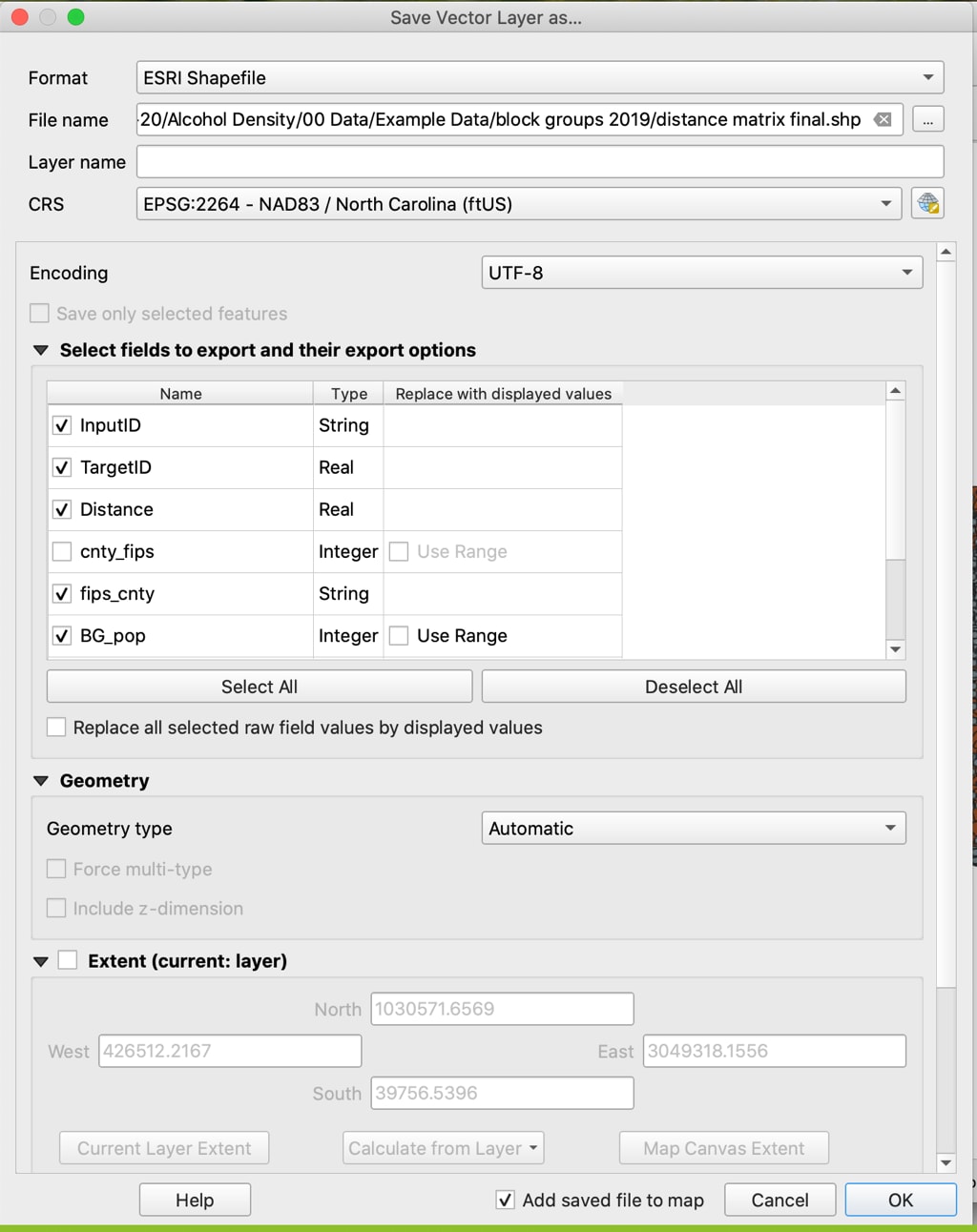
Export the layer into a new shapefile to make the join permanent, naming it “distance matrix final.” You will not be able to conduct calculations otherwise, as the added columns fields may not appear for selection when the Group Stats plugin is used. Right-click the layer, select Export, and go to “Save Vector Layer as.” Use this opportunity to export only the fields needed. Two columns with the same FIPS code for county are not both needed, so one can be left unchecked.
Use “Save Vector Layer” as an opportunity to drop duplicate columns, such as “cnty_fips”
Calculate Total County Population
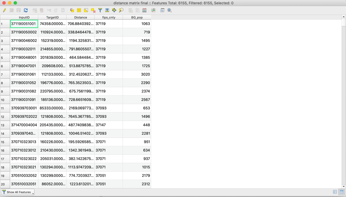
As you can see in the attribute table in the next screenshot, we now have the FIPS code, distance, FIPS county code, and block group population. We still need the overall population of the county that each distance’s centroid is located in. Use the block group populations to calculate overall county population, then return to the distance matrix and attach the overall county population to each distance, using matching county FIPS codes.
The block group populations “BG_pop” will be summed by county to get overall county population
As mentioned in the Measuring Alcohol Outlet Density Toolkit, the Group Stats plugin can be used to summarize measurements of one column based on the category of another column. We can use this to average distances by their “category” of county: the county FIPS code column. If you have not already downloaded the plugin, do so now: In Menu view, select Plugins, then Manage and Install Plugins. In the search bar, type “Groups Stats,” click on Install Plugin for the result, then click Close.
Adding Group Stats plugin to QGIS
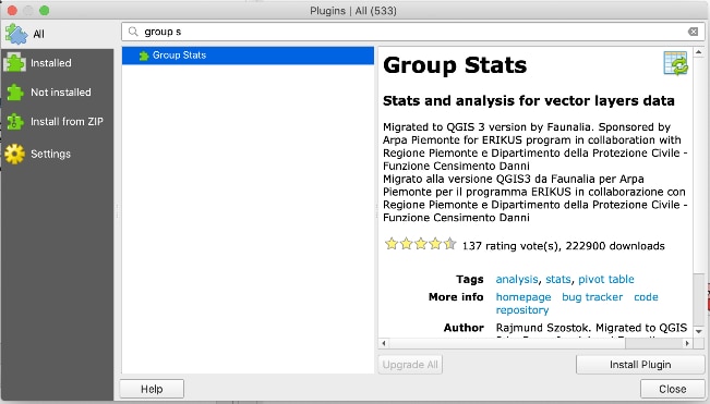
Now when you select Vector on the QGIS menu bar, Groups Stats should appear as an option.
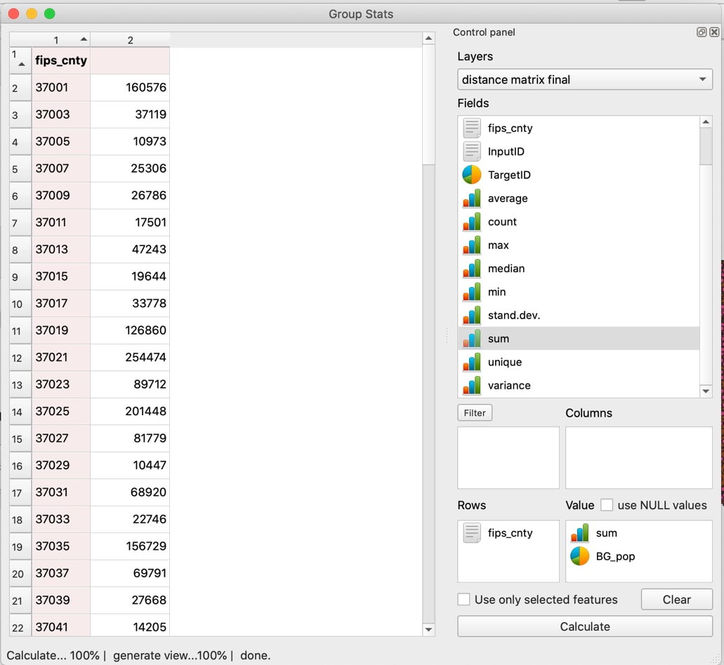
Open the Group Stats plugin. Select “distance matrix final” for “Layers” in the Control Panel. Drag “sum” and “BG_pop” into the Value panel, and “fips_cnty” into the Rows panel, then click Calculate. This will sum the block group populations by county. You may need to scroll down in the Fields pane if you don’t see the field you want.
Use Group Stats to sum populations of block groups by county to get total population of each county
Click on Data in the Menu bar and select “Save all to CSV file” to save the calculation to your computer as a CSV file: “Total County Pop.” Open the CSV and name the column “county_pop” before reimporting the CSV layer into QGIS.
View the attribute table of “Total County Pop” to review column names and check the data is as expected.
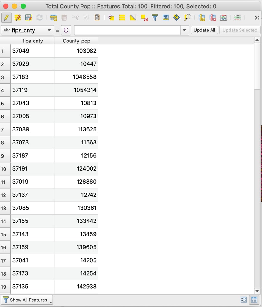
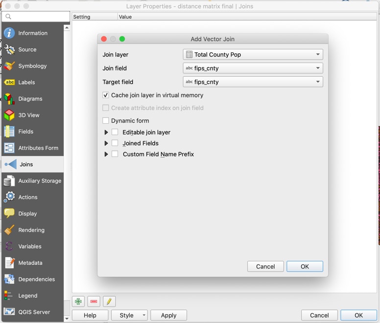
Now join the “Total County Pop” CSV layer to the “distance matrix final” layer, using the county FIPS column in both tables as the join and target fields.
Add total county population data to the “distance matrix final” layer
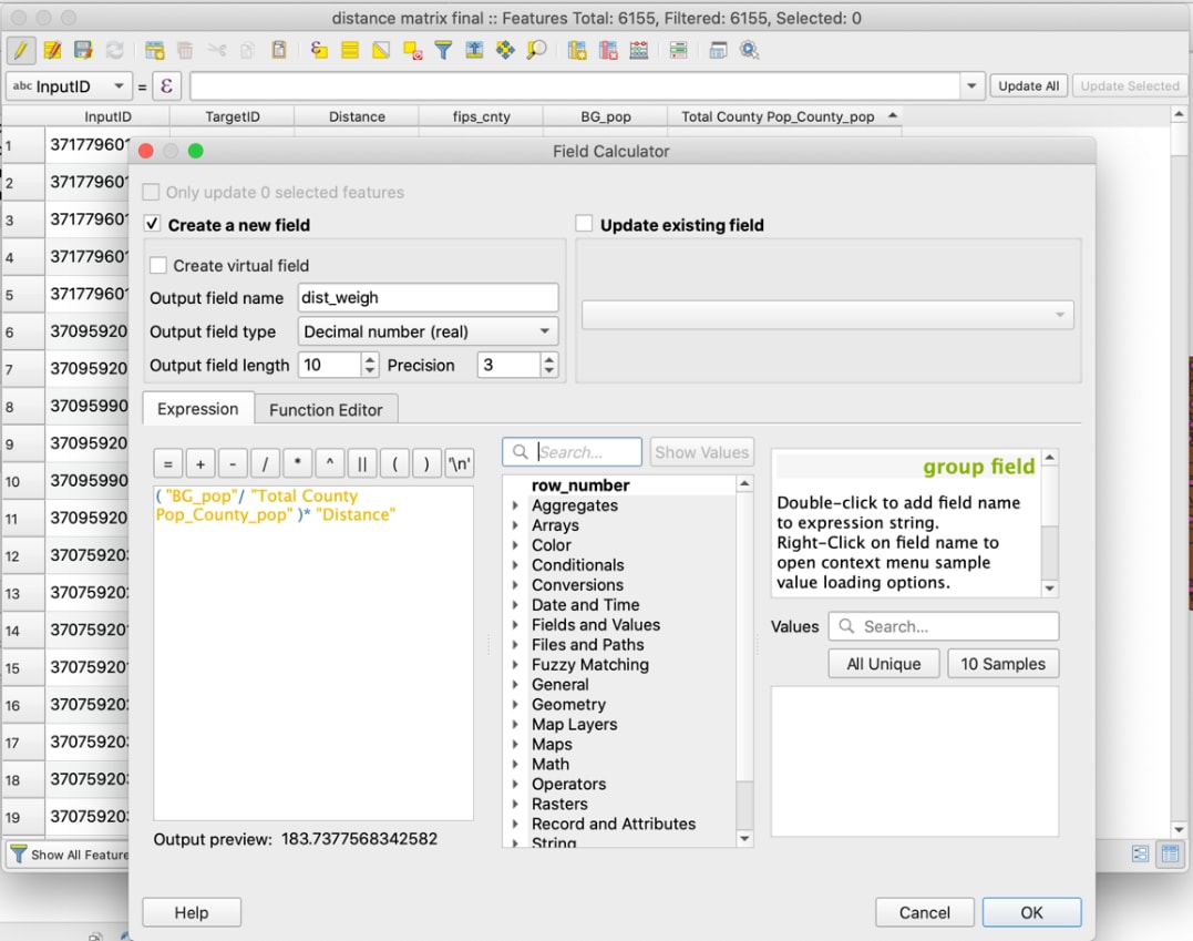
Now we can weight the measured distances of centroid to closest outlet by block group population, then sum them to receive an average county measurement. Using distance, county FIPS, block group population, and overall county population for each distance, calculate the population-weighted distance column “dist_weight.” Use the following formula, as shown in the next screenshot: (“BG_pop”/”Total County_pop”)*”Distance”.
Generate the population-weighted distances using the Field Calculator
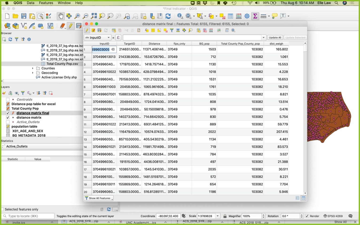
Final columns of “distance matrix final” including the newly generated “dist_weigh”
Sum the dist_weigh by county to get the total average distance for that county. To do this, open the Group Stats plugin, then drag “dist_weigh” and “sum” to the Value panel, and “fips_cnty” into the Rows column. Click Calculate, then click on Data in the menu bar and select “save all to CSV file.” The results should show the final indicator measurement value for each county, as represented by the 5-digit county FIPS code.
Group Stats calculation of average population-weighted distance to nearest outlet
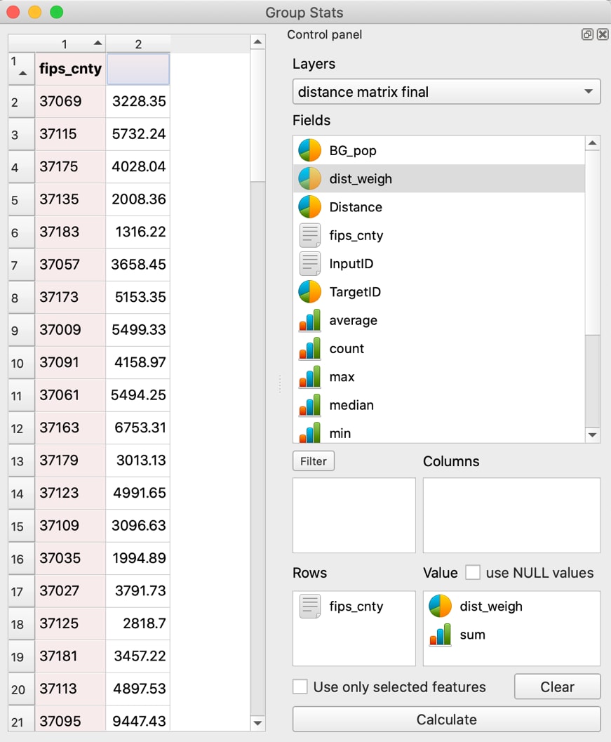
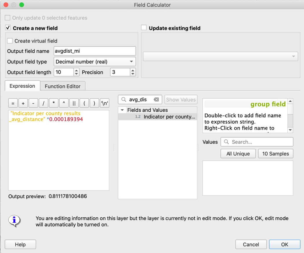
Check your units. Notice that the units in this example are in feet, which are not as easy to read as miles. To convert feet to miles, use Excel (or QGIS as shown in the next screenshot). Reimport the resulting CSV file into QGIS and navigate to the Field Calculator in the Attribute Table. Name the new output field name “avgdist_mi,” and select “Decimal number” for the output field type, with a field length of 10. In the Expression pane, multiply the final indicator measurement column field name by the conversion factor for feet to miles: “0.000189394.”
Convert indicator values from miles to feet using the Field Calculator
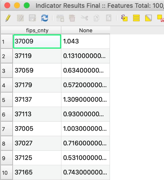
Exit editing mode to save the new column. Check your results one last time. The number of total features should match the number of counties, and the values should be within reason. For example, counties with the smallest average distance should have higher densities of outlets.
Verify the results are reasonable and that no data is missing.
Mapping Indicator Results
To create a map displaying the calculated indicator of outlet to person, join the CSV layer to a county shapefile by FIPS code.
You can create your own county shapefile, generate one from your block groups shapefile by creating a 5-digit county FIPS column and then using the dissolve tool to merge block groups into county boundaries. This is especially useful when you have attribute data at a subcounty level, but not at the county level yet. The dissolve tool will preserve the attribute data as you merge spatial boundaries into larger units. Alternately, county-level results can be joined to an existing county shapefile.
In this block group shapefile, as shown in the next screenshot, the state and county digits are separated in the attribute table. Create a new column that joins them to create a county FIPS code: “STATEFP” + “COUNTYFP.” Make sure the output field type is “Text (string).” Remember to exit editing mode to save the new column by clicking on the upper left pencil icon in the attribute table.
Combine the 2-digit state codes and the 3-digit county codes into the 5-digit FIPS code for each block group

The FIPS column will be the basis on which block groups are grouped before dissolving them into their respective counties. Go to Vector in the menu bar, select “Geoprocessing Tools…,” and select “Dissolve…”. The Dissolve Tool window will pop up. Select the block group shapefile as the input layer and click on the “…” button for “Dissolve field(s)” to checkmark the FIPS county field. Click Ok, then Run, and close.
Dissolve the block groups into larger units based on shared county FIPS codes
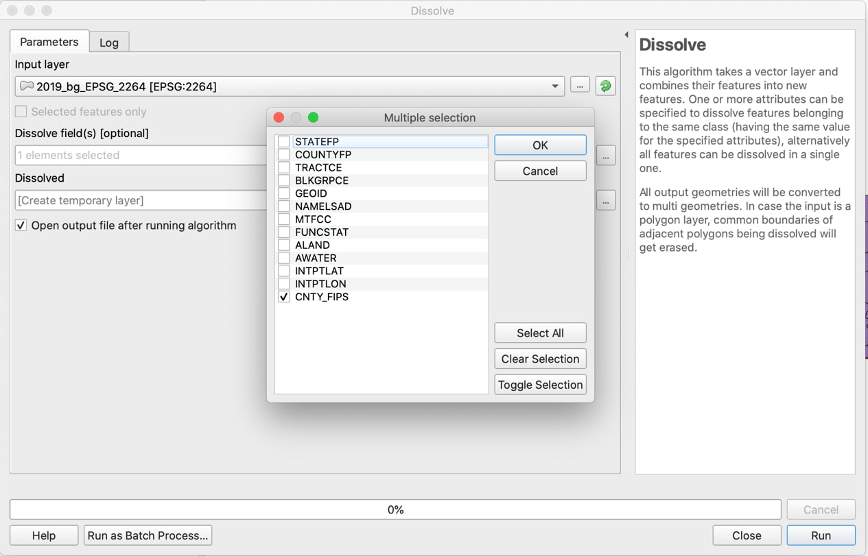
This will create a temporary layer, “Dissolved,” so make sure to re-save it as a new layer to make it permanent: “County final.” Then right-click on the ”County final” shapefile and navigate to the “Joins” pane. Click on the plus (+) button to open the new join pop-up and use the county FIPS columns of each layer as the join and target fields. Click Ok.
Join the indicator value CSV layer to the shapefile output of the dissolve tool
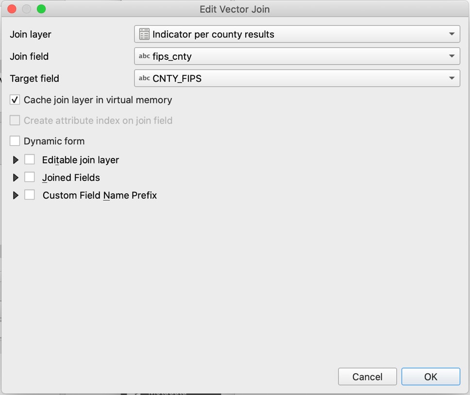
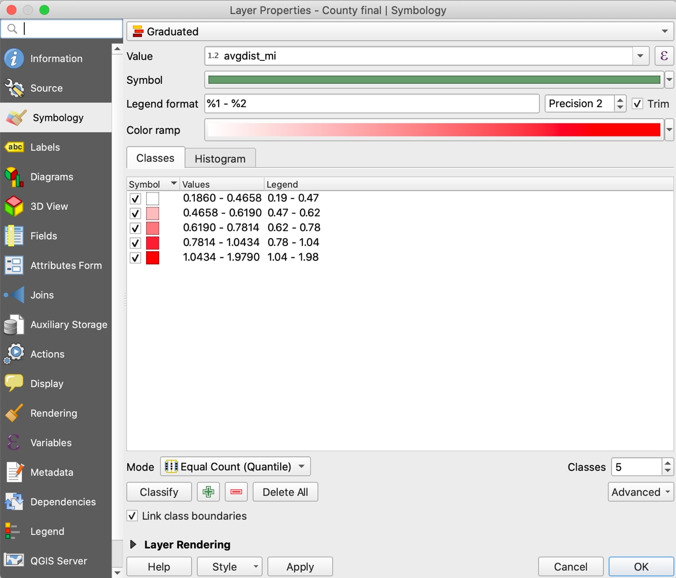
After verifying the join is successful, right-click again on the “County final” shapefile and navigate to the “Symbology” pane. Select “Graduated” for the top field and select the indicator column for the value: “avgdist_mi.” Click “Classify” to generate the color-coded ranges, and then click Ok. The shapefile should now demonstrate different fill colors for each county based on the value.
Adjust layer properties, creating a graduated map of the average distance in miles
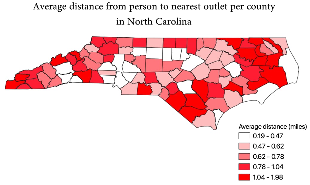
Use “New Print Layout” under “Project” in the menu bar to add a title, legend, or other features before exporting your map. A sample map output is shown in the next graphic.
Map of average distance from person to nearest alcohol outlet by county in North Carolina
Calculating the Average Distance from an Alcohol Outlet to Its Nearest Outlet (Outlet-to-Outlet)
Average distance between outlets by county can be calculated in QGIS using the distance matrix tool together with the Group Stats plugin.
If you use Nearest Neighbors from the Processing Toolbox, it will contain distances within the origin points. Instead, use the Distance Matrix tool from the menu bar: Vector → Analysis Tools → Distance Matrix. This version ignores calculating the distance of the origin points with itself. By selecting the option to calculate only the nearest k = 1 points, the distance matrix will have rows representing all outlets and a single column representing the distance to its nearest one outlet.
Calculate Each Outlet’s Distance to its Next Nearest Outlet:
- In the menu bar, select Vector, then Analysis Tools, and click on distance matrix.
- Make sure your outlets layer has a unique ID for each row/outlet. If there is not one in the existing attribute table, create a new column called “Temp_ID,” based on the row number.
- In the pop-up window, select the appropriate layer and fields:
- Input point layer: Select the layer containing all the plotted outlet points.
- Input unique ID field: Choose the field name containing a unique ID for each point.
- Target point layer: Since you are measuring points within the same layer, select the same layer as you did for Input point layer.
- Output matrix: Linear (N*k x 3) distance matrix.
- Use only the nearest (k) target points: 1.
Using Distance Matrix to calculate distance to each point’s nearest neighbor.
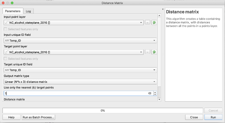
- Click Run, then close. A new temporary layer called “Distance Matrix” will have appeared.
- What unit of measurement are your distances calculated in?
- Double check distance units by going to the QGIS Project Properties, General, Measurements, Units for distance measurement. If the units are incorrect, change the unit and then rerun your outputs.
Join the Distance Matrix Results to the Original Outlets Layer
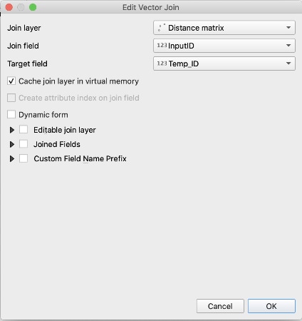
- Right-click on the outlets layer to which you will be adding the distance matrix results. Select Properties, then navigate to the “Joins” page.
- Click on the green plus (+) button on the bottom left. The pop-up window for “Add Vector Join” will appear.
- Select the appropriate layer and fields:
- Join Layer: Distance matrix.
- Join Field: Input ID.
- Target Field: The name of the unique ID field, in this case, Temp_ID.
- Select Ok to close the pop-up window. The new join will appear in the Layer Properties window. Click Ok to apply the join.
- Open the attribute table of the outlets layer. The data should appear in new columns on the far right. Distance matrix will create a table with InputID, TargetID, and Distance. When you do a join, the columns may appear as your unique ID column, “Distance_m” and “Distance_l,” with TargetID renamed as Distance_m. The actual distance you want to use in the next step is Distance_l. If you are unsure which column is correct, select a row in the attribute table and navigate to the map view. The selected point will be highlighted, and you can use the ruler measurement tool to manually measure the closest neighbor, then see which column contains that value.
- Export and save the outlets layer, otherwise the distance matrix data and join are temporary.
Join the distance matrix results to the original outlets layer
Summarize average outlet to nearest outlets distance by county
We will use Group Stats to average distances by their “category” of county, listed in another column. (Note that you can also use “Statistics by Category” to calculate this in QGIS 3.0.)
- Go to the Menu bar, select Vectors, mouse over Group Stats, and select “Group Stats.”
- In the pop-up window, a control panel has selectable options for Layers and Fields:
- Layers: Select the layer that contains the list of outlets and each distance to the nearest outlet
- Fields: Drag and drop “County” into the Rows box, then drag and drop the field name for distances, “distance_l” and “average” into the Value box. You may need to scroll to the end of Fields to see “average.”
- Select “Calculate.” A table should appear in the left portion of the pop-up window.
The right of the window is where you can drag and drop fields; the results will appear on the left after clicking Calculate.
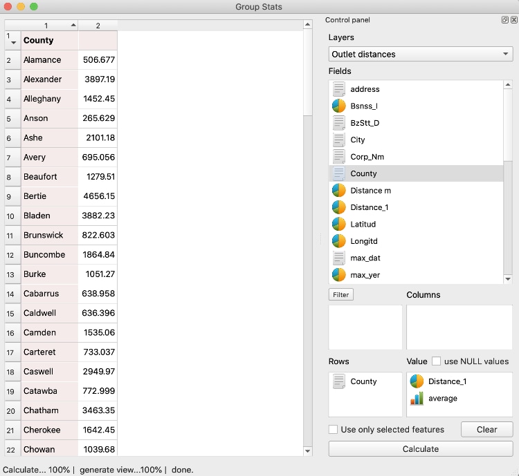
- To save the results, click on Data on the QGIS menu, and select “Save all to CSV file.”
- Navigate to your computer’s folder to verify and view the CSV file saved. It should consist of two columns: the county name and the average distance in meters between outlets for each.
- To use a distance measure that is more easily understood, use Excel to convert meters to miles by dividing the meters by 1609.
Visualize results
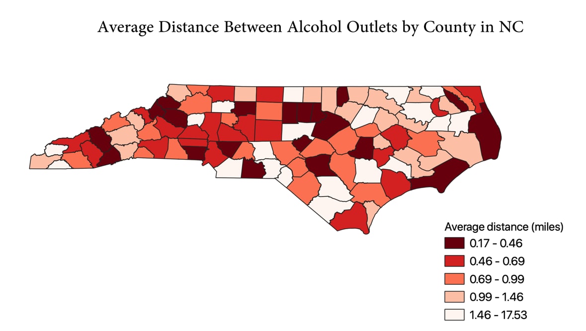
To visualize these results, add the CSV file as a layer and join it to the county shapefile using instructions from previous steps. As before, use Symbology to create an output as shown in the next image. Select Graduated for the top field and select the indicator column for the value: “avgdist_outlets.” Click Classify to generate the color-coded ranges, and then click Ok. As before, you can use the Print Layouts and Layout Manager for more detailed annotation. Detailed instructions for using Print Layouts in QGIS are available onlineexternal icon at docs.qgis.org.
Map of average distance from alcohol outlet to next nearest outlet by county in North Carolina
