Social Determinants of Health Recommended Queries
This information is for 2015 and is available for historical purposes. Updated recommended queries will be available in the future.
Download SDH slideset: PowerPoint version
Slide 1
The data included on these slides are related to our Center’s mission to reduce health inequities among populations most disproportionately affected by HIV, STDs, TB, and viral hepatitis, based on the available surveillance data.
For the most part, we used American Community Survey (ACS) data, from the US Bureau of the Census; please see individual slides for exact source. The ACS collects survey information continuously nearly every day of the year and then aggregates the results over a specific period of time – one year or five years (the 3-years estimates have been discontinued). We used the 5-year estimates as they have data for all of the US counties (the 1-year estimates, in contrast, are only collected for areas of over 65,000 people).
All of the NCHHSTP Atlas maps are choropleth maps, which use sequential colors (e.g., light blue to dark blue) to display data that progress from low to high values. Typically, one uses light colors for low data values and dark colors for high data values.
Slide 2
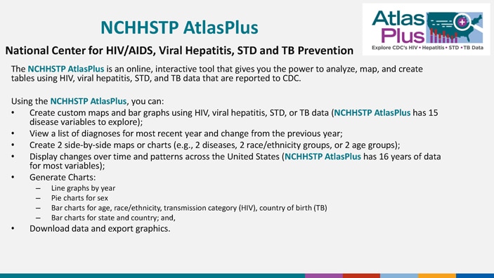
The NCHHSTP AtlasPlus is an online, interactive tool that gives you the power to analyze, map, and create tables using HIV, viral hepatitis, STD, and TB data that are reported to CDC.
Using the NCHHSTP AtlasPlus, you can:
- Create custom maps and bar graphs using HIV, viral hepatitis, STD, or TB data (NCHHSTP AtlasPlus has 15 disease variables to explore);
- View a list of diagnoses for most recent year and change from the previous year;
- Create 2 side-by-side maps or charts (e.g., 2 diseases, 2 race/ethnicity groups, or 2 age groups);
- Display changes over time and patterns across the United States (NCHHSTP AtlasPlus has 16 years of data for most variables);
- Generate Charts:
- Line graphs by year
- Pie charts for sex
- Bar charts for age, race/ethnicity, transmission category (HIV), country of birth (TB)
- Bar charts for state and country; and,
- Download data and export graphics.
Slide 3
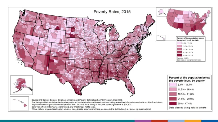
These are maps of poverty rates in 2015. The data are grouped into 5 classes, using natural breaks.
At the state level (smaller map, top right), the range is from 8.4% to 22.1%. The 3 states with the highest percentage of the population living below the poverty level are New Mexico, Louisiana, and Mississippi. Other southern and western states have a high percentage of the population living below the poverty level. The lowest percentages are found in the midwest and northeast.
County-level data can illustrate patterns of poverty rates within states, as well as cross-state patterns. At the county level, the range is from 3.4% to 47.4%. As seen in the map, the highest percentage of the population living below the poverty level are found in the southern half of the US, as well as several counties in the Dakotas, and the lowest percentages in the midwest and northeast.
(SAIPE does not provide data for US territories.)
Slide 4
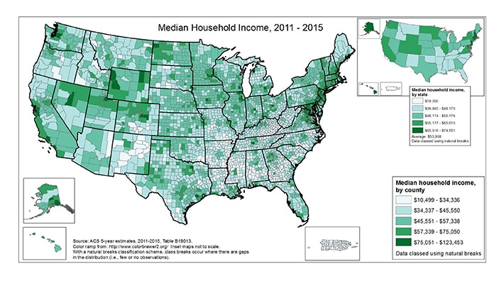
These are maps of median household (HH) income, 2011 – 2015. The data are grouped into 5 classes, using natural breaks.
At the state level (smaller map, top right), the range is from $19,350 (PR) to $74,551. The highest median HH incomes are found in the northeast, midwest, and west, and the lowest median HH incomes are seen in Puerto Rico and most of the south.
County-level data can illustrate patterns of median HH income within states, as well as cross-state patterns. At the county level, the range is from $10,499 to $123,453. As seen in the map, the highest median HH incomes are found in the northeast and west, and the lowest median HH incomes are seen in Puerto Rico and parts of the south and southwest.
(No data for US territories, other than Puerto Rico.)
Slide 5
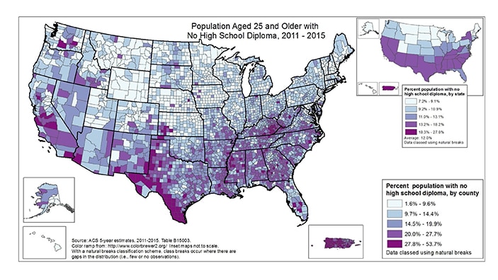
These are maps of percentage of the population aged 25 and older with no high school diploma, 2011 – 2015. The data are grouped into 5 classes, using natural breaks.
At the state level (smaller map, top right), the range is from 7.2% to 27.0%. With the exception of New York, the states where a high percentage of the population aged 25 and over have no high school diploma are in the southern half of the US (and also Puerto Rico).
County-level data can illustrate patterns of percentage of the population aged 25 and older with no high school diploma within states, as well as cross-state patterns. At the county level, the range is from 1.6% to 53.7%. With a few exceptions, the counties where 20% or greater of the population aged 25 and over have no high school diploma are in the southern half of the US (and also Puerto Rico).
(No data for US territories, other than Puerto Rico.)
Slide 6
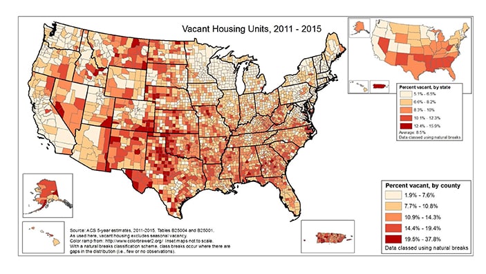
These are maps of percentage of vacant housing units, 2011 – 2015. The data are grouped into 5 classes, using natural breaks.
At the state level (smaller map, top right), the range is from 5.1% to 15.9%. Generally speaking, there is a higher percentage of vacant housing in the south, West Virginia, Nevada, New Mexico, and Puerto Rico. Vacancy rates are lowest in the western US, MN, WI, and several northeastern states.
County-level data can illustrate patterns of percentage of vacant housing units within states, as well as cross-state patterns. At the county level, the range is from 1.9% to 37.8%. Generally speaking, there is a higher percentage of vacant housing in Puerto Rico, the western half of the country (including AK), aside from the states along the Pacific coast. Vacancy rates are lowest in counties in the Midwest and northeast.
(No data for US territories, other than Puerto Rico.)
Slide 7
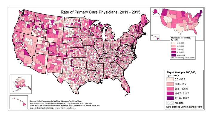
These are maps of the rate of physicians (per 100,000), 2011 – 2015. The data are grouped into 5 classes, using natural breaks.
At the state level (smaller map, top right), the range is from 54.0 to 115.9 per 100,000. The rate of physicians per 100,000 is highest in AK, HI, WA, OR and the northeastern US. Generally speaking, there is a lower rate of physicians per 100,000 in the south, with the exception of Florida and Tennessee.
County-level data can illustrate patterns of rates of primary care physicians within states, as well as cross-state patterns. At the county level, the range is from 0.0 to 469.2 per 100,000 (there are several dozen counties with no data). The county level pattern of physicians per 100,000 is somewhat random, but somewhat mirrors that at the state level – higher rates out west and in the northeast, and lower rates in the south.
(No data for US territories.)
Slide 8
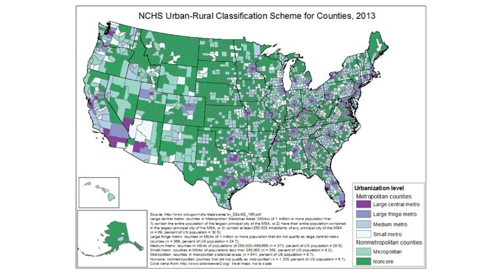
This scheme uses 2010 census population numbers and OMB standards for defining metropolitan statistical areas. 4 metro & 2 non-metro areas are produced by NCHS. The largest MSAs are separated into two groups, large central and fringe metro; NCHS says fringe metro may be very important in health status.
Large central metro: counties in Metropolitan Statistical Areas (MSAs) of 1 million or more population that:
1) contain the entire population of the largest principal city of the MSA, or 2) have their entire population contained in the largest principal city of the MSA, or 3) contain at least 250,000 inhabitants of any principal city of the MSA (n = 68, percent of US population = 30.5);
Large fringe metro: counties in MSAs of 1 million or more population that did not qualify as large central metro counties (n = 368, percent of US population = 24.7);
Medium metro: counties in MSAs of populations of 250,000–999,999 (n = 373, percent of US population = 20.9);
Small metro: counties in MSAs of populations less than 250,000 (n = 358, percent of US population = 9.2);
Micropolitan: counties in micropolitan statistical areas (n = 641, percent of US population = 8.7);
Noncore: nonmetropolitan counties that did not qualify as micropolitan (n = 1,335, percent of US population = 6.1).
There are no data for PR or other territories.
Citing AtlasPlus Materials
We are pleased to make these materials available, and ask that you please cite the NCHHSTP AtlasPlus. The recommended citation for any of the resources accessed is:
Centers for Disease Control and Prevention. NCHHSTP AtlasPlus. Updated 2021. https://www.cdc.gov/nchhstp/atlas/index.htm. Accessed on [insert date].
