Growing Pains for Wastewater Surveillance
Amid the rapid growth of a new system, CDC’s experts discovered better ways to display data for the public

When you’re doing something that’s never been done before, you might not get it right the first time – a lesson CDC microbiologist Amy Kirby learned the hard way.
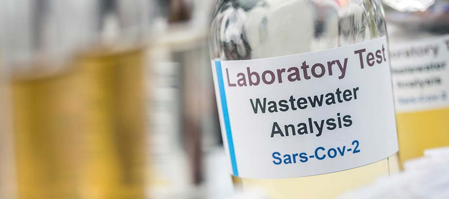
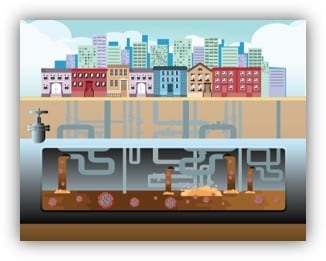
Kirby and her team at CDC’s Waterborne Disease Prevention Branch developed the National Wastewater Surveillance System (NWSS) for COVID-19 in 2020. This innovative new system tests sewage for scraps of genetic material from SARS-CoV-2, the virus that causes COVID-19, and other pathogens. The results can show communities whether cases are going up or down. It’s faster than other types of surveillance and can provide nearly a week’s heads-up on a brewing outbreak.

But presenting those results in an easy-to-understand way can be tricky. Like wastewater itself, the data can be murky. For example, raw numbers representing the amount of virus in a wastewater sample tend to be higher when more people live near a sampling site, even if those data reflect the same level of cases in a community as wastewater samples with lower numbers taken from less-populated areas. And not all the data come in at the same time: some sampling sites take up to four weeks to collect and report enough data for a full picture.
So when Kirby’s team wanted to create a dashboard of those results on CDC’s COVID Data Tracker, they were faced with the tough task of balancing all those variables. They also had to meet the conflicting demands of different audiences.
“Health departments needed an overview and the ability to explore the data, while academics needed information for research,” notes Kirby. During CDC’s internal review of the dashboard before release, CDC scientists wanted more technical explanations of the data. At the same time, the pandemic “created some very savvy public consumers of health data, and they wanted this data to inform their everyday decisions,” she adds.
A launch… and a crash landing
Kirby and her team worked day and night to get it right. The resulting dashboard went live in February 2022. It offered an at-a-glance display for communities, a map, and estimated COVID-19 trends in each community that was taking part in the system.
“And pretty immediately, we got slammed,” Kirby says. “The academics thought it was too simple, that you need to have the raw data posted,” she says. Others found the interface too complicated, telling her, “I just don’t understand what this means.”
It wasn’t the kind of splash the wastewater surveillance team wanted to make.
“One or two of those comments are expected,” she says. “But we had an overwhelming response. Pretty quickly, we knew we had a problem on our hands.”
The page’s problems reverberated inside CDC as well. As Kirby and her team started figuring out how to rework the page, she got summoned to a high-level meeting to explain the data.
Brainstorming for solutions
“You’re always worried when you get called by leadership and have to report on your activities, particularly when you know they’re going poorly,” she says. But the meeting actually turned into “a brainstorming session” to hash out ideas for improving the page.
Kirby huddled with CDC data visualization experts to rethink the elements of the dashboard. Communications specialists helped refine the message and refocus the content. And her team took the extra step of consulting with partners outside CDC, some of whom had been critical of the new page.
Together, they narrowed the dashboard’s primary audience to the data-savvy public. Users could view percentage changes and relative levels of SARS-CoV-2 concentrations in each community, with non-technical interpretations of the data. Trends in cases over the past 6 months appeared as a simple line. The page noted which sites were still collecting enough data to report, while directing health departments, academics, and other technical viewers to other data pages.
When the revised page went live in April 2022, “It was immediately much better,” Kirby says. “We were starting to see what we hoped to see, which was not suggestions or complaints about the dashboard, but people actually using it to understand what’s going on in their community.”
An eye on the future
Since then, Kirby and her team have kept their eye on continuously modernizing the data. At the heart of the NWSS system is DCIPHER, the cloud-based CDC data platform that’s one of the pillars of the agency’s Data Modernization Initiative. An advanced programming interface allows health departments or commercial laboratories to connect directly to the system and submit their data, speeding up the stream of information that can be analyzed and visualized. The system can also overlay vaccination data or variant data for the area under surveillance.

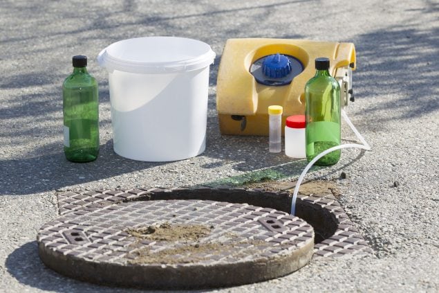
Taking samples of wastewater for chemical testing.
“NWSS has really pushed the boundaries of what DCIPHER can do,” Kirby says. “We’ve tried to make it a one-stop shop for all things wastewater surveillance for our implementers, and it’s gotten our reporting time down from as many as four weeks to about 5.5 days from sample collection to data available in the system.”
The NWSS team is also looking at ways to expand the system. They started in 2020 with 40 sampling sites and are now up to 1,450. The system has been used to test for mpox and will add surveillance for other major threats like antimicrobial resistance, flu, respiratory syncytial virus, and Candida auris, a drug-resistant fungal infection that’s an emerging global health threat.
In the end, the experience taught Kirby some lessons she’s now sharing with others:
- Bring in your communication and visualization experts before you start building your page. “Don’t wait until the review process – or worse, when your new visualization is being destroyed on Twitter,” she says.
- Be open to new approaches. “New science will demand new ways to visualize the data, so we have to be willing to think outside the box.”
- Don’t be afraid to say no. You’ll hear a lot of ideas, “and some of them are really cool,” Kirby says. “But it’s your job to wade through them and pick the ones that are right for your purpose.”
“NWSS is young, and we’re going to make some missteps,” Kirby says. “But as long as we’re transparent, stay engaged, and acknowledge mistakes, we’re going to be OK.”
Video conversation with Dr. Rochelle Walensky and Dr. Amy Kirby: National Wastewater Surveillance System Data (February 2022)