Types of Thematic Maps

View more examples of thematic maps and other types of maps in our Map Gallery.
Thematic maps focus on a particular theme or topic. The types of thematic maps on this page use symbols, lines, and dots to display data.
Resources
- Dent B. Cartography: Thematic Map Design. McGraw Hill, 5th Edition; 1999. ISBN: 0697384950.
- DiBiase D. Nature of Geographic Information—An Open Geospatial Textbook. Pennsylvania State University; 2011.
- CDC. (2013). Epi Info Resources for Creating Public Health Maps.
- Koch T. Cartographies of Disease: Maps, Mapping, and Medicine. ESRI Press, 1st Edition; 2005.
- Krygier J, Wood D. Making Maps: A Visual Guide to Map Design for GIS. The Guilford Press; 2005.
- Monmonier M. How to Lie with Maps. University of Chicago Press, 2nd Edition; 1996.
- Slocum TA, McMaster RB, Kessler FC, and Howard HH. Thematic Cartography and Geovisualization, 3rd Edition. Upper Saddle River, NJ: Pearson, Prentice Hall; 2009.
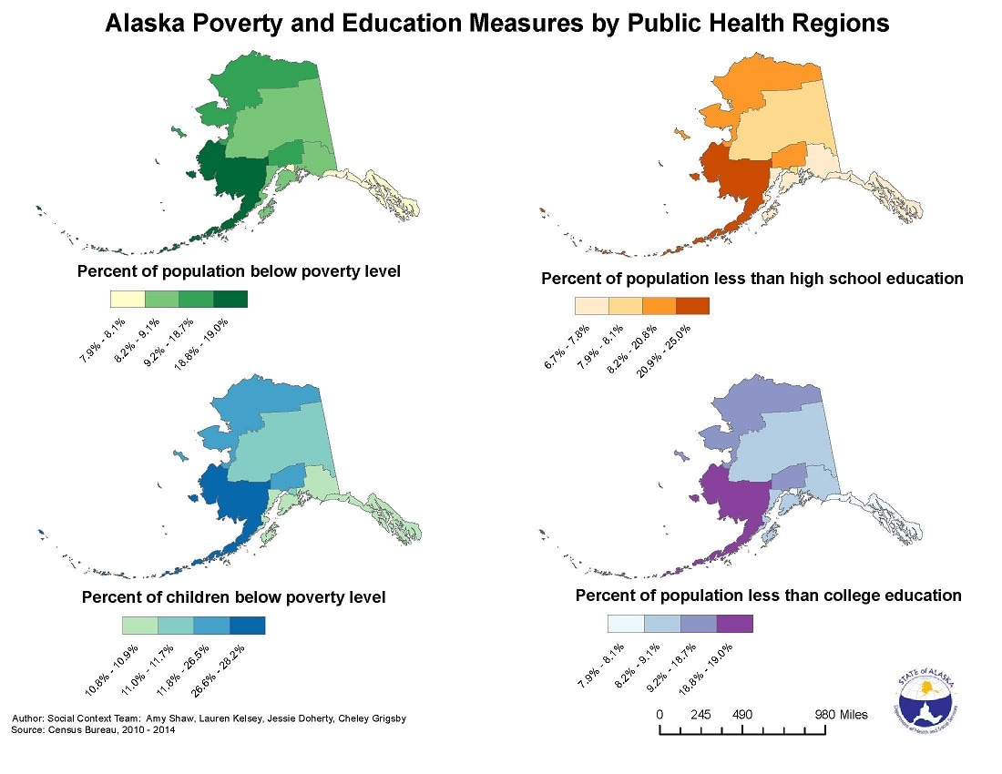
Choropleth Map (example)
- Description: These maps contain areas that are shaded or patterned in proportion to the statistical variable being displayed on the map. Data are aggregated over predefined areal units (politically-defined area or administrative—census or zip).
- Optimal uses: Best used when data are standardized (e.g., rates), discrete, and are evenly distributed within well-defined areal units.
- Design Considerations: Number of categories should be limited (between 3 and 7).
- More information on choosing classification schemes (and Brewer/Pickle article [PDF-6M])
Graduated Symbol Map (example)
- Description: These maps contain symbols varying in size to show their relative quantitative values; used with point/location data.
- Optimal Uses: Best used when there is a lot of variation and range in the data; the goal is to show relative magnitudes of phenomena at specific locations. This is also good choice for count data.
- Design Considerations: Should not be used for standardized data such as rates or percentages.
Dot Map (example)
- Description: Uses dots to show the presence of a feature or occurrence; displays a spatial pattern and relative density. Individual dots can represent single or multiple occurrences.
- Optimal Uses: Best used for count data; can also show multiple data sets (by using different symbols or colors).
- Design Considerations: Requires additional tools (e.g., geocoding) to locate dots on the map; perceptual issues as well as design techniques (e.g., dot size, value, and arrangements) should be considered.
Isopleth Map (example)
- Description: A contour map that depicts smooth continuous information (such as weather or pollution data); data are depicted using lines that connect points of equal numerical value.
- Optimal Uses: Serves as an effective method for highlighting spatial patterns in the data, as opposed to depicting discrete rates per enumeration area.
- Design Considerations: Requires understanding of various interpolation techniques.
Cartograms (or Density Equalized Map Projections) (example)
- Description: The spatial geometry of each mapped area is distorted to depict an attribute other than land area (e.g., population or income).
- Optimal Uses: Best accompanied by description of mapping techniques; can be constructed manually or digitally.
- Design Considerations: Methods are complex and interpretation can be difficult.
Dasymetric Map
- Description: A thematic map that uses symbols to spatially classify volumetric data; serves as an alternative to choropleth maps.
- Optimal Uses: Most appropriate to use dasymetric maps when the assumption of uniformly distributed phenomena is not met (e.g., population distribution). Interpretation can be facilitated when mapping technique is provided to map users. As with choropleth map, this technique is for depicting standardized data (e.g., rates).
- Design Considerations: As with cartograms, this method is quite complex and time-consuming; the extent of the mapped areas rarely correspond to the boundaries of enumeration units.
Page last reviewed: August 16, 2017
