Emergency Preparedness & Response View
Tracking the unique factors contributing to community vulnerability and resilience is vital to enhancing emergency planning and preparedness activities. This is important as environmental disasters become increasingly common and the impact is felt unequally across populations. While CDC’s Environmental Public Health Tracking Program (Tracking) collects a wide variety of health and environmental data from its network of partners, this view of the Data Explorer was created to help queries tailored to Emergency Preparedness and Response data needs.
What is the Emergency Preparedness and Response View?
- The Emergency Preparedness and Response View of Tracking’s Data Explorer is a filtered version of the Data Explorer tool. It showcases the content areas and associated measures that are commonly collected and used by Tracking recipients in hazard assessment and post-emergency recovery efforts. This view within the Data Explorer provides a focused and centralized view of information sources to support decision-making and enable quicker assessments of the breadth and variety of community resources and vulnerabilities for emergency situations.
- The selected measures include indicators of specific hazardous events. This includes extreme heat events, projected precipitation, and air quality, as well as relevant community characteristics and infrastructure, such as household composition and land use. To learn more about the specific indicators themselves and how they inform emergency preparedness activities—along with other resources—please see the preparedness and response content page.
Instructions/how to use the Emergency Preparedness and Response View
Selecting an Indicator
- The Emergency Preparedness and Response View functions in the same way as the Data Explorer, but with more tailored content areas and measures. To use the query panel, first select a content area of interest followed by an indicator, and then select a specific measure that you would like to visualize on a map. After making your content selection, select how you would like to visualize the information in the “Geography Type” drop-down menu. You will then be prompted to select a specific geographic level or area and a time frame for the data. Some measures will include additional view options under “Advanced View.”
Adding Additional Information Layers and View Customization
- You can further customize the visualizations in the Data Explorer by clicking on the map menu, highlighted in red in the image below.
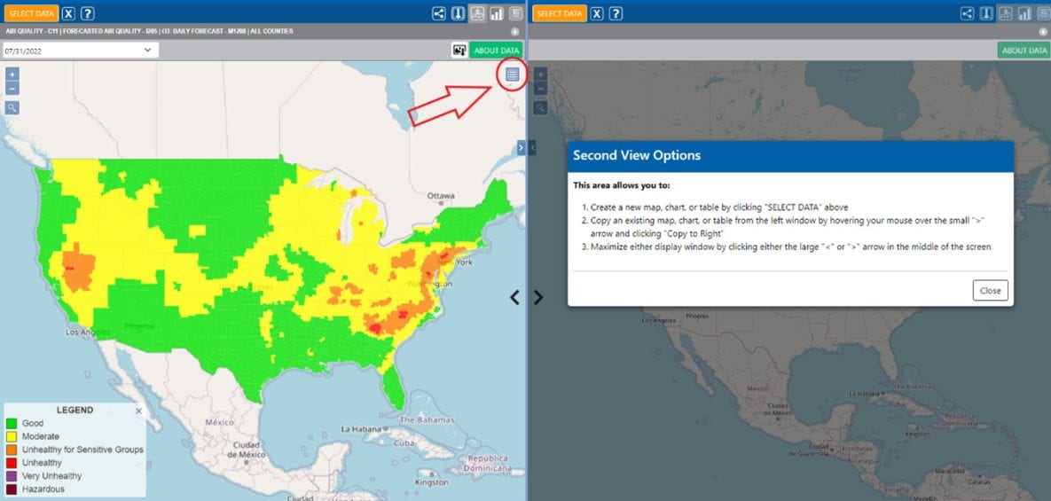
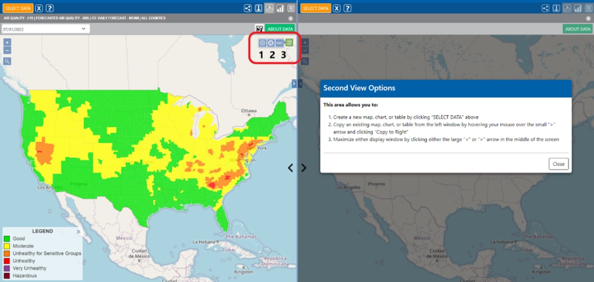
- When you click on the map menu, three icons will appear. The icons are numbered for clarity in the image below:
- Map options: Click on this icon to add a point of interest layer on top of the indicator being mapped, add an overlay layer with real-time environmental data, change the view of the map background layer, or change the boundary overlay.
- When you select the map options icon, a pop-up will appear with four options for further customizing the map:
- Add a point of interest layer (e.g., point locations of hospitals, schools, water bodies, federal property, etc.) on top of the indicator being mapped. An exclamation point will appear on the map if all points of interest are not being displayed. Zoom in to view additional points.
- Add an overlay layer with real-time environmental data (e.g.,: current radar, active Atlantic cyclones).
- Change the view of the map background layer.
- Change the boundary overlay.
- Legend Options: With this tool, you can change the color scheme of the map, adjust the number of break groups, or change the classification type (equal intervals, quantiles, natural breaks). These options allow you to customize the map, which is useful if you would like to export an image of the map you created.
- Link Maps: If you are visualizing two indicators side by side in the two available maps, selecting link maps will ensure that the zoom level across the two maps matches, and if you hover over a particular area, the detailed information will pop up for the same area in both maps, simultaneously.
- When you select the map options icon, a pop-up will appear with four options for further customizing the map:
- Map options: Click on this icon to add a point of interest layer on top of the indicator being mapped, add an overlay layer with real-time environmental data, change the view of the map background layer, or change the boundary overlay.
Example Use Cases for the Emergency Preparedness View
Real-time examples
Number of People and Housing Units within FEMA Designated Flood Hazard Area with Current Radar Overlay Layer
To use the current radar overlay layer, use the map options icon, as described above.
During periods of severe weather and heavy precipitation, visualizing the density and distribution of populations living in flood hazard areas with real-time radar projections can assist in tailoring safety messages to impacted populations and preparing shelter resources as situations develop.
Number of People and Housing Units within FEMA Designated Flood Hazard Area with Current Radar Overlay Layer.
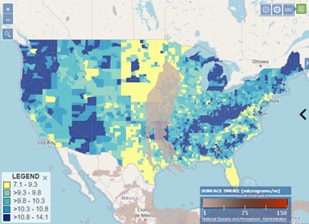
Comparing the Prevalence of Adult Asthma with the Geography of Current Surface Smoke
People with respiratory issues, like asthma, are at increased risk of respiratory hazards and adverse outcomes associated with wildfire smoke. During the event and in the aftermath of a wildfire, visualizing the geographic spread of asthma burden in the affected area will enable health authorities to begin targeted health interventions and easily provide hospital resources.
 [PNG - 113 KB]
Prevalence of Adult Asthma with Current Surface Smoke Overlay Layer.
Emergency planning examples
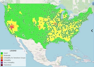
Forecasted Air Quality and the Distribution of U.S. Nursing Homes Point of Interest Layer
Visualizing air quality along with points of interest where groups with higher risk of health impacts are concentrated, such as nursing homes, could be useful in planning for the allocation of hospital and other care resources and the sharing of prevention messages for harmful ambient air quality.
 [PNG - 126 KB]
Forecasted Air Quality and the Distribution of U.S. Nursing Homes Point of Interest Layer
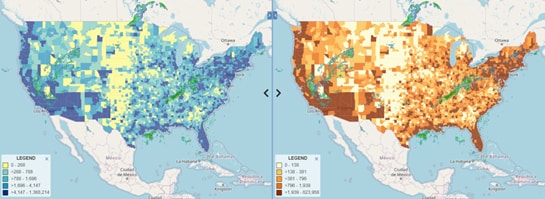
Number of People Living within FEMA Designated Flood Hazard Area vs County-level Social Vulnerability Overall Rank
The social vulnerability index (SVI) is a useful tool for identifying communities at greater risk during and after disasters. Due to the increasing frequency of severe weather events, comparing the SVI distribution to specific hazard vulnerabilities can be useful in the creation of long-term mitigation strategies and context-specific disaster plans.
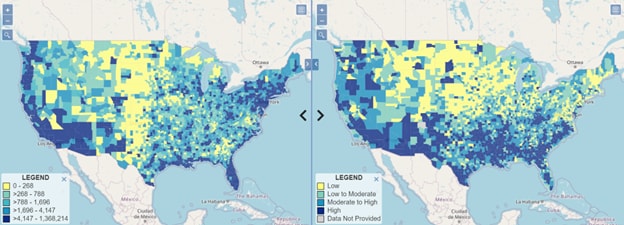
Number of People Living within FEMA Designated Flood Hazard Area vs County-level Social Vulnerability Overall Rank.
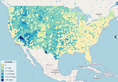
Monthly Projected Heat Exceedance Days with Mobile Home Park Point of Interest Layer
People with underlying conditions, older adults, children, and people living in poverty are, in particular, at higher risk of exposure to extreme heat exposure. Tracking users can use this layer to prepare for extreme heat events. The layer highlights geographic areas with higher potential vulnerabilities, such as mobile home parks, and the number of projected heat exceedance days. Users can use this information to enhance communications in these areas and provide cooling center resources.
 [PNG - 143 KB]
Monthly Projected Heat Exceedance Days with Mobile Home Park Point of Interest Layer