Visual Communication Resources
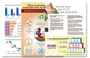
Visuals, such as pictures, drawings, charts, graphs and diagrams, can be effective tools for communicating health information. Visuals can make the presentation of complex information easier to comprehend and more attractive. They can also reinforce written or spoken health messages.
Visual communication can benefit all audiences, especially people with lower literacy and numeracy skills. Remember, though, that visuals can’t speak for themselves. People can interpret visuals, just as they do words, in different ways. Choose visuals that support the main message and have clear headings, labels, and captions.
Below, you will find sources for free health-related images in the public domain. You will also find resources that will help you make decisions about
- Choosing images that effectively communicate your message
- Creating visual displays your audience will understand
Sources of Health-Related Images in the Public Domain
- Public Health Image Library (Centers for Disease Control and Prevention)
- Visuals Onlineexternal icon (NIH National Cancer Institute)

Visuals can support the main message and help audiences understand numerical information.
Decision-Making Resources for Choosing Images and Creating Visual Displays
- Do No Harm Guide: Applying Equity Awareness in Data Visualizationpdf iconexternal icon (Urban Institute 2021)
This resource offers a set of guidelines for presenting data through a diversity, equity, and inclusion lens. It helps data communicators and other data practitioners see how choices made about colors, shapes, words, and representations in data analyses and visualizations can affect how people perceive the results, how change might be implemented, and how that change will impact different people and communities. - Picture This!external icon[National Institutes of Health (NIH) 2021)]
This NIH resource provides suggestions on selecting or developing images (drawings, illustrations, charts, maps, or animations) to accompany your text (or voice-over in video) to achieve a desired outcome. - Visualizing Healthexternal icon (University of Michigan 2014)
The University of Michigan describes Visualizing Health as a scientifically vetted style guide for communicating health data. The site contains 54 examples of tested data visualizations distributed via a Creative Commons license. This allows you to adapt them for your own objectives. - Making Data Talkpdf iconexternal icon (NIH National Cancer Institute 2011)
This workbook is intended to help you select and communicate quantitative data in ways lay audiences can understand. - Teaching Patients with Low Literacy Skillsexternal icon(Doak, Doak, and Root 1996)
This free downloadable book is considered a classic text in health literacy. Chapter 7, Visuals and How to Use Them, identifies the special needs of poor readers and provides guidance to make visuals responsive to those needs.