Death in the United States, 2011
- Key findings
- How long can we expect to live?
- Which population groups experienced the greatest reductions in mortality over the last decade?
- Do death rates vary by state?
- What are the leading causes of death?
- What are the most recent trends in infant mortality?
- Summary
- Definitions
- Data source and methods
- About the author
- References
- Suggested citation
NCHS Data Brief No. 115, March 2013
PDF Versionpdf icon (705 KB)
Arialdi M. Miniño, M.P.H.
Key findings
Data from the National Vital Statistics System (Mortality)
- Life expectancy at birth for the U.S. population was 78.7 years in 2011. Life expectancy for the Hispanic population was 81.4 years. Hispanic females had the highest life expectancy at birth (83.7 years), followed by non-Hispanic white females (81.1 years).
- Non-Hispanic black males experienced the largest decrease in mortality (23%) during the period 2000–2011. The age-adjusted death rate for this population decreased from 1,422.0 per 100,000 in 2000 to 1,101.2 in 2011.
- States in the southeast region had higher death rates than those in other regions of the country.
In 2011, the age-adjusted death rate for the United States was 740.6 per 100,000 population (1). This rate represents a 0.9% drop from the rate in 2010 (747.0), and is a record low. The highest mortality was observed for the non-Hispanic black population (903.9), followed by the non-Hispanic white population (753.9). Death rates for all race groups of the U.S. population generally have been decreasing since 1935 (2), and the rates for the Hispanic population have been declining since the late 1990s (3). Data for 2011 maintain that trend. The figures presented in this report are based on preliminary mortality data for 2011 and final data for 2000–2010.
Keywords: mortality, National Vital Statistics System, life expectancy
How long can we expect to live?
U.S. life expectancy at birth for all races and both sexes was 78.7 years in 2011—the same as it was in 2010 (Figure 1). Hispanic females have the longest life expectancy (83.7 years), followed by non-Hispanic white females (81.1 years), Hispanic males (78.9 years), non-Hispanic black females (77.8 years), non-Hispanic white males (76.4 years), and non-Hispanic black males (71.6 years).
Figure 1. Life expectancy at birth, by Hispanic origin, race for non-Hispanic population, and sex: United States, preliminary 2011
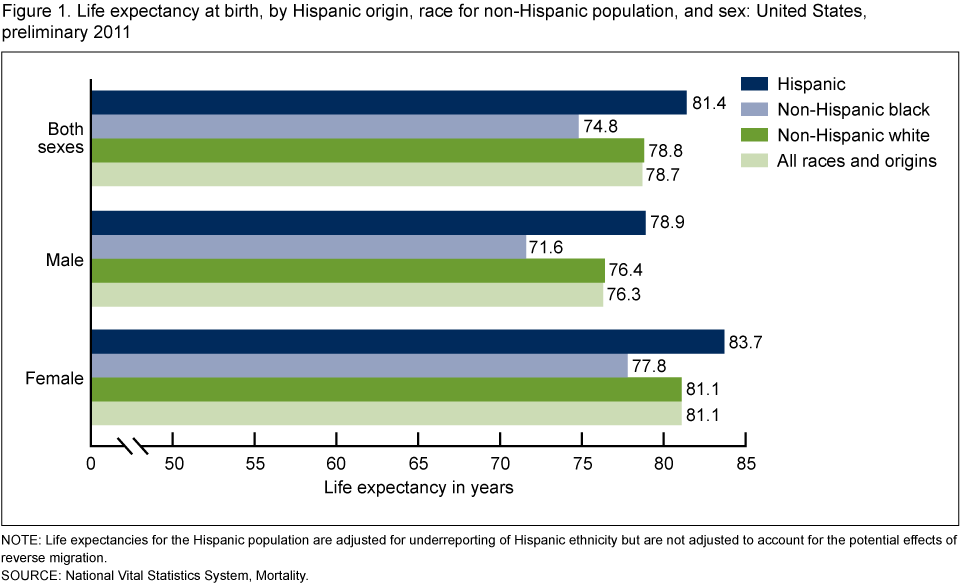
NOTE: Life expectancies for the Hispanic population are adjusted for underreporting of Hispanic ethnicity but are not adjusted to account for the potential effects of reverse migration.
SOURCE: National Vital Statistics System, Mortality.
The life expectancy gap between the non-Hispanic white population and the non-Hispanic black population was 4.0 years in 2011. The difference in life expectancy between the Hispanic population and the non-Hispanic white population was 2.6 years. The difference between the Hispanic population and the non-Hispanic black population was 6.6 years (1).
Life expectancies for the Hispanic population shown in this report are adjusted for underreporting of Hispanic ethnicity (4).
Which population groups experienced the greatest reductions in mortality over the last decade?
When compared with death rates for the year 2000, the rates for 2011 show decreases in mortality across every population group defined by sex and race and Hispanic origin. The largest reductions in mortality between 2000 and 2011 occurred among males (Figure 2). Non-Hispanic black males experienced the largest decrease during this period (22.6%).
Much of the recent improvement in death rates and life expectancy for all population groups can be attributed to continuing reductions in death rates from major causes of death, such as heart disease, cancer, stroke, and chronic lower respiratory diseases (3).
Figure 2. Age-adjusted death rates for selected populations: United States, 2000 and preliminary 2011
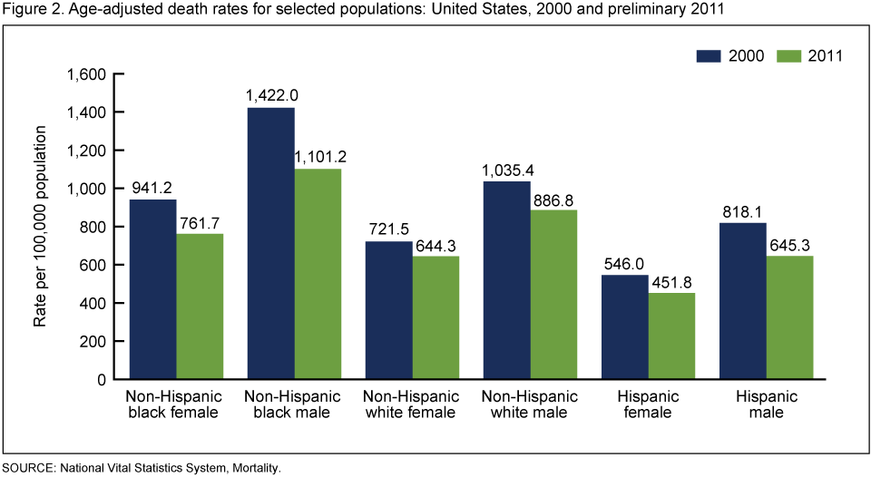
SOURCE: National Vital Statistics System, Mortality.
Do death rates vary by state?
States experience different mortality risks. Hawaii had the lowest age-adjusted death rate (584.8 deaths per 100,000 population) of all the states in 2011—21.0% lower than the rate for the United States (740.6) (Figure 3). Mississippi had the highest age-adjusted death rate in 2011 (956.2)—29.1% higher than the U.S. rate.
In general, states in the southeast region had higher rates than those in other regions of the country. Louisiana is typical of the region, with an age-adjusted death rate of 882.1 deaths per 100,000 population (1).
States that had death rates similar to the overall U.S. death rate include Illinois in the Midwest (737.3 deaths per 100,000 population) and Virginia in the Southeast (741.6 deaths per 100,000 population).
Figure 3. Age-adjusted death rates for each state and the District of Columbia: United States, preliminary 2011
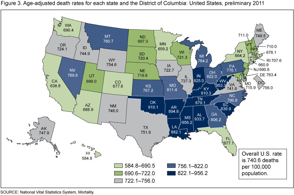
SOURCE: National Vital Statistics System, Mortality.
What are the leading causes of death?
In 2011, five major causes of death (heart disease, cancer, chronic lower respiratory diseases, stroke, and accidents) accounted for 62% of all deaths in the United States (1). However, this general profile of leading causes varies substantially based on a decedent’s age.
The five leading causes of death for those aged 1–24 years include external causes (i.e., accidents, homicide, and suicide), followed by cancer and heart disease (Figure 4). This pattern of external causes accounting for more deaths than do chronic conditions shifts noticeably as age increases. In older age groups, chronic conditions account for more deaths than do external causes of injury.
Figure 4. Percent distribution of five leading causes of death, by age group: United States, preliminary 2011
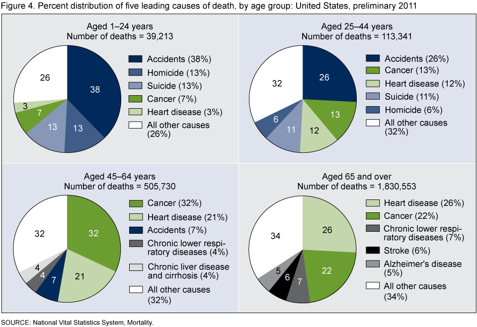
SOURCE: National Vital Statistics System, Mortality.
What are the most recent trends in infant mortality?
The infant mortality rate (IMR) is the ratio of infant deaths to live births in a given year. The IMR is generally regarded as a good indicator of the overall health of a population. The preliminary IMR for 2011 is 6.05 infant deaths per 1,000 live births (1) (Figure 5). Although the IMR for 2011 is not significantly different from the rate for 2010 (6.15 deaths per 1,000 live births), the IMR in 2011 was 34% lower than in 1990 (9.22).
Figure 5. Infant mortality rates: United States, 1990–2010 final and preliminary 2011
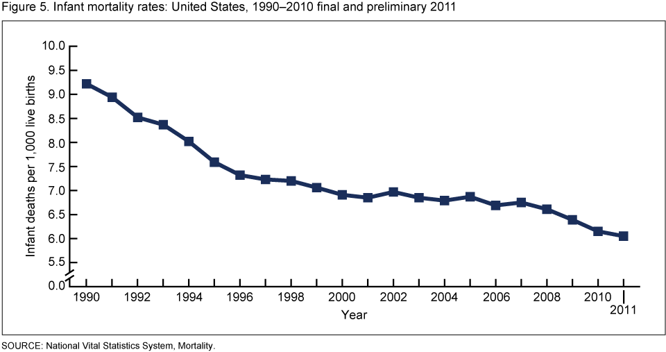
SOURCE: National Vital Statistics System, Mortality.
Summary
Mortality in 2011 continued to decline among most groups defined by sex and race and Hispanic origin. Although continuing declines in mortality have slowly reduced longstanding gaps in life expectancy, differences in mortality across ethnic and racial groups persist (1,3,5).
Definitions
Cause-of-death classification: Cause of death is determined based on medical information—including injury diagnoses and external causes of injury—that is entered on death certificates filed in the United States. This information is classified and coded in accordance with the International Statistical Classification of Diseases and Related Health Problems, Tenth Revision (ICD–10) (6).
Death rates: Death rates for 2011 are based on population estimates for July 1, 2011 that are consistent with the April 1, 2010 census. These population estimates (as well as population figures for the 2010 census) are available on the National Center for Health Statistics (NCHS) website (7). Age-adjusted death rates are useful when comparing different populations because they remove the potential bias that can occur when the populations being compared have different age structures. NCHS uses the “direct” method of standardization; see the Technical Notes of “Deaths: Preliminary Data for 2011” (1) for more discussion.
Life expectancy: Data showing life expectancy for the period 2000–2011 are based on a newly revised methodology and may differ from figures previously published. Life expectancies for Hispanic groups shown in this report are adjusted for underreporting of Hispanic ethnicity. See the Technical Notes of “Deaths: Preliminary Data for 2011” (1) for more discussion.
Infant mortality rate (IMR): This rate is computed by dividing the number of infant deaths in a calendar year by the number of live births registered for that same time period. The IMR is the most widely used index for measuring the risk of dying during the first year of life.
Data source and methods
The figures shown in this report reflect information collected on death certificates filed in each of the independent registration areas throughout the United States. Preliminary mortality data for 2011 are based on an excess of 98% of both the demographic and medical files for infant decedents and those aged 1 year and over from the statistical records that NCHS continuously receives from states’ vital registration systems. This portion of records is weighted to better estimate final numbers, using independent record tallies as control factors. Tallies are provided by the states and registration areas. Death rates for 2011 are based on population estimates for July 1, 2011 that are consistent with the April 1, 2010 census.
About the author
Arialdi M. Miniño is a statistician with the Centers for Disease Control and Prevention’s National Center for Health Statistics, Division of Vital Statistics.
References
- Hoyert DL, Xu JQ. Deaths: Preliminary data for 2011. National vital statistics reports; vol 61 no 6. Hyattsville, MD: National Center for Health Statistics. 2012.
- Hoyert DL. 75 years of mortality in the United States, 1935–2010. NCHS data brief, no 88. Hyattsville, MD: National Center for Health Statistics. 2012.
- Kochanek KD, Xu JQ, Murphy SL, et al. Deaths: Final data for 2009. National vital statistics reports; vol 60 no 3. Hyattsville, MD: National Center for Health Statistics. 2012.
- Arias E. United States life tables by Hispanic origin. National Center for Health Statistics. Vital Health Stat 2(152). 2010.
- National Center for Health Statistics. Health, United States, 2010: with special feature on death and dying. Table 22. Hyattsville, MD. 2011.
- World Health Organization. International statistical classification of diseases and related health problems, tenth revision. Geneva. 1992.
- National Center for Health Statistics, National Vital Statistics System. U.S. census populations with bridged race categories
Suggested citation
Miniño AM. Death in the United States, 2011. NCHS data brief, no 115. Hyattsville, MD: National Center for Health Statistics. 2013.
Copyright information
All material appearing in this report is in the public domain and may be reproduced or copied without permission; citation as to source, however, is appreciated.
National Center for Health Statistics
Edward J. Sondik, Ph.D., Director
Jennifer H. Madans, Ph.D., Associate Director for Science
Division of Vital Statistics
Charles J. Rothwell, M.S., Director