Map Details – Michigan Unemployment Rates by County
Impact Statement
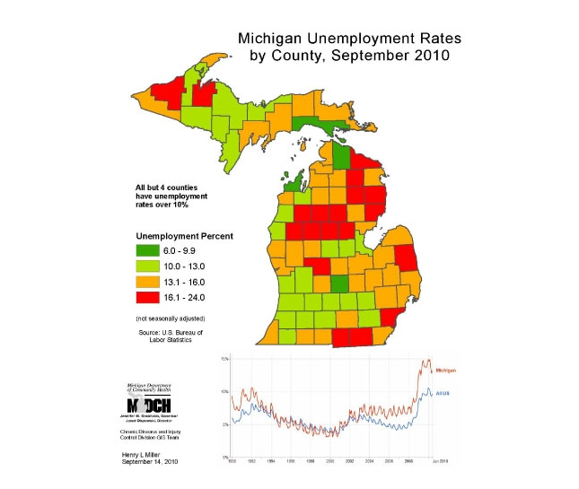
This map displays unemployment rates in Michigan, using a green, yellow, red mix to highlight the dangerously high level of unemployment, reinforced by the time line chart showing Michigan unemployment substantially higher than national, and the highest in years. This map also documents unemployment rates in state by county. You can use this map as part of the social determinants of health risk factors in constructing burden of disease documents and presentations.